“Okay, I get it. I should be showing and telling because we all process visual information (color, size, length) much faster than information encoded in words and numbers. But what is the best ratio of show to tell?”
A participant in one of my data viz workshops posed this question to me, in a more polite way. And here is my answer. Like so many answers, it begins with “it depends.” There is no exact formula for the best ratio of text to images (including data visualizations or other types of images like photos.) I think it depends on the medium — report, presentation, webpage — and the audience — general, already engaged, expert.
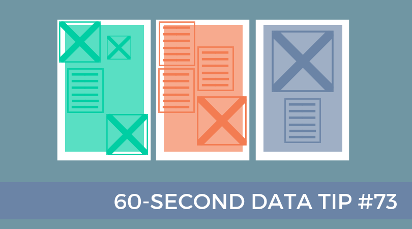
At one end of the spectrum, where you are sharing information with highly engaged experts, particularly in print form, I think you should include more text so that you ensure a precise and careful communication that includes a lot of specifics. In this case, the split might be 30/70 in favor of text.
At the other end of the spectrum are communications to a general audience that is not necessarily familiar with your subject matter. Then I would go for at least a 50/50 split. Also, the images should be easy to understand, and the overall amount of information, whether in text or images, should be limited to the key points.
In the middle of the spectrum, you might have a somewhat informed audience or a diverse audience including experts and novices. Here I would offer a smorgasbord with plenty of sign posts. I know I’m mixing my metaphors, but stick with me. The idea is to make your report or webpage accessible to the casual reader, who is going to peruse the titles, subtitles, pull quotes, images, and charts. These elements of the smorgasbord, together, should tell a general story without the aid of the text. Charts, in particular, should have sufficient titles and labels so that someone can consume them without reading the surrounding text. And some of these elements — titles, subtitles, and pull quotes— also act as sign posts, directing the reader to the content of greatest interest. Indeed, if done well, the sign posts can turn a casual reader into an engaged one.
See other data tips in this series for more information on how to effectively visualize and make good use of your organization's data.

