Details, Details (And When To Include Them)

Copy of 60-SECOND DATA TIP_3.png

What I remember most about the movie “Inside Out” is a scene about forgetting. And it has helped to shape my thoughts on presenting data.

In the 2015 Pixar film, memories are shining orbs sent through vacuum tubes to “Long Term,” a mammoth storage room with, nevertheless, limited capacity. So “Mind Workers” continuously cull the memory orbs, discarding the unnecessary ones – old phone numbers, piano lessons, names of past presidents – into the “Memory Dump.” I remembered this scene most recently when:

1) I heard Bryan Caplan interviewed on NPR. He’s an economist who wrote the thought-provoking book The Case Against Education. One argument Caplan makes against education is that we mostly forget it.  He cites studies that show little retention of both facts and generalized skills post college.

 2) My 12- and 14-year-old daughters’ shared with me YouTube channels like Oversimplified, In A Nutshell, and Crash Course. These funny, brief videos explain stuff I’ve forgotten (or perhaps never learned, who knows?) like the origins of the French Revolution and how the immune system works.

So here’s the question: Given that our brains are continuously purging information, particularly details, and retaining, at best, big picture stuff that can be contained in a 10-minute video, should we not bother with the details in the first place? My short answer is no. For me, it’s about who should spend time on the details and when.

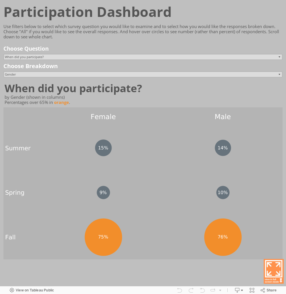
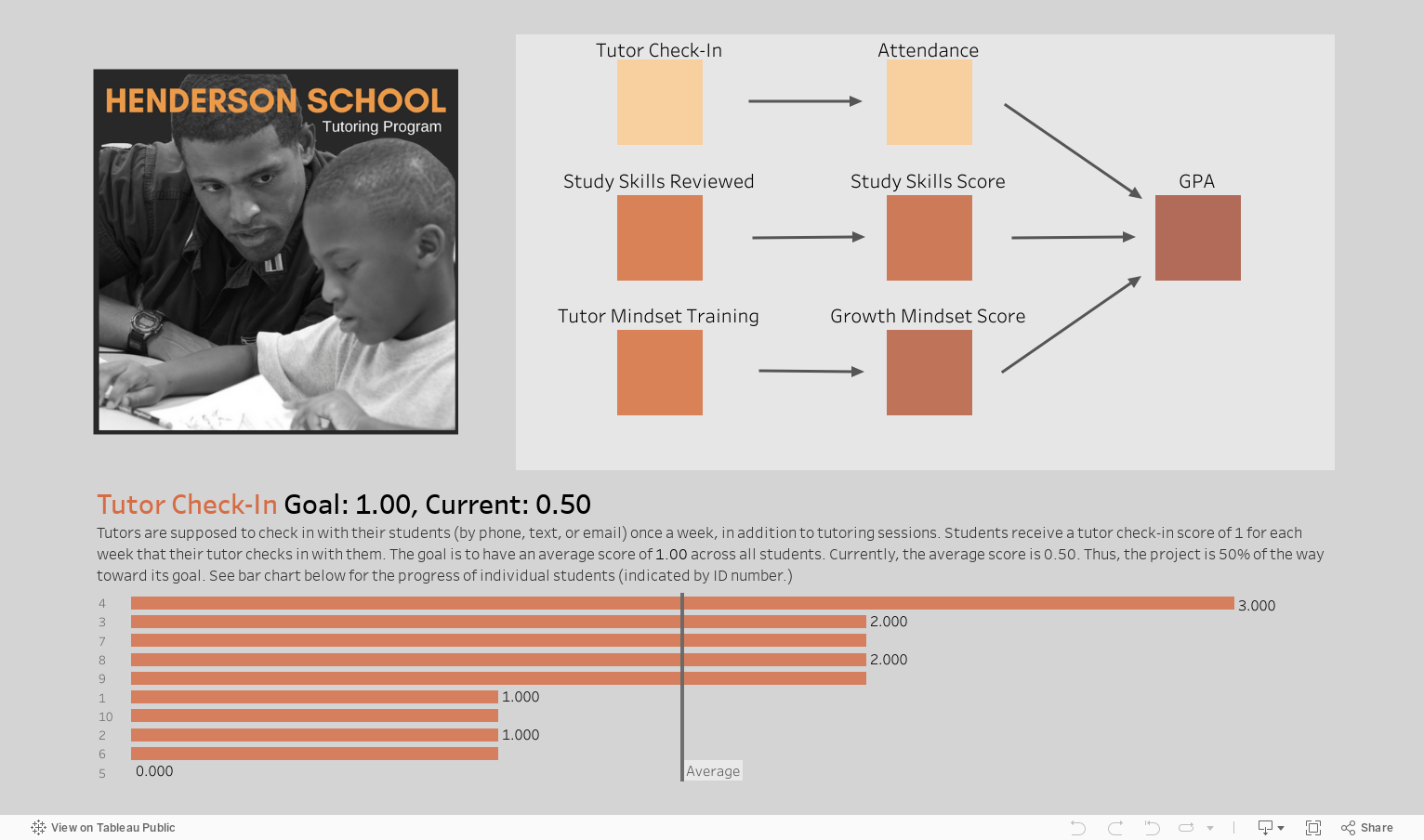
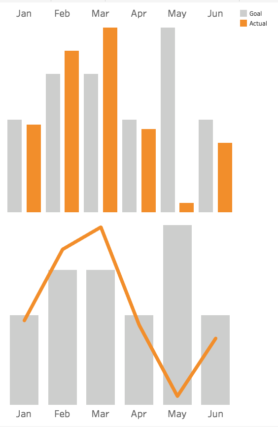
If you are presenting data in any form, it’s incumbent upon you to know the details of the data -- what the trends are overall and by subgroup, who or what is not represented in the data, where the outliers are. And then the idea is to transfer aspects of this knowledge in the right form for the right people, paying as much attention to what you exclude as to what you include.

Some of the people will only need the biggest picture, but even they should to be tipped off to any exceptions to the rule hidden in the data. They also need to know where to go to learn more if and when they want to. Some of the people will need a more detailed rendering of the data, but don’t give them so many trees that they can’t see the forest. Indeed, they may retain the details more if you give them a general picture first which serves as a scaffolding on which they can attach details presented later.

And here’s hoping you retain the gist of this data tip!

Data Viz for Nonprofits help organizations to effectively and beautifully present their data on websites, reports, slide decks, interactive data dashboards and more. Click HERE to learn more about our services and HERE to set up a meeting to discuss how we can meet your particular needs.

Freedom From Pivoting

60-SECOND DATA TIP_3 (1).png

Often, perhaps most of the time, we do best by looking at our data from a number of different vantage points. Sure, we want the broad view: how are all of our participants doing in the program? But we also want to know how particular types of participants are doing such as those in certain age brackets, those who got a certain set of services, those who persisted in program for longer or shorter periods of time, etc. To see our data broken down into such subgroups can be a pain in programs like Excel*. You have to generate a different pivot table for each type of breakdown. But in programs like Tableau, you can create “parameters” that allow you to toggle among different breakdowns easily and painlessly. With some Tableau know-how, you can see how different types of survey respondents responded to different types of question as in the example below.


***

Data Viz for Nonprofits helps organizations to effectively and beautifully present their data on websites, reports, slide decks, interactive data dashboards and more. Click HERE to learn more about our services and HERE to set up a meeting to discuss how we can meet your particular needs.

*If you have a version of Excel with the “slicer” feature, you can have more flexibility in looking at your data from different angles.

Plug Your Logic Model Into Real-Time Data

Copy of 60-SECOND DATA TIP_3 (5).png

Want to see this rather boring logic model come to life?

A logic model (aka causal chain, model of change, roadmap, or theory of change) is a type of flow chart showing how an intervention or program is supposed to work. It tells a story about how one thing leads to another. It’s a great way to plan for solving a problem. But logic models are hypothetical, best case scenarios. And, well, reality can bite.

Another problem with logic models is that they get more play during the planning and proposal-writing phase of a project than during implementation. During the daily work of a project, logic models are taking it easy, gathering dust in files and on servers.

But what if we could plug a logic model into the real world? What if we could see how our plan is playing out in reality and make adjustments along the way?

You can do just that with data viz software like Tableau. The current that animates such “living logic models” is real-time data. A living logic model compares theory to reality by showing progress to date. It also allows you to track the progress of subgroups and individuals. So it helps you to plan, to ask the right questions, and to make mid-course corrections.

A living logic model is more understandable and tangible than a traditional one. The user can scroll over any component in the model to learn more about it. Such descriptions can include photos and web links for interested users.

A living logic model shows progress to date. Color saturation indicates the status of each component. And the user can click on any component to see what subgroups might be driving progress, stagnation, or regression.

Play around with this living logic model for a tutoring program to get an idea of its potential for your organization. It’s best viewed in full screen mode. If you’d rather not learn Tableau to make one yourself, I’d be happy to create one for you. Just shoot me an email at amelia@nonprofitviz.com.


Data Viz for Nonprofits help organizations to effectively and beautifully present their data on websites, reports, slide decks, interactive data dashboards and more. Click HERE to learn more about our services and HERE to set up a meeting to discuss how we can meet your particular needs.

How To Make Your Data Riveting

60-SECOND DATA TIP_3.png

Attention is like a bouncer at the entrance to our brains. For anything to get inside and make a difference in how we think and act, it first has to win our attention. And I don’t have to tell you (although here I go anyway) that we each have limited attention and lots of things are competing for it. So if you aim to influence others’ thoughts and actions with data, give some consideration to the nature of attention.

What wins people’s attention? 1) Stuff that stands out and 2) Stuff related to our desires or goals. The former wins our “exogenous” attention. The latter wins our “endogenous” attention.

Say you are at a crowded cocktail party. You are going to notice stuff that stands out like loud noises or bright lights. But you will also notice stuff that does not stand out but is of particular interest to you such as that woman standing in far corner whom you were hoping to see. You may also notice if one of your favorite songs is playing softly in the background.

We can make use of this understanding of attention when we visualize data by:

  • Making the most important aspects stand out.  Vary the size, color, and space around text and data points. For example, make the title much larger than the rest of the text or color all of the data points gray except for the ones you want to call attention to.

  • Pointing to aspects that may interest your intended viewers. Use titles, subtitles, data labels and captions to highlight and explain aspects of the data that may be particularly engaging for your intended audience.

Check out the before-and-after vizes below to see how I’ve applied these techniques to focus my audience’s attention.

BEFORE

Slide2.jpg

AFTER

Slide1.jpg

See other data tips in this series for more information on how to effectively visualize and make good use of your organization's data.

Wait, What? Numbers That Bewilder

60-SECOND DATA TIP_3 (1).png

Numbers can bewilder our hunter-gatherer brains. For more than 95 percent of human history, folks were not processing written numbers or words. But they were processing visual information in the form of color, shape, and size. It’s not surprising that our brains, evolved over many thousands of years, are better at understanding data in visual form than in word and number form. So when numbers confuse, try “translating” them to the visual.

Here’s a great example of a number that makes me scratch my head: “54% more students with monitors improved attendance than students without monitors.” The statement relates to a fictional program that (like some non-fictional programs) pairs students with monitors to boost their attendance. At first blush, to me, that sounds pretty impressive. It sounds like this: if 10% of the students without monitors improved their attendance, then 64% (10% + 54%) with monitors improved their attendance. Or, put another way, six times as many kids with monitors improved their attendance as kids without monitors.

But my brain just made a wrong turn. That 54% is showing what statisticians call “relative difference.” And the problem with this type of stat is that indicators with low values have a tendency to produce large relative differences even when the “absolute difference” is small.

Okay, still bewildered? No worries, I give you now a picture for your primitive brain. Let’s say, in our fictional program, there are 10 students per class. In one class, all of the kids got paired with monitors. In the other class, none of the kids did. The picture below shows how many kids in each class improved their attendance.

out of 10 students who got Little Bit support, improved their attendance. (3).png

So the difference (aka “absolute difference”) is 1.4 (4.0-2.6) which means that 1.4 more kids in the class with monitors improved their attendance. How did that measly 1.4 become 54%? Well, relative difference is calculated as the absolute difference divided by the “standard” which, in this case, is the class without monitors. So 4.0 minus 2.6 divided by 2.6 or .54, which when expressed as a percentage is 54%.

If relative difference requires varsity level processing for many of us, then percentages are junior varsity. So if I were visualizing the difference between the two groups, I would stay away from both and use an icon chart, like the one above. I might make it even more concrete by showing 25 person icons in each group since the typical elementary school classroom has 25 students. I would then use color to show that 6.5 students out of 25 without monitors had improved attendance and 10 students out of 25 with monitors had improved attendance. So, if you bring the program to a typical classroom, you might expect it to improve the attendance of an additional 3 to 4 kids.

Bottom line? Numbers can be like road signs pointing us in the wrong direction. To move folks in the right direction, make your message concrete and visible.

See other data tips in this series for more information on how to effectively visualize and make good use of your organization's data.


Avoid This Danger When Choosing Metrics

60-SECOND DATA TIP_3.png

I’m all about making data clear and easy-to-digest. But there is a danger in it. The clarity may cause you accept what the data seems to tell you. You may not linger. You may not reflect.

Writer Margaret J. Wheatley warns us that “without reflection, we go blindly on our way, creating more unintended consequences, and failing to achieve anything useful.”

Economist Charles Goodhart recognized this danger in the metrics we create to measure our progress. At first, a certain metric may seem like a good indicator of progress. If we want kids in an after-school track program to increase their endurance, we might measure how far they run at the beginning of the program and then again at the end.  Makes sense, right? We might then try to motivate students by offering them free running shorts if they increase their miles by a certain amount. But, that’s when students might start gaming the system. They can increase their miles not only by training hard and running farther over time but also by running very short distances at the start. This is the kind of unintended consequence that Goodhart warned us about. His law states: “When a measure becomes a target, it ceases to be a good measure.” 

The solution? First, reflection. Consider the potential unintended consequences of each of your metrics, particularly those tied to incentives. Second, use multiple metrics to provide a more balanced understanding of progress.  In our running example, in addition to the change in miles participants run, you might also measure resting heart rates at the beginning and end of the program, knowing that a lower resting heart rate generally indicates a higher level of cardiovascular fitness.

See other data tips in this series for more information on how to effectively visualize and make good use of your organization's data. 

How To Continuously Update Your Outdated Annual Report

60-SECOND DATA TIP_3.png

What were you doing on this date last year? If you don’t remember, and if it seems like a long time ago, then reconsider your annual report. Showing your donors, board members, and other stakeholders what you were doing a year ago (or even more, depending on how long it takes to produce your annual report) is not always the best strategy. What if you could describe to them – not only in words but also numbers – what is happening right now? Programs like Tableau make this possible. You can create an online multi-page report, complete with photos, illustrations, and interactive charts. But the numbers on those charts will show what is happening now rather than a year ago. And, of course, you also can show trends over time. Even the free version of Tableau (called Tableau Public) allows you to connect charts to real-time data. The Tableau Foundation has its own “living” rather than “annual” report. To take a look, click here and scroll down!

See other data tips in this series for more information on how to effectively visualize and make good use of your organization's data. 

The Ideal Text to Image Ratio

60-SECOND DATA TIP_3.png

“Okay, I get it. I should be showing and telling because we all process visual information (color, size, length) much faster than information encoded in words and numbers. But what is the best ratio of show to tell?”

A participant in one of my data viz workshops posed this question to me, in a more polite way. And here is my answer. Like so many answers, it begins with “it depends.” There is no exact formula for the best ratio of text to images (including data visualizations or other types of images like photos.) I think it depends on the medium — report, presentation, webpage — and the audience — general, already engaged, expert.

At one end of the spectrum, where you are sharing information with highly engaged experts, particularly in print form, I think you should include more text so that you ensure a precise and careful communication that includes a lot of specifics. In this case, the split might be 30/70 in favor of text.

At the other end of the spectrum are communications to a general audience that is not necessarily familiar with your subject matter. Then I would go for at least a 50/50 split. Also, the images should be easy to understand, and the overall amount of information, whether in text or images, should be limited to the key points.

In the middle of the spectrum, you might have a somewhat informed audience or a diverse audience including experts and novices. Here I would offer a smorgasbord with plenty of sign posts. I know I’m mixing my metaphors, but stick with me. The idea is to make your report or webpage accessible to the casual reader, who is going to peruse the titles, subtitles, pull quotes, images, and charts. These elements of the smorgasbord, together, should tell a general story without the aid of the text. Charts, in particular, should have sufficient titles and labels so that someone can consume them without reading the surrounding text. And some of these elements — titles, subtitles, and pull quotes— also act as sign posts, directing the reader to the content of greatest interest. Indeed, if done well, the sign posts can turn a casual reader into an engaged one.

See other data tips in this series for more information on how to effectively visualize and make good use of your organization's data. 

Data Viz Don'ts

60-SECOND DATA TIP_3.png

This week’s 60-second tip is to head on over to Sarah Leo’s article on Medium the next time you have 8 minutes to spare and read about mistakes she and others at The Economist have made when visualizing data. It’s called “Mistakes, we’ve made a few: learning from our errors in data visualization.”

First, it will make you feel better about your own mistakes. Even the pros get it wrong sometimes.

Second, it will test your data viz prowess. If you have been digesting my bite-sized morsels of data viz wisdom on a regular basis, then use this article as a little quiz. Take a look at Leo’s “before” and “after” vizes and figure out why the “after” version is better.

Third, it may give you some new ideas on how to visualize your own data!

See other data tips in this series for more information on how to effectively visualize and make good use of your organization's data. 

Error by Roselin Christina.S from the Noun Project

3 Simple Infographic Tips

60-SECOND DATA TIP_3.png

Awhile back, I wrote about the difference between data viz and infographics. In short, an infographic is more of a story, and a data visualization is more of a tool. (For more, see original tip here.) Seems nonprofit communications folks everywhere have jumped on the infographic bandwagon. The thinking goes something like this: if they won’t pay attention to what we have to say about climate change, homelessness, or education in written form, maybe they will if we say it in pictures. So they hire a graphic designer if they have some extra change in their pockets or they DIY with programs like Canva or Spark. But an infographic is no cure-all for your communication woes. Pictures don’t always beat words, particularly confusing pictures.

In my experience, the most effective infographics . . .

1) Are simple. They employ just a few visual elements (pictures or charts), words, and numbers. I’ve seen many infographics which are a jumble of clip art or icons labeled with numbers. A few might work. Too many and you’ve lost your audience.

2) Have a clear point of entry. They include visual signposts that tell the viewer where to look first and where to go from there. Some do this by making the infographic narrow and long creating a clear pathway from top to bottom. Some use numbers or arrows. Without a marked trail to follow, my eyes jump around an infographic. And because no clear message or story emerges, I give up.

3) Use just a few colors. They use color to direct attention to the most important elements of the message. Black and white and one accent color often works well.

See other data tips in this series for more information on how to effectively visualize and make good use of your organization's data. 

3 PowerPoint Laws to Always Obey

60-SECOND DATA TIP_3 (1).png

Charts, graphs, and maps often make their debut in PowerPoint presentations (or the like.) This is a problem. A bad PowerPoint can kill even a great data visualization.

We already know PowerPoints are a problem. We have napped through many of them in our careers. And we even know, when we are on the creating end, that they shouldn’t be text heavy. But we don’t know what else do besides typing in a few bullet points and pasting in some bad clip art.

Since I’m committed to giving you something useful in 60-second portions, this week I give you my top three PowerPoint laws (yes laws – you might not take mere recommendations as seriously, and this is important!)

Law #1: Slides are for seeing. Think about the last subtitled movie you saw. Did you miss a lot of the action while reading? Research shows we are quite good at simultaneously processing pictures and spoken words. But our brains go on overdrive when processing pictures plus written text – like during subtitled movies. And our brains can completely shut down when processing written text plus spoken words, which is what we ask audiences to do during our Powerpoints.* So move those bullet points to your script or speaking notes and use a well-designed data visualization or a great free photo from websites like Unsplash.

Law #2: Portion control. The hard truth is that our audience members are going to walk away from our presentation retaining just a few ideas whether we like it or not. If we shower them with ten, twenty, thirty ideas, we don’t control which ones they retain. So choose just a few and weed out the rest. Then feature only one idea per slide. And go easy on the charts, maps, and graphs. They are more difficult to process than photos or illustrations, so give your viewers a cognitive break between charts.

Law #3: Obey visual hierarchy. Remember what Antoine de Saint-Exupery said: “Perfection is achieved, not when there is nothing more to add, but when there is nothing left to take away.” Simplify your slides with one compelling image or one chart, map, or graph (which, itself, has been stripped down to what is necessary). Make sure there is plenty of empty space around the image or chart to give it prominence. Then enlarge only the most important elements while reducing the size of the rest. Similarly, use color sparingly to draw attention to the most important aspects of the slide. And for much more on visual hierarchy, check out this great article on Canva.

See other data tips in this series for more information on how to effectively visualize and make good use of your organization's data. 

* For more on this, check out Moreno and Mayer’s studies on multimedia learning.

Photos by NeONBRAND and Cody Davis on Unsplash

Data Viz for Fundraising (Part 2)

60-SECOND DATA TIP_3 (1).png

If we show data in engaging visual formats, we can conquer the primary challenges of fundraising: 1) making the case for a grant or donation (see tip here), and 2) strategizing and planning fundraising activities, the topic of this tip. Here are a few ways to boost your fundraising strategies with visualizations:

Identifying whom to cultivate: According to Andrea John-Smith of Scout Finch Consulting, we need to know four basic things about our donors: recency (which isn’t really a word, but I’ll give Andrea a pass because it really should be), consistency, frequency, and level of giving. This information will “point you to people you are probably neglecting who are jumping up and down screaming ‘I love your mission.’” A simple bar chart will help you keep track of the most recent, consistent, frequent, and generous donors.

Setting goals: A bar chart with goal lines (for individual donors, groups of donors, or certain campaigns) shows you, quickly, where you are in relation to where you want to be.

Understanding relationships among donors: You can do this with free online network diagram tools or just with a paper and pen. Create circles for each current and potential donor on your list. Use different colors to distinguish between these two types of donors. Now draw lines to show relationships among them. Such a diagram, like all data visualizations, will tell you both what you do know and what you should know. See a circle without connections? Maybe you can increase your list of prospects by researching this donor’s connections. See a donor with many connections? Consider how you might better use this donor in your fundraising efforts.

See other data tips in this series for more information on how to effectively visualize and make good use of your organization's data. 

Photo by Prince Akachi and  mauro paillex on Unsplash

Data Viz for Fundraising (Part 1)

60-SECOND DATA TIP_3.png

By showing data in engaging visual formats, we can conquer the primary challenges of fundraising. These challenges fall into two categories: 1) making the case for a grant or donation, and 2) strategizing and planning fundraising activities. This week’s data tip is about making the case for new or continued funding with data visualizations.

Through maps, charts, and graphs, you can SHOW − rather than tell − donors and funders that your programs and services are:

NEEDED. You can show how the problem your organization addresses has increased over time, what its prevalence is geographically, the percent of a given population it affects, and the percent of the problem related to various causes.

EFFECTIVE. You can show your organization’s increasing impact over time, the percent benefitting from a program, and the geographic spread of programs related to a measure of need such as income.

EFFICIENT. You can show the percent of funds used on administration vs. programs, your return on investment, and the ratio of fundraising investment to return.

DISTINCTIVE. You can show change over time compared to the field in general or compared to a particular competitor or the paucity of similar programs or services in your geographic area.

Stay tuned! Next week’s data tip is about using data viz to strategize and plan fundraising activities.

See other data tips in this series for more information on how to effectively visualize and make good use of your organization's data. 

Bar Chart Hack #7: The Lollipop Chart

60-SECOND DATA TIP_3.png

The lollipop chart provides a short and sweet ending to the 60-Second Data Tip series, “How to Hack a Bar Chart.”

A lollipop chart is nothing more than thin bars with circles on top. So why go to the trouble? Well, if you have a lot of bars of similar length, you should not go to the trouble. The circles will just make comparing the lengths of the bars more difficult.

But the lollipop chart can be helpful when you have a bunch of bars of varying lengths, and you want to set them apart in a visually interesting way. Also, you can use those circle as labels, as in the example above.

Check out these easy instructions for making lollipop charts in Tableau and Excel.

And, before we leave bar chart hacks altogether, check out this wonderful animated bar chart showing the GDP of various countries over time. Watch China fall and rise! (And thanks to my friend, Harry Gottlieb, for sharing this chart with me.)

See other data tips in this series for more information on how to effectively visualize and make good use of your organization's data. 

Icons created by Ben Davis, Dinosoft Labs, and andrewcaliber from Noun Project.

Bar Chart Hack #6: The Funnel Chart

60-SECOND DATA TIP_3.png

Today we arrive at Episode 6 of the 60-Second Data Tip series, “How to Hack a Bar Chart.” As we have discussed, bar charts are user-friendly and familiar, but familiarity can breed contempt. So this week we consider yet another variation of the bar chart called the funnel chart.

The funnel chart is used to visualize a process and how the amount of something decreases as it progresses from one phase to another.

The example below shows the decreasing number of participants at each stage of a food service training program. We can see that few of those who attend orientation make it all the way to a job. And we can see where there is the most/least drop off. This funnel is also interactive. You can see the funnels for particularly subgroups, such as men and women, by changing the filter at the top to gender. Other options are race/ethnicity and family status.

It looks cool and makes intuitive sense, but a funnel chart is just a bar chart on its side with a mirror image. Check out these easy instructions for making funnel charts in Tableau and Excel.

Funnel Image 1.png
Funnel Image 2.png

See other data tips in this series for more information on how to effectively visualize and make good use of your organization's data. 

Bar Chart Hack #5: Fine Tuning

60-SECOND DATA TIP_3.png

Welcome back to the 60-Second Data Tip series, “How to Hack a Bar Chart.” This week we look at some graphical fine-tuning that can transform a traditional bar chart into something that’s more engaging and more informative.

First I’ll show. Then I’ll tell.

Take a look at example A below. Then take a look at example B.

large_small_data (version 1).jpg

Example A

voices.png

Example B


Both are bar charts showing the same data. But B wins, hands down. Why?

Chart A truncates the Y-axis making the difference between large and small counties look bigger than it actually is. Chart B, by contrast, fills in the whole bar and darkens the portion not attending school or employed, thus giving us a sense of the size of both groups (those who are in and out of of school and work) in large and small counties.

Chart B points us to the conclusion it wants us to draw with the title and annotations.

Chart B doesn’t have unnecessary and distracting visual elements such as gridlines and axes labels.

Chart B provides images to further emphasize the contrast between large and small counties.

See other data tips in this series for more information on how to effectively visualize and make good use of your organization's data. 

Bar Chart Hack #4: Radial Charts

3.png

Welcome to Episode 3 of “How to Hack a Bar Chart.” This time we consider two bar chart species that recast the regular bar chart in circular form. They may be eye-catching but be careful how you use them.

1.png

Radial Column Chart: (aka Circular Column Graph or Star Graph). As you can see in the example above, the bars on this chart are plotted on a grid of concentric circles, each representing a value on a scale. Usually, the inner circles represent lower values and values increase as you move outward. Sometimes each bar is further divided using color to show subgroups within each category. Because we are better at assessing length along a common scale, this type of chart isn’t ideal if you want viewers to accurately compare the lengths of each bar. However, these charts are great at showing cyclical patterns. Florence Nightingale used this type of chart (which she called a polar area chart) to show a cyclical pattern in the number and causes of death in the Crimean war.

This work is in the public domain in its country of origin and other countries and areas where the copyright term is the author's life plus 70 years or less.


2.png

Radial Bar Chart (aka Circular Bar Chart) is simply a bar chart in which the bars curve around a circle, like runners on a circular track. As you may recall, races on circular or oval running tracks include staggered starting lines so that runners on the outer (longer) tracks run the same distance as those on the inner (shorter) tracks. But the bars on a radial chart have the same starting line making it difficult to compare lengths. So skip the radial bar chart. Not worth the effort.

See other data tips in this series for more information on how to effectively visualize and make good use of your organization's data. 

Bar Chart Hack #3: The Combo Chart

60-SECOND DATA TIP_3.png

Welcome to another episode in the 60-Second Data Tip series, “How to Hack a Bar Chart.” As we have discussed, bar charts are user-friendly familiar but like all things familiar, they can be boring and easy-to-ignore. This week we consider—in about 30 seconds— how to combine a bar chart with another type of chart to wake us and engage us.

Consider the two charts below. Both show the same data: fundraising goals vs. actual funds raised. The one on top uses bars for both categories. The bottom one uses bars for the goals and lines for actual amounts.

Which works better? I vote for the bottom one. It makes comparing values between two different categories easier because it uses not only different colors to distinguish them but different “encodings” (bars and lines).  The bottom chart gives us a clear view of when we are exceeding or falling short of our goals in any given month.

See other data tips in this series for more information on how to effectively visualize and make good use of your organization's data. 

combo chart image.png

Bar Chart Hack #2: The Icon Bar Chart

60-SECOND DATA TIP_3.png

Welcome to Episode 2 of “How to Hack a Bar Chart.” This mini-series shows you how to take something that works well and that folks understand and move it in a more creative and engaging direction. This time, you meet a close cousin of the bar chart, but this cousin is more interesting than its relative. It has icons.

This is what you should NOT do with icons: make them into bars. Here’s why: bar charts are powerful (if boring) because we can easily compare their lengths. When icons or images are used in place of bars, such comparisons are more difficult to make. See the first example below showing how many clients live in different types of homes. It’s quite a challenge to determine how many more clients live in suburban homes vs. high rises. That’s because the height of the icons are difficult to assess.

2.png

The second example makes it a little easier. But I’d argue that in both examples 1 and 2, the icons make the viewer’s job (comparing lengths) unnecessarily difficult.

3.png

The third example, introduces bars back into the bar chart and thus requires minimal viewer effort.

60-SECOND+DATA+TIP_3+%281%29.jpg

And the fourth further lightens the load by removing the Y-axis and directly labeling the bars and placing the bars closer together.

5.jpg

See other data tips in this series for more information on how to effectively visualize and make good use of your organization's data. 

Image credits: House by ANTON icon from the Noun Project, company by Angriawan Ditya Zulkarnain from the Noun Project, Farm by Ferran Brown from the Noun Project

Bar Chart Hack #1: The Divergent Stacked Bar Chart

60-SECOND DATA TIP.png

Last week I promised to arm you with useful bar chart hacks. The idea is to take something that works well and that folks understand but move it in a more creative and interesting direction.

So this week I give to you: The Divergent Stacked Bar Chart.

Okay, so you know what a bar chart is. And you probably know what a stacked bar chart is, even if you don’t call it that. It uses color to show the subgroups that comprise each bar (or larger group) in the chart like this:

bar.png

Regular Stacked Bar Chart

Now the cool, or divergent, part. It’s easier to show you than to describe it. So take a look:

returnstohomelessness.jpg

Divergent Stacked Bar Chart

As you can see, the the divergent chart aligns each bar around a common midpoint. So it’s much easier to compare, for example, positive and negative values across categories.

Stephanie Evergreen provides directions on making a divergent stacked bar chart in Excel. And here are instructions on creating such a chart in Tableau. Other data viz softwares can make this chart too.

For a much deeper dive into the data viz world’s debate over when and if to use divergent stacked bar charts, check out this article by Daniel Zvinca.

See other data tips in this series for more information on how to effectively visualize and make good use of your organization's data.