Avoid This Danger When Choosing Metrics

60-SECOND DATA TIP_3.png

I’m all about making data clear and easy-to-digest. But there is a danger in it. The clarity may cause you accept what the data seems to tell you. You may not linger. You may not reflect.

Writer Margaret J. Wheatley warns us that “without reflection, we go blindly on our way, creating more unintended consequences, and failing to achieve anything useful.”

Economist Charles Goodhart recognized this danger in the metrics we create to measure our progress. At first, a certain metric may seem like a good indicator of progress. If we want kids in an after-school track program to increase their endurance, we might measure how far they run at the beginning of the program and then again at the end.  Makes sense, right? We might then try to motivate students by offering them free running shorts if they increase their miles by a certain amount. But, that’s when students might start gaming the system. They can increase their miles not only by training hard and running farther over time but also by running very short distances at the start. This is the kind of unintended consequence that Goodhart warned us about. His law states: “When a measure becomes a target, it ceases to be a good measure.” 

The solution? First, reflection. Consider the potential unintended consequences of each of your metrics, particularly those tied to incentives. Second, use multiple metrics to provide a more balanced understanding of progress.  In our running example, in addition to the change in miles participants run, you might also measure resting heart rates at the beginning and end of the program, knowing that a lower resting heart rate generally indicates a higher level of cardiovascular fitness.

See other data tips in this series for more information on how to effectively visualize and make good use of your organization's data. 

How To Continuously Update Your Outdated Annual Report

60-SECOND DATA TIP_3.png

What were you doing on this date last year? If you don’t remember, and if it seems like a long time ago, then reconsider your annual report. Showing your donors, board members, and other stakeholders what you were doing a year ago (or even more, depending on how long it takes to produce your annual report) is not always the best strategy. What if you could describe to them – not only in words but also numbers – what is happening right now? Programs like Tableau make this possible. You can create an online multi-page report, complete with photos, illustrations, and interactive charts. But the numbers on those charts will show what is happening now rather than a year ago. And, of course, you also can show trends over time. Even the free version of Tableau (called Tableau Public) allows you to connect charts to real-time data. The Tableau Foundation has its own “living” rather than “annual” report. To take a look, click here and scroll down!

See other data tips in this series for more information on how to effectively visualize and make good use of your organization's data. 

The Ideal Text to Image Ratio

60-SECOND DATA TIP_3.png

“Okay, I get it. I should be showing and telling because we all process visual information (color, size, length) much faster than information encoded in words and numbers. But what is the best ratio of show to tell?”

A participant in one of my data viz workshops posed this question to me, in a more polite way. And here is my answer. Like so many answers, it begins with “it depends.” There is no exact formula for the best ratio of text to images (including data visualizations or other types of images like photos.) I think it depends on the medium — report, presentation, webpage — and the audience — general, already engaged, expert.

At one end of the spectrum, where you are sharing information with highly engaged experts, particularly in print form, I think you should include more text so that you ensure a precise and careful communication that includes a lot of specifics. In this case, the split might be 30/70 in favor of text.

At the other end of the spectrum are communications to a general audience that is not necessarily familiar with your subject matter. Then I would go for at least a 50/50 split. Also, the images should be easy to understand, and the overall amount of information, whether in text or images, should be limited to the key points.

In the middle of the spectrum, you might have a somewhat informed audience or a diverse audience including experts and novices. Here I would offer a smorgasbord with plenty of sign posts. I know I’m mixing my metaphors, but stick with me. The idea is to make your report or webpage accessible to the casual reader, who is going to peruse the titles, subtitles, pull quotes, images, and charts. These elements of the smorgasbord, together, should tell a general story without the aid of the text. Charts, in particular, should have sufficient titles and labels so that someone can consume them without reading the surrounding text. And some of these elements — titles, subtitles, and pull quotes— also act as sign posts, directing the reader to the content of greatest interest. Indeed, if done well, the sign posts can turn a casual reader into an engaged one.

See other data tips in this series for more information on how to effectively visualize and make good use of your organization's data. 

Data Viz Don'ts

60-SECOND DATA TIP_3.png

This week’s 60-second tip is to head on over to Sarah Leo’s article on Medium the next time you have 8 minutes to spare and read about mistakes she and others at The Economist have made when visualizing data. It’s called “Mistakes, we’ve made a few: learning from our errors in data visualization.”

First, it will make you feel better about your own mistakes. Even the pros get it wrong sometimes.

Second, it will test your data viz prowess. If you have been digesting my bite-sized morsels of data viz wisdom on a regular basis, then use this article as a little quiz. Take a look at Leo’s “before” and “after” vizes and figure out why the “after” version is better.

Third, it may give you some new ideas on how to visualize your own data!

See other data tips in this series for more information on how to effectively visualize and make good use of your organization's data. 

Error by Roselin Christina.S from the Noun Project

3 Simple Infographic Tips

60-SECOND DATA TIP_3.png

Awhile back, I wrote about the difference between data viz and infographics. In short, an infographic is more of a story, and a data visualization is more of a tool. (For more, see original tip here.) Seems nonprofit communications folks everywhere have jumped on the infographic bandwagon. The thinking goes something like this: if they won’t pay attention to what we have to say about climate change, homelessness, or education in written form, maybe they will if we say it in pictures. So they hire a graphic designer if they have some extra change in their pockets or they DIY with programs like Canva or Spark. But an infographic is no cure-all for your communication woes. Pictures don’t always beat words, particularly confusing pictures.

In my experience, the most effective infographics . . .

1) Are simple. They employ just a few visual elements (pictures or charts), words, and numbers. I’ve seen many infographics which are a jumble of clip art or icons labeled with numbers. A few might work. Too many and you’ve lost your audience.

2) Have a clear point of entry. They include visual signposts that tell the viewer where to look first and where to go from there. Some do this by making the infographic narrow and long creating a clear pathway from top to bottom. Some use numbers or arrows. Without a marked trail to follow, my eyes jump around an infographic. And because no clear message or story emerges, I give up.

3) Use just a few colors. They use color to direct attention to the most important elements of the message. Black and white and one accent color often works well.

See other data tips in this series for more information on how to effectively visualize and make good use of your organization's data. 

3 PowerPoint Laws to Always Obey

60-SECOND DATA TIP_3 (1).png

Charts, graphs, and maps often make their debut in PowerPoint presentations (or the like.) This is a problem. A bad PowerPoint can kill even a great data visualization.

We already know PowerPoints are a problem. We have napped through many of them in our careers. And we even know, when we are on the creating end, that they shouldn’t be text heavy. But we don’t know what else do besides typing in a few bullet points and pasting in some bad clip art.

Since I’m committed to giving you something useful in 60-second portions, this week I give you my top three PowerPoint laws (yes laws – you might not take mere recommendations as seriously, and this is important!)

Law #1: Slides are for seeing. Think about the last subtitled movie you saw. Did you miss a lot of the action while reading? Research shows we are quite good at simultaneously processing pictures and spoken words. But our brains go on overdrive when processing pictures plus written text – like during subtitled movies. And our brains can completely shut down when processing written text plus spoken words, which is what we ask audiences to do during our Powerpoints.* So move those bullet points to your script or speaking notes and use a well-designed data visualization or a great free photo from websites like Unsplash.

Law #2: Portion control. The hard truth is that our audience members are going to walk away from our presentation retaining just a few ideas whether we like it or not. If we shower them with ten, twenty, thirty ideas, we don’t control which ones they retain. So choose just a few and weed out the rest. Then feature only one idea per slide. And go easy on the charts, maps, and graphs. They are more difficult to process than photos or illustrations, so give your viewers a cognitive break between charts.

Law #3: Obey visual hierarchy. Remember what Antoine de Saint-Exupery said: “Perfection is achieved, not when there is nothing more to add, but when there is nothing left to take away.” Simplify your slides with one compelling image or one chart, map, or graph (which, itself, has been stripped down to what is necessary). Make sure there is plenty of empty space around the image or chart to give it prominence. Then enlarge only the most important elements while reducing the size of the rest. Similarly, use color sparingly to draw attention to the most important aspects of the slide. And for much more on visual hierarchy, check out this great article on Canva.

See other data tips in this series for more information on how to effectively visualize and make good use of your organization's data. 

* For more on this, check out Moreno and Mayer’s studies on multimedia learning.

Photos by NeONBRAND and Cody Davis on Unsplash

Data Viz for Fundraising (Part 2)

60-SECOND DATA TIP_3 (1).png

If we show data in engaging visual formats, we can conquer the primary challenges of fundraising: 1) making the case for a grant or donation (see tip here), and 2) strategizing and planning fundraising activities, the topic of this tip. Here are a few ways to boost your fundraising strategies with visualizations:

Identifying whom to cultivate: According to Andrea John-Smith of Scout Finch Consulting, we need to know four basic things about our donors: recency (which isn’t really a word, but I’ll give Andrea a pass because it really should be), consistency, frequency, and level of giving. This information will “point you to people you are probably neglecting who are jumping up and down screaming ‘I love your mission.’” A simple bar chart will help you keep track of the most recent, consistent, frequent, and generous donors.

Setting goals: A bar chart with goal lines (for individual donors, groups of donors, or certain campaigns) shows you, quickly, where you are in relation to where you want to be.

Understanding relationships among donors: You can do this with free online network diagram tools or just with a paper and pen. Create circles for each current and potential donor on your list. Use different colors to distinguish between these two types of donors. Now draw lines to show relationships among them. Such a diagram, like all data visualizations, will tell you both what you do know and what you should know. See a circle without connections? Maybe you can increase your list of prospects by researching this donor’s connections. See a donor with many connections? Consider how you might better use this donor in your fundraising efforts.

See other data tips in this series for more information on how to effectively visualize and make good use of your organization's data. 

Photo by Prince Akachi and  mauro paillex on Unsplash

Data Viz for Fundraising (Part 1)

60-SECOND DATA TIP_3.png

By showing data in engaging visual formats, we can conquer the primary challenges of fundraising. These challenges fall into two categories: 1) making the case for a grant or donation, and 2) strategizing and planning fundraising activities. This week’s data tip is about making the case for new or continued funding with data visualizations.

Through maps, charts, and graphs, you can SHOW − rather than tell − donors and funders that your programs and services are:

NEEDED. You can show how the problem your organization addresses has increased over time, what its prevalence is geographically, the percent of a given population it affects, and the percent of the problem related to various causes.

EFFECTIVE. You can show your organization’s increasing impact over time, the percent benefitting from a program, and the geographic spread of programs related to a measure of need such as income.

EFFICIENT. You can show the percent of funds used on administration vs. programs, your return on investment, and the ratio of fundraising investment to return.

DISTINCTIVE. You can show change over time compared to the field in general or compared to a particular competitor or the paucity of similar programs or services in your geographic area.

Stay tuned! Next week’s data tip is about using data viz to strategize and plan fundraising activities.

See other data tips in this series for more information on how to effectively visualize and make good use of your organization's data. 

Bar Chart Hack #7: The Lollipop Chart

60-SECOND DATA TIP_3.png

The lollipop chart provides a short and sweet ending to the 60-Second Data Tip series, “How to Hack a Bar Chart.”

A lollipop chart is nothing more than thin bars with circles on top. So why go to the trouble? Well, if you have a lot of bars of similar length, you should not go to the trouble. The circles will just make comparing the lengths of the bars more difficult.

But the lollipop chart can be helpful when you have a bunch of bars of varying lengths, and you want to set them apart in a visually interesting way. Also, you can use those circle as labels, as in the example above.

Check out these easy instructions for making lollipop charts in Tableau and Excel.

And, before we leave bar chart hacks altogether, check out this wonderful animated bar chart showing the GDP of various countries over time. Watch China fall and rise! (And thanks to my friend, Harry Gottlieb, for sharing this chart with me.)

See other data tips in this series for more information on how to effectively visualize and make good use of your organization's data. 

Icons created by Ben Davis, Dinosoft Labs, and andrewcaliber from Noun Project.

Bar Chart Hack #6: The Funnel Chart

60-SECOND DATA TIP_3.png

Today we arrive at Episode 6 of the 60-Second Data Tip series, “How to Hack a Bar Chart.” As we have discussed, bar charts are user-friendly and familiar, but familiarity can breed contempt. So this week we consider yet another variation of the bar chart called the funnel chart.

The funnel chart is used to visualize a process and how the amount of something decreases as it progresses from one phase to another.

The example below shows the decreasing number of participants at each stage of a food service training program. We can see that few of those who attend orientation make it all the way to a job. And we can see where there is the most/least drop off. This funnel is also interactive. You can see the funnels for particularly subgroups, such as men and women, by changing the filter at the top to gender. Other options are race/ethnicity and family status.

It looks cool and makes intuitive sense, but a funnel chart is just a bar chart on its side with a mirror image. Check out these easy instructions for making funnel charts in Tableau and Excel.

Funnel Image 1.png
Funnel Image 2.png

See other data tips in this series for more information on how to effectively visualize and make good use of your organization's data. 

Bar Chart Hack #5: Fine Tuning

60-SECOND DATA TIP_3.png

Welcome back to the 60-Second Data Tip series, “How to Hack a Bar Chart.” This week we look at some graphical fine-tuning that can transform a traditional bar chart into something that’s more engaging and more informative.

First I’ll show. Then I’ll tell.

Take a look at example A below. Then take a look at example B.

large_small_data (version 1).jpg

Example A

voices.png

Example B


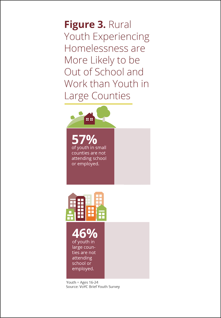
Both are bar charts showing the same data. But B wins, hands down. Why?

Chart A truncates the Y-axis making the difference between large and small counties look bigger than it actually is. Chart B, by contrast, fills in the whole bar and darkens the portion not attending school or employed, thus giving us a sense of the size of both groups (those who are in and out of of school and work) in large and small counties.

Chart B points us to the conclusion it wants us to draw with the title and annotations.

Chart B doesn’t have unnecessary and distracting visual elements such as gridlines and axes labels.

Chart B provides images to further emphasize the contrast between large and small counties.

See other data tips in this series for more information on how to effectively visualize and make good use of your organization's data. 

Bar Chart Hack #4: Radial Charts

3.png

Welcome to Episode 3 of “How to Hack a Bar Chart.” This time we consider two bar chart species that recast the regular bar chart in circular form. They may be eye-catching but be careful how you use them.

1.png

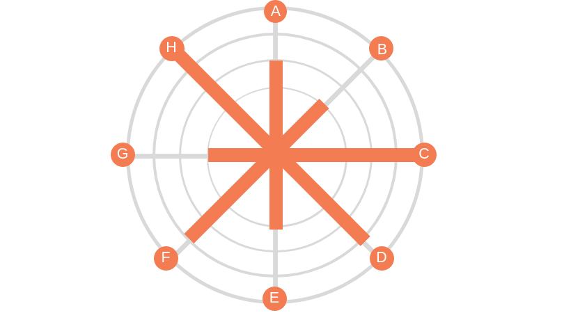
Radial Column Chart: (aka Circular Column Graph or Star Graph). As you can see in the example above, the bars on this chart are plotted on a grid of concentric circles, each representing a value on a scale. Usually, the inner circles represent lower values and values increase as you move outward. Sometimes each bar is further divided using color to show subgroups within each category. Because we are better at assessing length along a common scale, this type of chart isn’t ideal if you want viewers to accurately compare the lengths of each bar. However, these charts are great at showing cyclical patterns. Florence Nightingale used this type of chart (which she called a polar area chart) to show a cyclical pattern in the number and causes of death in the Crimean war.

This work is in the public domain in its country of origin and other countries and areas where the copyright term is the author's life plus 70 years or less.


2.png

Radial Bar Chart (aka Circular Bar Chart) is simply a bar chart in which the bars curve around a circle, like runners on a circular track. As you may recall, races on circular or oval running tracks include staggered starting lines so that runners on the outer (longer) tracks run the same distance as those on the inner (shorter) tracks. But the bars on a radial chart have the same starting line making it difficult to compare lengths. So skip the radial bar chart. Not worth the effort.

See other data tips in this series for more information on how to effectively visualize and make good use of your organization's data. 

Bar Chart Hack #3: The Combo Chart

60-SECOND DATA TIP_3.png

Welcome to another episode in the 60-Second Data Tip series, “How to Hack a Bar Chart.” As we have discussed, bar charts are user-friendly familiar but like all things familiar, they can be boring and easy-to-ignore. This week we consider—in about 30 seconds— how to combine a bar chart with another type of chart to wake us and engage us.

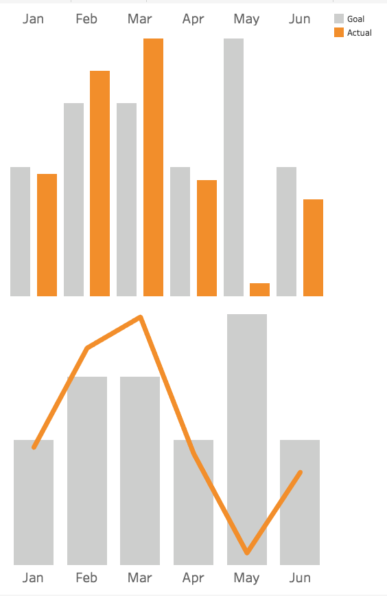
Consider the two charts below. Both show the same data: fundraising goals vs. actual funds raised. The one on top uses bars for both categories. The bottom one uses bars for the goals and lines for actual amounts.

Which works better? I vote for the bottom one. It makes comparing values between two different categories easier because it uses not only different colors to distinguish them but different “encodings” (bars and lines).  The bottom chart gives us a clear view of when we are exceeding or falling short of our goals in any given month.

See other data tips in this series for more information on how to effectively visualize and make good use of your organization's data. 

combo chart image.png

Bar Chart Hack #2: The Icon Bar Chart

60-SECOND DATA TIP_3.png

Welcome to Episode 2 of “How to Hack a Bar Chart.” This mini-series shows you how to take something that works well and that folks understand and move it in a more creative and engaging direction. This time, you meet a close cousin of the bar chart, but this cousin is more interesting than its relative. It has icons.

This is what you should NOT do with icons: make them into bars. Here’s why: bar charts are powerful (if boring) because we can easily compare their lengths. When icons or images are used in place of bars, such comparisons are more difficult to make. See the first example below showing how many clients live in different types of homes. It’s quite a challenge to determine how many more clients live in suburban homes vs. high rises. That’s because the height of the icons are difficult to assess.

2.png

The second example makes it a little easier. But I’d argue that in both examples 1 and 2, the icons make the viewer’s job (comparing lengths) unnecessarily difficult.

3.png

The third example, introduces bars back into the bar chart and thus requires minimal viewer effort.

60-SECOND+DATA+TIP_3+%281%29.jpg

And the fourth further lightens the load by removing the Y-axis and directly labeling the bars and placing the bars closer together.

5.jpg

See other data tips in this series for more information on how to effectively visualize and make good use of your organization's data. 

Image credits: House by ANTON icon from the Noun Project, company by Angriawan Ditya Zulkarnain from the Noun Project, Farm by Ferran Brown from the Noun Project

Bar Chart Hack #1: The Divergent Stacked Bar Chart

60-SECOND DATA TIP.png

Last week I promised to arm you with useful bar chart hacks. The idea is to take something that works well and that folks understand but move it in a more creative and interesting direction.

So this week I give to you: The Divergent Stacked Bar Chart.

Okay, so you know what a bar chart is. And you probably know what a stacked bar chart is, even if you don’t call it that. It uses color to show the subgroups that comprise each bar (or larger group) in the chart like this:

bar.png

Regular Stacked Bar Chart

Now the cool, or divergent, part. It’s easier to show you than to describe it. So take a look:

returnstohomelessness.jpg

Divergent Stacked Bar Chart

As you can see, the the divergent chart aligns each bar around a common midpoint. So it’s much easier to compare, for example, positive and negative values across categories.

Stephanie Evergreen provides directions on making a divergent stacked bar chart in Excel. And here are instructions on creating such a chart in Tableau. Other data viz softwares can make this chart too.

For a much deeper dive into the data viz world’s debate over when and if to use divergent stacked bar charts, check out this article by Daniel Zvinca.

See other data tips in this series for more information on how to effectively visualize and make good use of your organization's data. 


How To Hack A Bar Chart

60-SECOND DATA TIP (1).png

Choosing a chart type is like making breakfast for your kids. Bar charts are Cheerios. You know they will eat it and it’s healthy. Now come the buts:

But #1:  Cheerios is boring and you wish they had a wider palate.

But #2: If you give them a quinoa breakfast bowl, it will go uneaten and you might as well have given them Cheerios.

When it comes to data visualization, Maarten Lambrechts says don't settle for Cheerios. He calls the problem “xenographobia” or the fear of weird charts. And he implores us to boost our viewers’ “graphicacy” by feeding them the equivalents of quinoa breakfast bowls in the chart world.

Here’s what I think. We should neither spook our children at breakfast time nor our funders, board members, and staff throughout the day. But we should try to slowly widen their palates. One way to do that is to take something they know and love and hack it a bit. Throw some nuts on the Cheerios. Use color in novel ways to enliven a bar chart.

Over the next several weeks, I will offer up different ways to hack a bar chart. Stay tuned!

See other data tips in this series for more information on how to effectively visualize and make good use of your organization's data.

A Simple Approach to Using Your Data

60-SECOND DATA TIP (3).png

When you come across discussions of data analysis and evaluation, you might think: ah yes, a worthy pursuit in a perfect world. And, in the wake of this thought, rushes another one: these are complex and technical tasks that my organization has neither time, funds, nor expertise to pursue. And so the thought dissipates, and you return to the tasks at the top of your to-do list.

These 60-Second Data Tips are about demystifying data analysis so that you can evaluate and improve your work easily and regularly. We’ve talked a lot about how to transform data into images (aka data visualizations) to make your data more digestible and useful. The best data visualizations are like mirrors that you can pass by each day to get a quick picture of how you’re looking.

In a nutshell, the purpose of collecting and visualizing data is to address this question: how are we doing? And the first step is to figure out what you mean by “we” and “doing.”

“We” can be all of your participants, visitors, funders, etc. But you should also look at subgroups of these groups, for example those in certain age ranges or those who have been in the program for different lengths of time.

“Doing” can be a measure of any input (e.g. funding or training), any interim outcome (e.g. attendance or survey scores), or any long-term outcome (e.g. employment rates, college attendance, or housing provided.)

And to understand how well you are doing, compare your work to something else: some type of standard or goal, other organizations in your field, or your past performance. A simple line chart showing change over time on a given measure will help you to compare your current performance to the past. A reference line showing a goal will help you to compare your performance to a standard. And, if you can get data from other organizations, you can plot their trends alongside your organization’s.

Answering the question “how are we doing?” from a number of different angles will give you a clear picture and will help you to focus on where change is needed and where to stay the course. Pretty simple.

See other data tips in this series for more information on how to effectively visualize and make good use of your organization's data.

Photo by Jeremy Bishop on Unsplash

Head Versus Gut

60-SECOND DATA TIP.png

Data is head food. But we often make decisions with our gut. And the gut is fueled by emotions.

It’s hard to defy our gut feelings when deciding. That’s because emotions often drive behavior. Evolutionary psychologists believe that emotions evolved to get us to do what has to be done to survive: to avoid predators, secure nutrients, resist infection, mate . . . you get the idea. So when your head says A, but your gut says B, you might feel an urgent need to do B because your survival button has been pushed.

I’m going to venture to guess that most of your decisions, like mine, are not directly related to survival. And when that’s the case, our emotions can lead us astray. In a 2016 article in the Atlantic, Olga Khazan summarizes research which suggests just how far astray. For example, anger may cause us to be trigger-happy and simplify our thinking. Happiness may lead us to make shallow assessments based on looks and likability. And depression may induce dwelling on particular issues.

It’s important to recognize our emotions and what they are telling us, rather than blindly following them. Sure, we can form hypotheses about gut feelings and see if the data support them. But when faced with a pressing decision in the real world, we often have a strong emotion and little data at hand. In these situations, we can ask ourselves: Is there a way to bring some more data to the problem quickly?

  • Perhaps it’s data collected by other people for other purposes. We can look for statistics about organizations similar to ours or about issues that our organization addresses.

  • Perhaps it's a quick and dirty anonymous survey of our staff, asking for their knowledge and opinions relevant to the decision.

The idea is to feed the head with some data and, in the process, temper the pleadings of the gut.

See other data tips in this series for more information on how to effectively visualize and make good use of your organization's data.
The Allure and Danger of Data Stories

60-SECOND DATA TIP (1).png

“Data” and “storytelling” are an item. You see them together all the time lately.

When I first came across the term “data storytelling,” it instantly appealed to me. “Data” suggests credibility, information that has some objective basis. But data, to many of us, is boring. Its meaning is often uncertain or unclear. Or, even worse, it’s both. “Storytelling,” by contrast, suggests clarity, a plot with both excitement and resolution. So, by coupling these two words, we seem to get the best of both worlds. Data lend credibility to stories. Stories lend excitement and clarity to data.

Indeed, that’s the point of data storytelling. As Brent Dykes, a data storytelling evangelist of sorts, noted in a 2016 Forbes article, “Much of the current hiring emphasis has centered on the data preparation and analysis skills—not the ‘last mile’ skills that help convert insights into actions.” That’s where data storytelling comes in, using a combination of narrative, images, and data to make things “clear.”

But let’s step back just a minute. Why are we so drawn to stories? According to Yuval Harari, author of Sapiens: A Brief History of Humankind, the answer is:  survival. Harari maintains that humans require social cooperation to survive and reproduce. And, he suggests that to maintain large social groups (think cities and nations), humans developed stories or “shared myths” such as religions and corporations and legal systems. Shared myths have no basis in objective reality. Reality includes animals, rivers, trees, stuff you can see, hear, and touch. Rather, stories are an imagined reality that governs how we behave. The U.S. Declaration of Independence states: “We hold these truths to be self-evident: that all men are created equal . . . “ Such “truths” may have seemed obvious to the framers, but Harari notes that there is no objective evidence for them in the outside world.  Instead, they are evident based on stories we have told and retold until they have the ring of truth.

So stories (in the past and present) are not about telling the whole truth and nothing but the truth. Instead, they are often about instruction: whom to trust, how to behave, etc. And we should keep this in mind when telling and listening to “data stories.” To serve their purpose, stories leave out a lot of data — particularly data that doesn’t fit the arc of the story. For example, you might not hear about a subgroup whose storyline is quite different from the majority. Or, indeed the story might focus exclusively on a subgroup, ignoring truths about the larger group.

Bottom line: listener beware. A story, whether embellished with data or not, is still just a story. And truth can lie both within and outside of that story.

See other data tips in this series for more information on how to effectively visualize and make good use of your organization's data.

How To Make Data Beautiful

Copy of 60-SECOND DATA TIP.png

Data people meet designer people. Designer people meet data people. You can learn a lot from each other. Today we will focus on what graphic designers know and data analysts should learn.

A couple of tips ago, we talked about how beauty can actually help a viewer more effectively process a visualization of data. If you missed that one, click here. Now we will consider how to make data more beautiful. Luckily, we need not start from scratch. Graphic designers already know a lot about what makes anything that we look at more attractive and engaging. They have written many books and blogs on the subject. But for the purposes of a 60-second data tip, below are some composition basics to consider from Dan Scott. (Also check out his website.) Data presented in a pleasing composition is more likely to engage your viewer.

If you want it in an even smaller nutshell than the list below, here you go: “Perfection is achieved, not when there is nothing more to add, but when there is nothing left to take away.” Sage advice from French writer and poet Antoine de Saint-Exupery.

danscottimage.jpg

See other data tips in this series for more information on how to effectively visualize and make good use of your organization's data.