Head Versus Gut

60-SECOND DATA TIP.png

Data is head food. But we often make decisions with our gut. And the gut is fueled by emotions.

It’s hard to defy our gut feelings when deciding. That’s because emotions often drive behavior. Evolutionary psychologists believe that emotions evolved to get us to do what has to be done to survive: to avoid predators, secure nutrients, resist infection, mate . . . you get the idea. So when your head says A, but your gut says B, you might feel an urgent need to do B because your survival button has been pushed.

I’m going to venture to guess that most of your decisions, like mine, are not directly related to survival. And when that’s the case, our emotions can lead us astray. In a 2016 article in the Atlantic, Olga Khazan summarizes research which suggests just how far astray. For example, anger may cause us to be trigger-happy and simplify our thinking. Happiness may lead us to make shallow assessments based on looks and likability. And depression may induce dwelling on particular issues.

It’s important to recognize our emotions and what they are telling us, rather than blindly following them. Sure, we can form hypotheses about gut feelings and see if the data support them. But when faced with a pressing decision in the real world, we often have a strong emotion and little data at hand. In these situations, we can ask ourselves: Is there a way to bring some more data to the problem quickly?

  • Perhaps it’s data collected by other people for other purposes. We can look for statistics about organizations similar to ours or about issues that our organization addresses.

  • Perhaps it's a quick and dirty anonymous survey of our staff, asking for their knowledge and opinions relevant to the decision.

The idea is to feed the head with some data and, in the process, temper the pleadings of the gut.

See other data tips in this series for more information on how to effectively visualize and make good use of your organization's data.

The Allure and Danger of Data Stories

60-SECOND DATA TIP (1).png

“Data” and “storytelling” are an item. You see them together all the time lately.

When I first came across the term “data storytelling,” it instantly appealed to me. “Data” suggests credibility, information that has some objective basis. But data, to many of us, is boring. Its meaning is often uncertain or unclear. Or, even worse, it’s both. “Storytelling,” by contrast, suggests clarity, a plot with both excitement and resolution. So, by coupling these two words, we seem to get the best of both worlds. Data lend credibility to stories. Stories lend excitement and clarity to data.

Indeed, that’s the point of data storytelling. As Brent Dykes, a data storytelling evangelist of sorts, noted in a 2016 Forbes article, “Much of the current hiring emphasis has centered on the data preparation and analysis skills—not the ‘last mile’ skills that help convert insights into actions.” That’s where data storytelling comes in, using a combination of narrative, images, and data to make things “clear.”

But let’s step back just a minute. Why are we so drawn to stories? According to Yuval Harari, author of Sapiens: A Brief History of Humankind, the answer is:  survival. Harari maintains that humans require social cooperation to survive and reproduce. And, he suggests that to maintain large social groups (think cities and nations), humans developed stories or “shared myths” such as religions and corporations and legal systems. Shared myths have no basis in objective reality. Reality includes animals, rivers, trees, stuff you can see, hear, and touch. Rather, stories are an imagined reality that governs how we behave. The U.S. Declaration of Independence states: “We hold these truths to be self-evident: that all men are created equal . . . “ Such “truths” may have seemed obvious to the framers, but Harari notes that there is no objective evidence for them in the outside world.  Instead, they are evident based on stories we have told and retold until they have the ring of truth.

So stories (in the past and present) are not about telling the whole truth and nothing but the truth. Instead, they are often about instruction: whom to trust, how to behave, etc. And we should keep this in mind when telling and listening to “data stories.” To serve their purpose, stories leave out a lot of data — particularly data that doesn’t fit the arc of the story. For example, you might not hear about a subgroup whose storyline is quite different from the majority. Or, indeed the story might focus exclusively on a subgroup, ignoring truths about the larger group.

Bottom line: listener beware. A story, whether embellished with data or not, is still just a story. And truth can lie both within and outside of that story.

See other data tips in this series for more information on how to effectively visualize and make good use of your organization's data.

How To Make Data Beautiful

Copy of 60-SECOND DATA TIP.png

Data people meet designer people. Designer people meet data people. You can learn a lot from each other. Today we will focus on what graphic designers know and data analysts should learn.

A couple of tips ago, we talked about how beauty can actually help a viewer more effectively process a visualization of data. If you missed that one, click here. Now we will consider how to make data more beautiful. Luckily, we need not start from scratch. Graphic designers already know a lot about what makes anything that we look at more attractive and engaging. They have written many books and blogs on the subject. But for the purposes of a 60-second data tip, below are some composition basics to consider from Dan Scott. (Also check out his website.) Data presented in a pleasing composition is more likely to engage your viewer.

If you want it in an even smaller nutshell than the list below, here you go: “Perfection is achieved, not when there is nothing more to add, but when there is nothing left to take away.” Sage advice from French writer and poet Antoine de Saint-Exupery.

danscottimage.jpg

See other data tips in this series for more information on how to effectively visualize and make good use of your organization's data.

When To Reconsider The Pie Chart

Copy of 60-SECOND DATA TIP.png

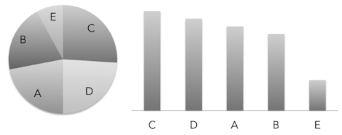
In honor of the upcoming pie-focused holiday, I am revisiting the pie chart. You’ve heard me (and perhaps countless others) disparage the pie chart. Humans, as you may recall, are not so good at distinguishing between different angles. And pie slices involve angles. We are better at assessing length along a common scale. So it’s much easier to figure out which bar in the bar chart below is longest than it is to determine which pie slice is largest.

bar_pie_charts.jpg

Data viz gurus will tell you to only use the pie chart to show part-to-whole relationships. Like this one showing what percentage of all pie lovers love minced meat pie (data source: my imagination).

part_whole.jpg

But I’m going to push back against the data viz orthodoxy a bit. Because I think there are two types of angles we are really good at assessing: the 90-degree angle and the 180-degree angle. Moreover, when we use those angles to divide a circle, we instantly perceive one-quarter and one-half, respectively. Nothing says “a quarter” like a quarter slice of pie. But show me quarter of a tray of brownies? Well, one-fourth is probably not your first thought.

brownie.jpg

Indeed, we are so good at one-half and one-quarter assessments, that we can immediately detect when a slice slightly misses the mark. 

Untitled design (1).jpg

But it’s more difficult when comparing bars. Can you tell which bar below is divided 75/25 and which is 73/27?

bar_percent.jpg

So consider a pie chart (or it’s close cousin the donut chart) when:

  • Showing how the size of one or two groups relates to the whole group

  • Showing group sizes that equal one-half or one-quarter of the whole

  • Showing when a group size is slightly more or less than one-half or one-quarter of the whole

And during Thanksgiving, just consider pie, regardless of the shape and size of the slice.

(I know I promised you more on making data beautiful last week. Stay tuned for that tip in the upcoming weeks.)

See other data tips in this series for more information on how to effectively visualize and make good use of your organization's data.


Photo by Chloe Benko-Prieur on Unsplash

Photo by Alison Marras on Unsplash

Truth and Beauty

Copy of 60-SECOND DATA TIP.png

Real data people care about truth, not beauty. More accurately, they care about evidence that might suggest a truth. So they don’t really embrace truth, just the pursuit of it. However, they don’t have any time for pursuing beauty. Indeed, they may see beauty as deception. A glossy chart or graph is the province of advertisers or advocates seeking to influence rather than to fully inform. As far as the look of displays of information, they advocate for clarity. They may embrace Tufte’s rule of reducing the "data-ink ratio" by removing unnecessary gridlines, labels, and what he calls “chartjunk” (i.e. non-informative elements) to let the data shine through. (For more on Tufte, see Data Tip #11.)

I’m here to argue — both to “real” data people and the rest of us — that we should not discount beauty when visualizing data. Indeed, it might be worth our while to pursue it as we pursue truth. The reason? Well, because we like pretty things. If that sounds like a flimsy explanation,  stick with me a bit longer.

Research evidence suggests that visually attractive things make us happy. (See “The Beauty-Happiness Connection” in The Atlantic for more on this.) And a positive mood, in turn, helps to expand our working memory, which allows us to process more information. So rather than being deceptive window dressing, beauty can actually more deeply engage the viewer in the pursuit of truth.

How can we make data more beautiful? Stay tuned. This is the topic of next week’s data tip.

See other data tips in this series for more information on how to effectively visualize and make good use of your organization's data.

Tap Into The Mighty Flowchart

Copy of 60-SECOND DATA TIP (1).png

Behold the power of the flowchart. They are engaging, easy to digest, and charmingly analog. Don’t forget to use them to:

See other data tips in this series for more information on how to effectively visualize and make good use of your organization's data.
Guinea Pig It

Copy of 60-SECOND DATA TIP.png

Data Viz UX, Episode 5

Today we tackle the fifth and final step in the data viz user experience design process: the beta test. Let’s say you have dutifully followed steps 1-4 by profiling your users, choosing the right data and type of viz, and then refining that viz. Now you have a carefully designed visualization. But does it work on real, live people? Time to find some humans (preferably those similar to your intended users), show them the visualization, and do the following:

  • Ask them what they think the viz is about and what question(s) it is trying to answer.

  • Then ask them to try to answer several specific questions using the viz. These questions should focus on the key information you want users to easily extract from the viz.

  • Take notes. What was difficult for them to figure out? Did they miss any critical aspects of the viz? Did they come to any incorrect conclusions or interesting conclusions you didn’t expect?

Use your notes to revise! Make some aspects of the viz more prominent using color, fade other aspects to the background, add a better title or more captions, remove confusing or distracting elements, even add new data to make clearer comparisons.

See other data tips in this series for more information on how to effectively visualize and make good use of your organization's data.

Photo by Karlijn Prot on Unsplash

Turn A Good Viz Into A Great One

Copy of 60-SECOND DATA TIP (1).png

Data Viz UX, Episode 4

Four weeks ago, I promised to show you how to apply some UX (User Experience) tips to keep your viewers awake, engaged, and wielding data from the data visualizations (aka data viz) you create. So far, I’ve covered the first three steps: knowing your users, choosing the right data, and choosing the right type of visualization (chart, map, graph). The next leg of the journey is to turn a good viz into a great one.

There are lots of suggestions out there about what makes a visualization easy to read and engaging. I’ve culled them down to a list of ten. Each of my “10 Data Viz Suggestments” appears in a previous tip. Please follow the links below to learn more.

  1. Encode Thoughtfully

  2. Consider Your Axes

  3. Highlight What’s Important

  4. Show Order

  5. Clarify With Color

  6. Simplify

  7. Flatten Your Data

  8. Compare Side-By-Side

  9. Zoom In

  10. Stick With A Table (Sometimes)

Stay tuned for the last step in the UX process: testing the viz.

See other data tips in this series for more information on how to effectively visualize and make good use of your organization's data.

Choose The Right Viz

Copy of 60-SECOND DATA TIP.png

Data Viz UX, Episode 3

Three weeks ago, I promised to show you how to apply some UX (User Experience) tips to keep your viewers awake, engaged, and wielding data from the data visualizations (aka data viz) you create. So far, I’ve covered the first two steps: knowing your users and choosing the right data. Today, we tackle choosing the right visualization for your data.

I highly recommend Andrew Abela’s simple decision tree called Chart Suggestions—A Thought-Starter.  It’s based on Gene Zelazny's classic work Saying It With Charts. The decision tree starts with the basic question: “What would you like to show?” And provides four options:

Comparison. You have two or more groups of things or people and you want to see which group is largest/smallest or highest/lowest (or somewhere in between) on some measure. You also may want to see how these groups compare on the measure overtime.

Distribution. You have a bunch of data points (e.g. the ages of participants in a program or test scores of students in a class) and you want to know how spread out or bunched up they are. Are most of the ages, test scores (whatever) near the average? Or is there a wide range? Are there some extreme outliers?

Composition. You want to understand who or what makes up a larger group such as how many of the participants in a program are in different age brackets or how many have been in the program for different lengths of time.

Relationship. You want to know if one thing is related to another, either at one point in time or overtime. Does more participation in a mental health program correlate with less distress over time? Do those with lower incomes have higher heart rates?

Once you answer this basic question, the decision tree helps you to choose a specific chart based on the type of data you have. Abela’s chart chooser includes the types of charts you are most likely to select. But there are more rare species out there. To learn more about the wide array of ways to visualize data, check out the Data Visualisation Catalog.

However, I will leave you with a word of caution. And that word is: “Xenographphobia” or fear of weird charts. It’s a thing. And you should be aware of it. Although we might like the look of sexy charts, we don’t usually have the time or patience to figure them out. So in the interest of creating a positive and productive UX, stick with the charts folks already know how to read or are self-explanatory.

Stay tuned for the other steps in the UX process: refining the viz and testing it.

See other data tips in this series for more information on how to effectively visualize and make good use of your organization's data.


Column chart with line chart by HLD, Line Graph by Creative Stall, Pie Chart by frederick allen, Radar Chart by Agus Purwant, and sankey diagram by Rflor (from the Noun Project)

Choose The Right Data

Copy of 60-SECOND DATA TIP.png

Data Viz UX, Episode 3

Too often we start with the data rather than the questions. It’s sort of like starting dinner with the ingredients you happen to have in the fridge (frozen pizza, grape juice, and hot sauce) rather than asking: what meal would be most healthy and satisfying and then buying the right ingredients for that meal.

Two weeks ago, I promised to show you how to apply some UX (User Experience) tips to keep your viewers awake, engaged, and wielding data from the data visualizations (aka data viz) you create. And last week I shared the first step, which is knowing your users. This week’s tip is about the second step: choosing the right data.

Ideally, you don’t start at the fridge when making dinner. And ideally, you don’t start with data when planning and evaluating your work. Instead, you decide what you need to know to improve what you do. Let’s say you run a tutoring program. You rely on talented tutors. So, you might ask: who make the best tutors? Okay, you are off to a great start. Now do the following:

Refine The Question. What do you mean by “tutors”? Only tutors in your own program or more generally? Do you want to look at only tutors with a significant degree of experience or also include newbies? What do you mean by “best”? Those who persist in the program for at least a year? Those whose students show academic improvement? Those who form close relationships with their students? After some refining, you might end up with a question like this: “Among our past tutors (2000-2018), who has persisted (>=6 months) in the program and had students whose GPA increased (>=1 point)?”

Identify Important Subgroups. Perhaps you want to see if certain types of tutors works best with certain types of students. Then you are going to need data on both tutor characteristics (such as ethnicity, gender, profession) and student characteristics.

Share Your Strategy. At this point, it’s a good idea to check in with the folks who are going to use the data to make decisions. Share with them how you have refined the question and the subgroups you intend to look at. Get their feedback and tweak your strategy.

Find the Right Data. Okay, now you can consider data because now you know what data you need. You might consider data in your own databases and data from other sources. Before settling on any data sources, always ask: Is the data credible? Is it complete? Is the data clean (e.g. have duplicates and data entry errors been removed)? Is the data connected (e.g. if you are using multiple data sources, is there a way to connect them using unique identifiers for individuals or groups)?

Turns out that if you ask good, clear questions, you get better answers — answers you can use. Stay tuned for the other steps in the UX process: choosing the right viz, refining the viz, and testing it.

And, if you have a moment, check out this great New York Times article which shows how our view of the economy depends on what questions we ask and what data we choose. (Turns out G.D.P. is kind of like the hot sauce in our fridge. We use it because we have it. But we’d be better off with different data.)

See other data tips in this series for more information on how to effectively visualize and make good use of your organization's data.

Know Your Data Viz User

Copy of 60-SECOND DATA TIP.png

Data Viz UX, Episode 2

UX is a hip (if inexact) acronym for user experience. As I explained in last week’s data tip, it’s about how user-friendly a product or service is. In that tip, I promised to show you how to apply some UX tips to keep your viewers awake, engaged, and wielding data from the data visualizations (aka data viz) you create. It involves knowing your users, choosing the right data, choosing the right viz, refining the viz, and testing it.

Today’s topic: knowing your users. I will offer brief tips on the other topics in the weeks to come. To know your data viz user, answer the following questions:

Who are they? Your intended user can range from just yourself to all living sentient beings. Answer this question as exactly as possible.

What do they want to know? What decisions are they looking to make? Are they monolithic or diverse in their interests?

How engaged are they? Do they have a deep or casual interest in the topic? Or somewhere in between?

What do they already know? Consider how savvy they are both about the topic and about data analysis. While you don’t want to assume too much knowledge, you don’t want to patronize either.

With a clear picture of your intended users in mind, you are ready to consider what data to present. Stay tuned. That’s next week’s tip.

See other data tips in this series for more information on how to effectively visualize and make good use of your organization's data.
How to make a good data experience for your funders, board, and staff

Copy of 60-SECOND DATA TIP (3).png

Data Viz UX, Episode 1

“UX” is one of those terms that pretty much everyone has heard. But those of us outside the tech or corporate worlds might politely nod at its mention and then wonder, “Wait, what's UX again?”

It means “user experience.” (No, experience does not begin with an X. Just another way in which the tech world is cooler than the rest of us.) And what exactly is user experience? It’s the experience we have with any product or service. The experience you had assembling 482 parts to make an Ikea dresser? Bad UX. The experience you had buying all your holiday gifts online and avoiding the mall? Good UX.

Data visualizations come with their own UX. There are some pretty sexy charts out there that dazzle at first sight but ultimately frustrate when you try to extract meaning from them.

So how can you keep your funders, board, and staff awake, engaged, and wielding data from the visualizations (aka vizes) you create? It involves knowing your users, choosing the right data, choosing the right viz, refining the viz, and testing it.

That’s way more than I can do in 60 seconds. But I promise to feed it to you in 60-second bites, starting next week. Until then, notice your own experiences trying to extract meaning from charts, maps, and graphs. What goes down easily? What makes you choke?

See other data tips in this series for more information on how to effectively visualize and make good use of your organization's data.

Zoom In

Copy of 60-SECOND DATA TIP (1).png

Imagine a photo of a flower. It’s a yellow daisy. Turn the page, and there’s the daisy again, on a black lapel. Turn the page once more, and you see a teenage boy wearing a dark suit with a daisy on his lapel standing in front of split-level ranch house. Now imagine that the carnation along a roadside surrounded by trash or in a bucket on a flower truck.

Someone once said (and then a lot of others repeated): “Context is everything.”

So when presenting a series of charts, maps, or graphs, give your viewer some context. Provide the wide view first (the ranch house, the roadside, the flower truck) and then zoom in on the details (the daisy).

Here's an example. It's a series of charts showing the prevalence of chronic disease among adults (based on data from the Center for Disease Control).

Begin With The Wide View: The first is a map shows how prevalent all chronic diseases are across the U.S.

map.jpeg

Then Zoom In: The second is a parallel coordinates chart in which each line represents one of the 50 states. It provides a more specific view of the prevalence of particular types of diseases in particular states.

pc.jpeg

Now Zoom In Further: Finally, the interactive dashboard, the third view, allows the viewer to drill even further into the data and explore how various risk and protective factors (diet, smoking) relate to the prevalence of different diseases.

explore.jpeg

See other data tips in this series for more information on how to effectively visualize and make good use of your organization's data.

Photo by Cam Morin on Unsplash


How To Make Your Data Digestible

Copy of 60-SECOND DATA TIP.png

I’ve said it before. We are much better at digesting visual information—position, size, color, hue—than we are at digesting words and numbers. Words and numbers, which only appeared within the last few thousand years, require our visual system to scan individual characters one at a time and piece them together to create meaning. By contrast, we can process visual cues simultaneously and very quickly. We don’t read pictures from left to right and from top to bottom. We process the elements of a picture in parallel. Very efficient.

Once you decide to represent your data visually, you need to decide how. What visual cues are right for the job?  Luckily, there’s some research to point you in the right direction. Cleveland and McGill (and others) have studied what types of encodings or “channels” people are able to decode most accurately and ranked them, as shown above.

As you can see, we are great at assessing position along a common scale and pretty good at length, even without a common scale. This is one reason why bar charts are so powerful. We are less good at assessing something like color intensity. While we can see that one color is darker than the other, it’s hard to determine if it’s twice as dark.

So if you need your viewers to make more accurate assessments, use visual encodings toward the right end of the spectrum, but other encodings, toward  the left end, are fine for more general assessments.

See other data tips in this series for more information on how to effectively visualize and make good use of your organization's data.

How To See What's Invisible In Your Organization

Copy of 60-SECOND DATA TIP (1).png

The words we say affect what we see. This is an amazing phenomenon that escapes most of us. But once you know it, you have a powerful tool for change.

Organizations tend to talk in a certain language. We speak to our colleagues, clients, funders, and board members using particular terms. Anyone new to an organization learns this quickly. We also have common understandings about the needs we are addressing, the services we provide, and the people we serve. This common language helps us communicate efficiently. Unless we are speaking with someone far removed from our work (usually at cocktail parties), we can speak in this sort of code to others without long explanations of terms.

The problem with our common languages is that they may obscure what we see. Various studies suggest just how powerfully language affects perception. For example, the Himba tribe in Namibia has no word for blue. In a study, tribe members who were shown a circle with 11 green squares and one blue struggled to distinguish between the blue square and the green ones. However, the Himba have more words for types of green than exist in English. So, in the same study, they could distinguish between squares of slightly different shades of green much better than we can. To see the colored squares, check out Kevin Loria’s fascinating article in Business Insider. Other studies suggest that language can affect our understanding of space, time, causality, and our relationships with others. (See Can Language Influence Our Perception of Reality? by Mitch Moxley in Slate.) 

We can’t turn a language switch and suddenly see our organizations differently. But we can be aware of our language and ask questions about the terms we use and the assumptions we make. Data can make the invisible visible to us if we ask the right questions.  For example, we might have a short hand profile of the typical student who is persistently truant. We might assume that truant students struggle with academics. But is this true? Even if they have, in general, lower grades than non-truant students, their grades may be the result rather than the cause of their truancy. What do the numbers show?

None of us have 20/20 vision about what we do, no matter how confident we feel. But if we apply data carefully, we can shed light on more effective paths forward.

See other data tips in this series for more information on how to effectively visualize and make good use of your organization's data.

Photo by Evan Kirby on Unsplash

When You Should NOT Visualize Your Data

Copy of 60-SECOND DATA TIP (1).png

Data viz is getting a lot of hype these days. And, if you have read any of my data tips, you know I’m on the bandwagon. But even a devotee like myself can see that visualizing data is not always best. There are at least two circumstances when you are better off with a drab spreadsheet:

1) You have an already-engaged but diverse audience.

These are folks who are highly motivated to access certain data and won’t be annoyed by having to find that data on a table. Tables use paper or screen real estate efficiently. You can fit a lot of rows and columns in a small space allowing users with different interests to find data in a single table.

2) You have many units of measure.

For example, you want to show the height, weight, location, and satisfaction level of participants in a healthy eating program. This data involves four different units of measure: inches, pounds, latitude/longitude, and survey ratings. Such complexity is difficult to represent on a single visualization but you can do so in a single table quite easily.

See other data tips in this series for more information on how to effectively visualize and make good use of your organization's data.

How To Dress Your Data In The Right Colors

Copy of 60-SECOND DATA TIP.png

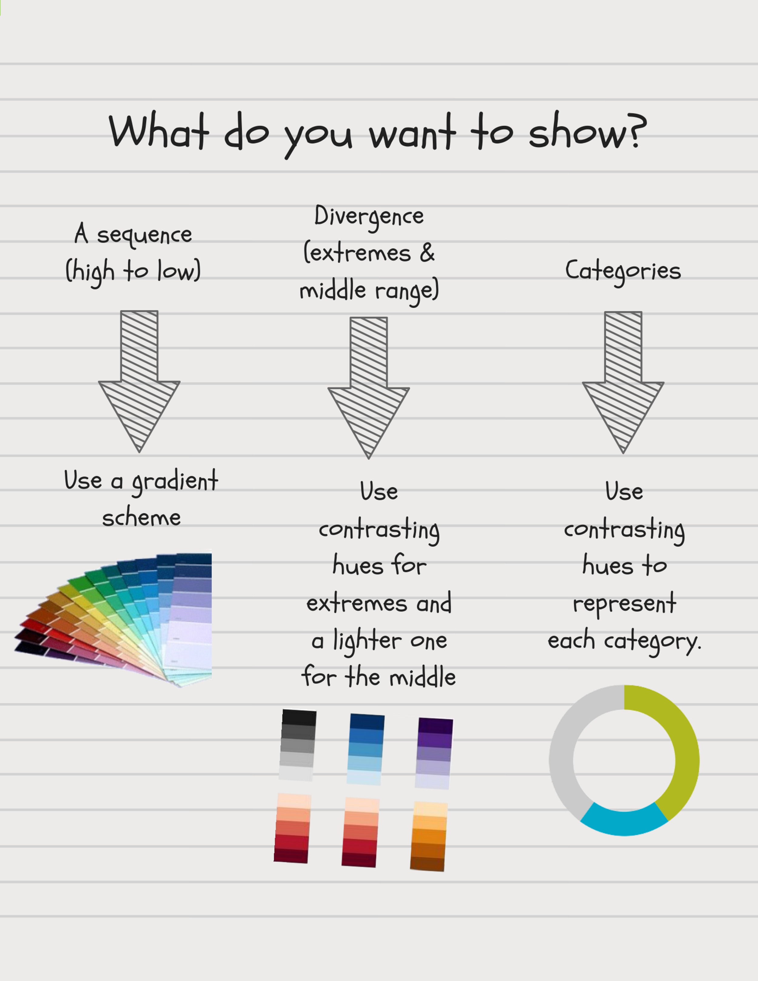
Bad color decisions can break an otherwise effective data visualization. In Data Tip #14, I gave you some color dos and don'ts. Today, I offer a simple flow chart to help you choose the right type of color scheme for your viz, based on what you want to show.

Choosing Colors.png

See other data tips in this series for more information on how to effectively visualize and make good use of your organization's data.

Why Your Organization Should Care About Data Deviants

60-SECOND DATA TIP #8.png

“Standard deviation” sounds like an oxymoron. Any high school student knows that you can’t be both standard and a deviant at the same time. And any high school stats class will clarify, in the first week or so, what standard deviations are really about. And most high school students will hold that knowledge for a semester and then delete it to make space for more valuable knowledge.

But I come to you today to re-enter the standard deviation onto your personal hard drive. Because it is valuable even to those of us who are not statisticians or researchers. It’s a great tool for anyone trying to understand what is going in organizations trying to up their impact.

60-Second Data Tip #13 addressed what averages obscure. The answer was: how spread out your data points are around the average. The standard deviation tells you just how spread out they are. You might think of the average as the “standard” (the person at your high school who was average in every way). And you might think of the rest of the data points as “deviants” with some deviating from average just a bit (perhaps a kid with a nose ring who was otherwise sporty) and others deviating a lot (full-on Goth).

Here’s a more nonprofity example. If the average wage of participants in a job-training program is $19 per hour, this might obscure the fact that a few participants are earning over $30 per hour and the majority are earning below $10 per hour.

A standard deviation close to 0 indicates that the data points tend to be very close to the mean. As standard deviation values climb,  data point values are farther away from the mean, on average. So a job-training program aiming for an average wage of $17 per hour among participants might want to see a pretty low standard deviation in wages to feel confident that the large majority has reached the goal.

I won’t scare you with the formula for calculating the standard deviation. You can keep that off your hard drive. Any spreadsheet program will calculate it for you. For example, for data in rows 1-350 in column A on an Excel spreadsheet, just use enter “=STDEV(A1:A350)” to get it.

See other data tips in this series for more information on how to effectively visualize and make good use of your organization's data.

Photos by Ben Weber and Alex Iby on Unsplash

How To Decide With Data

60-SECOND DATA TIP #8 (1).png

This week’s tip is short and extra sweet.

There is data. And then there is real life. Sometimes there seems to be little relationship between the two. Data seems too rigid or too limited or too boring to capture the brilliant vagaries of the real world. We have a different tool for the vagaries. We call it intuition.

I’m not knocking intuition. But our expectations can weaken our intuition. (See last week’s tip for more on this.) The solution is to bring some data to your decision-making game. And how best to bring it? By visualizing it.

This sounds more complex than it is. Imagine you are not at your computer or in a meeting but instead ordering dessert. The dessert menu is long with lots of text. You are a bit drowsy from digesting your dinner. And you are not sure what you want. So you’ve got data (the menu) and you’ve got a decision to make. And you’re tired. Not a bad analogy to a work setting.

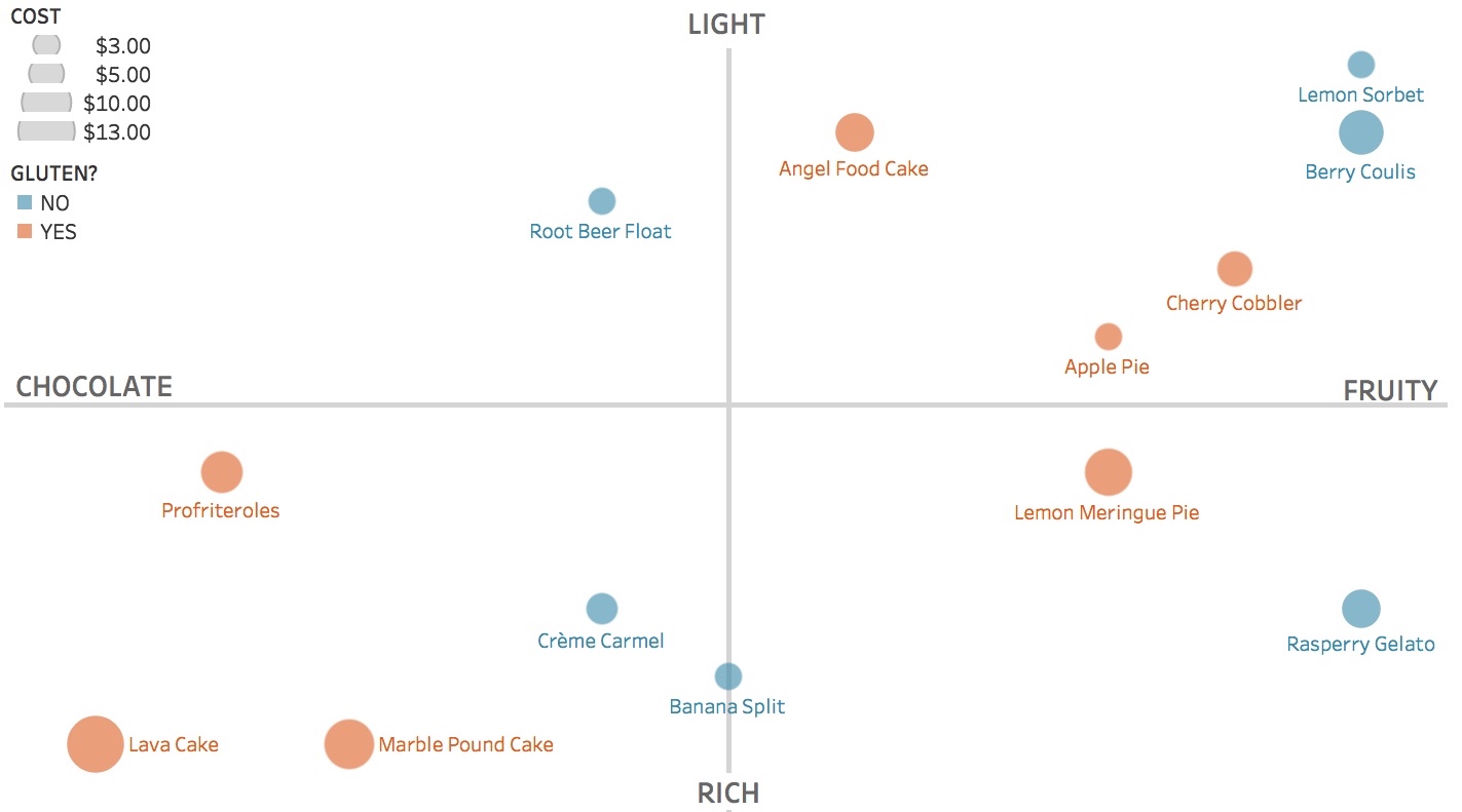
If you could visualize the data to aid your dessert decision, what would you do? You might first decide on the salient decision criteria. For example: richness, flavor, price, and gluten content. Then you might place, size, and color the data to allow easy comparisons among your options. See the quadrants chart below. Want a light, fruity, gluten-free dessert at a low price point? Lemon sorbet is clearly your best bet.

Too often our workplaces and restaurants hinder the journey from data to action. But there are better (and sweeter) ways.

DESSERT.jpeg

See other data tips in this series for more information on how to effectively visualize and make good use of your organization's data.


Photos by Jennifer PallianHenry Be and Brenda Godinez on Unsplash

What Data Do You Absorb (And What Eludes You)?

60-SECOND DATA TIP #8.png

There is a certain breed of nonprofit staff who roll their eyes at the mention of “evidence-based practices” or “KPIs” or other data jargon. I myself have experienced mild nausea when listening to someone try to quantify what seems unquantifiable: what a child feels after learning to paint or what a homeless adult feels upon acquiring an apartment.

But I’m here to implore, beseech, even beg you to not write off data. Why? Because of how our brains work.
What we perceive is based not just on what we actually observe but also on what we expect to observe. This is how it works. First, the brain evaluates which of a variety of probable events are actually occurring. Then it uses this information, along with signals from the outside world (aka data), to decide what it is perceiving.  And here's the surprising news: there are far more signals coming from within the brain that affect our perception than data signals from the outside.

These inner brain signals or expectations can distort our understanding of a situation. Thus data are quite important to confirming or negating our expectations.  But you have to pay attention to data to make that happen. And that’s where things get tricky.

The esteemed philosopher and psychologist, William James, noted in The Principles of Psychology (1890): “Millions of items of the outward order are present to my senses which never properly enter into my experience. Why? Because they have no interest for me. My experience is what I agree to attend to. Only those items which I notice shape my mind .” 

So how can we see what we are not attending to, the stuff that eludes us? The answer is to think like a scientist. Rather than operating on assumption or instinct, form hypotheses about how your programs and services work and then gather data to test them. You might be surprised.

(And, if you missed it, check out last week's data tip on how data visualization can help correct misperceptions.)

See other data tips in this series for more information on how to effectively visualize and make good use of your organization's data.