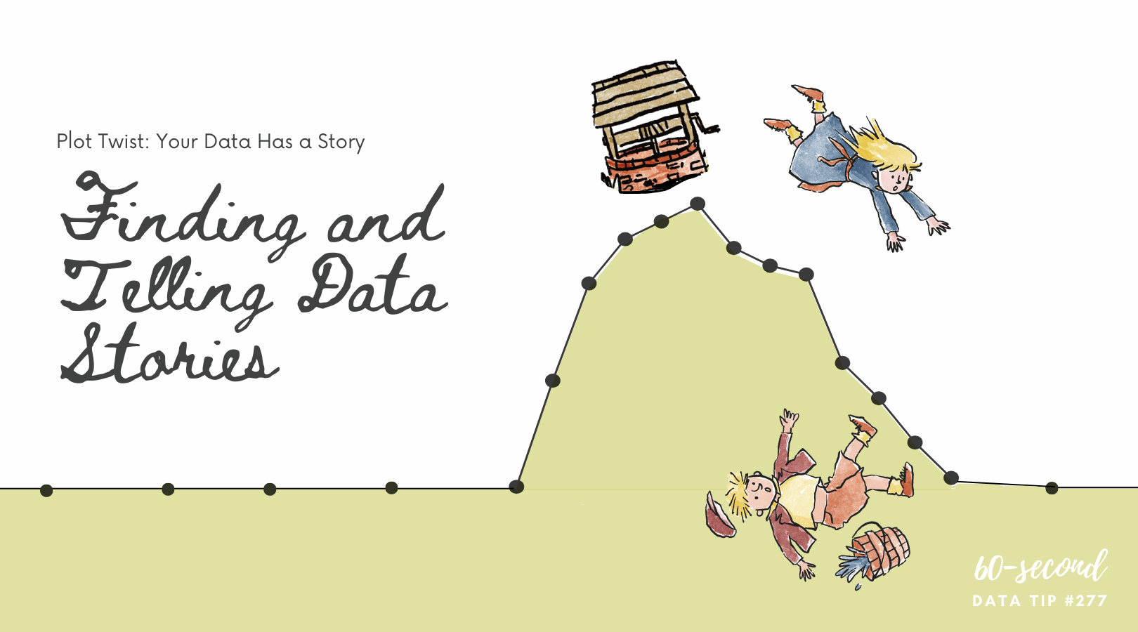
Data Viz UX, Episode 3
Too often we start with the data rather than the questions. It’s sort of like starting dinner with the ingredients you happen to have in the fridge (frozen pizza, grape juice, and hot sauce) rather than asking: what meal would be most healthy and satisfying and then buying the right ingredients for that meal.
Two weeks ago, I promised to show you how to apply some UX (User Experience) tips to keep your viewers awake, engaged, and wielding data from the data visualizations (aka data viz) you create. And last week I shared the first step, which is knowing your users. This week’s tip is about the second step: choosing the right data.
Ideally, you don’t start at the fridge when making dinner. And ideally, you don’t start with data when planning and evaluating your work. Instead, you decide what you need to know to improve what you do. Let’s say you run a tutoring program. You rely on talented tutors. So, you might ask: who make the best tutors? Okay, you are off to a great start. Now do the following:
Refine The Question. What do you mean by “tutors”? Only tutors in your own program or more generally? Do you want to look at only tutors with a significant degree of experience or also include newbies? What do you mean by “best”? Those who persist in the program for at least a year? Those whose students show academic improvement? Those who form close relationships with their students? After some refining, you might end up with a question like this: “Among our past tutors (2000-2018), who has persisted (>=6 months) in the program and had students whose GPA increased (>=1 point)?”
Identify Important Subgroups. Perhaps you want to see if certain types of tutors works best with certain types of students. Then you are going to need data on both tutor characteristics (such as ethnicity, gender, profession) and student characteristics.
Share Your Strategy. At this point, it’s a good idea to check in with the folks who are going to use the data to make decisions. Share with them how you have refined the question and the subgroups you intend to look at. Get their feedback and tweak your strategy.
Find the Right Data. Okay, now you can consider data because now you know what data you need. You might consider data in your own databases and data from other sources. Before settling on any data sources, always ask: Is the data credible? Is it complete? Is the data clean (e.g. have duplicates and data entry errors been removed)? Is the data connected (e.g. if you are using multiple data sources, is there a way to connect them using unique identifiers for individuals or groups)?
Turns out that if you ask good, clear questions, you get better answers — answers you can use. Stay tuned for the other steps in the UX process: choosing the right viz, refining the viz, and testing it.
And, if you have a moment, check out this great New York Times article which shows how our view of the economy depends on what questions we ask and what data we choose. (Turns out G.D.P. is kind of like the hot sauce in our fridge. We use it because we have it. But we’d be better off with different data.)
See other data tips in this series for more information on how to effectively visualize and make good use of your organization's data.