Surveys provide answers to many nonprofit questions. How do participants like this program? What are barriers to enrollment? What types of services do community members lack and need?
It’s easy enough to create a survey on Survey Monkey or the like. It's harder to get an adequate number of responses. And even when you do, the respondents might not fairly represent the larger group you want to know about. But let’s say you get past this hurdle. There’s still a major hurdle ahead of you: extracting meaning from your data.
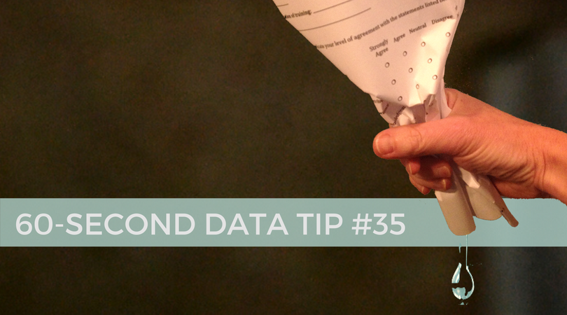
Surveys include different types of questions. Perhaps the most common one is the Likert scale question. You have seen them a million times. Respondents are asked to indicate how much they agree or disagree with a particular statement using a five to seven point scale.
Let’s say you want to know participants’ feelings about a program. Your Likert scale statements might be; “I feel that I can ask the instructor for help when I’m confused” or “I feel comfortable interacting with the other participants in the program.” Survey Monkey will give you each respondent’s rating of each statement and will also give you the average rating. What meaning can you extract from these numbers?
Many organizations will use just the averages to determine where they are doing well and where they need to worker harder or differently. But there is so much more information in those numbers than averages can tell you, including:
The extremes: Averages can’t tell you what were the lowest or highest ratings on any given statement.
What most respondents said: Averages also can’t tell you if the average is three because most people responded with a “3” or because half responded with a 5 and half responded with a 1.
What subgroups think and feel: Even though the overall average might be high, the average might be low for some subgroups within your group of respondents. Perhaps respondents from a certain neighborhood, for example, had very different opinions than the group overall.
You can extract and show this information using data visualization tools like Tableau that allow you to interact with your data. The viz below shows the range of responses to each survey statement and the proportion of responses for each rating. Moreover, the interactive version allows you to “drill down” into the data an see if whole group results hold for subgroups.
If you are going to go to the trouble of conducting a survey, make sure to squeeze all of the information you can from the data you collect.

See other data tips in this series for more information on how to effectively visualize and make good use of your organization's data.