A Simple Approach to Using Your Data

60-SECOND DATA TIP (3).png

When you come across discussions of data analysis and evaluation, you might think: ah yes, a worthy pursuit in a perfect world. And, in the wake of this thought, rushes another one: these are complex and technical tasks that my organization has neither time, funds, nor expertise to pursue. And so the thought dissipates, and you return to the tasks at the top of your to-do list.

These 60-Second Data Tips are about demystifying data analysis so that you can evaluate and improve your work easily and regularly. We’ve talked a lot about how to transform data into images (aka data visualizations) to make your data more digestible and useful. The best data visualizations are like mirrors that you can pass by each day to get a quick picture of how you’re looking.

In a nutshell, the purpose of collecting and visualizing data is to address this question: how are we doing? And the first step is to figure out what you mean by “we” and “doing.”

“We” can be all of your participants, visitors, funders, etc. But you should also look at subgroups of these groups, for example those in certain age ranges or those who have been in the program for different lengths of time.

“Doing” can be a measure of any input (e.g. funding or training), any interim outcome (e.g. attendance or survey scores), or any long-term outcome (e.g. employment rates, college attendance, or housing provided.)

And to understand how well you are doing, compare your work to something else: some type of standard or goal, other organizations in your field, or your past performance. A simple line chart showing change over time on a given measure will help you to compare your current performance to the past. A reference line showing a goal will help you to compare your performance to a standard. And, if you can get data from other organizations, you can plot their trends alongside your organization’s.

Answering the question “how are we doing?” from a number of different angles will give you a clear picture and will help you to focus on where change is needed and where to stay the course. Pretty simple.

See other data tips in this series for more information on how to effectively visualize and make good use of your organization's data.

Photo by Jeremy Bishop on Unsplash

Head Versus Gut

60-SECOND DATA TIP.png

Data is head food. But we often make decisions with our gut. And the gut is fueled by emotions.

It’s hard to defy our gut feelings when deciding. That’s because emotions often drive behavior. Evolutionary psychologists believe that emotions evolved to get us to do what has to be done to survive: to avoid predators, secure nutrients, resist infection, mate . . . you get the idea. So when your head says A, but your gut says B, you might feel an urgent need to do B because your survival button has been pushed.

I’m going to venture to guess that most of your decisions, like mine, are not directly related to survival. And when that’s the case, our emotions can lead us astray. In a 2016 article in the Atlantic, Olga Khazan summarizes research which suggests just how far astray. For example, anger may cause us to be trigger-happy and simplify our thinking. Happiness may lead us to make shallow assessments based on looks and likability. And depression may induce dwelling on particular issues.

It’s important to recognize our emotions and what they are telling us, rather than blindly following them. Sure, we can form hypotheses about gut feelings and see if the data support them. But when faced with a pressing decision in the real world, we often have a strong emotion and little data at hand. In these situations, we can ask ourselves: Is there a way to bring some more data to the problem quickly?

  • Perhaps it’s data collected by other people for other purposes. We can look for statistics about organizations similar to ours or about issues that our organization addresses.

  • Perhaps it's a quick and dirty anonymous survey of our staff, asking for their knowledge and opinions relevant to the decision.

The idea is to feed the head with some data and, in the process, temper the pleadings of the gut.

See other data tips in this series for more information on how to effectively visualize and make good use of your organization's data.

How To See What's Invisible In Your Organization

Copy of 60-SECOND DATA TIP (1).png

The words we say affect what we see. This is an amazing phenomenon that escapes most of us. But once you know it, you have a powerful tool for change.

Organizations tend to talk in a certain language. We speak to our colleagues, clients, funders, and board members using particular terms. Anyone new to an organization learns this quickly. We also have common understandings about the needs we are addressing, the services we provide, and the people we serve. This common language helps us communicate efficiently. Unless we are speaking with someone far removed from our work (usually at cocktail parties), we can speak in this sort of code to others without long explanations of terms.

The problem with our common languages is that they may obscure what we see. Various studies suggest just how powerfully language affects perception. For example, the Himba tribe in Namibia has no word for blue. In a study, tribe members who were shown a circle with 11 green squares and one blue struggled to distinguish between the blue square and the green ones. However, the Himba have more words for types of green than exist in English. So, in the same study, they could distinguish between squares of slightly different shades of green much better than we can. To see the colored squares, check out Kevin Loria’s fascinating article in Business Insider. Other studies suggest that language can affect our understanding of space, time, causality, and our relationships with others. (See Can Language Influence Our Perception of Reality? by Mitch Moxley in Slate.) 

We can’t turn a language switch and suddenly see our organizations differently. But we can be aware of our language and ask questions about the terms we use and the assumptions we make. Data can make the invisible visible to us if we ask the right questions.  For example, we might have a short hand profile of the typical student who is persistently truant. We might assume that truant students struggle with academics. But is this true? Even if they have, in general, lower grades than non-truant students, their grades may be the result rather than the cause of their truancy. What do the numbers show?

None of us have 20/20 vision about what we do, no matter how confident we feel. But if we apply data carefully, we can shed light on more effective paths forward.

See other data tips in this series for more information on how to effectively visualize and make good use of your organization's data.

Photo by Evan Kirby on Unsplash

How To Decide With Data

60-SECOND DATA TIP #8 (1).png

This week’s tip is short and extra sweet.

There is data. And then there is real life. Sometimes there seems to be little relationship between the two. Data seems too rigid or too limited or too boring to capture the brilliant vagaries of the real world. We have a different tool for the vagaries. We call it intuition.

I’m not knocking intuition. But our expectations can weaken our intuition. (See last week’s tip for more on this.) The solution is to bring some data to your decision-making game. And how best to bring it? By visualizing it.

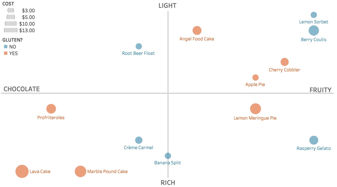
This sounds more complex than it is. Imagine you are not at your computer or in a meeting but instead ordering dessert. The dessert menu is long with lots of text. You are a bit drowsy from digesting your dinner. And you are not sure what you want. So you’ve got data (the menu) and you’ve got a decision to make. And you’re tired. Not a bad analogy to a work setting.

If you could visualize the data to aid your dessert decision, what would you do? You might first decide on the salient decision criteria. For example: richness, flavor, price, and gluten content. Then you might place, size, and color the data to allow easy comparisons among your options. See the quadrants chart below. Want a light, fruity, gluten-free dessert at a low price point? Lemon sorbet is clearly your best bet.

Too often our workplaces and restaurants hinder the journey from data to action. But there are better (and sweeter) ways.

DESSERT.jpeg

See other data tips in this series for more information on how to effectively visualize and make good use of your organization's data.


Photos by Jennifer PallianHenry Be and Brenda Godinez on Unsplash

Can Data Viz Unite Us?

60-SECOND DATA TIP #8 (2).png

Progress in organizations — and in all of human history — starts with the concession that we might be wrong. As Yuval Noah Harari suggests in Sapiens: A Brief History of Humankind, the scientific revolution was the point in history when “humankind admits its ignorance and (as a result) begins to acquire unprecedented power.” 

That’s what I said in Data Tip #23, and I’m sticking with it. However, it’s way easier to say than to practice. Particularly in these partisan times.

I recently soaked in a series of well-executed yet oh-so-depressing data vizes in this article from the Pew Research Center. You’ve seen these types of charts before. The liberals are a blue iceberg, the conservatives a red iceberg, and they are drifting apart at an alarming rate. “We” seem to be living in a different reality than “them.”

Shortly after reading the Pew article, I climbed out of my dark hole long enough to happen upon this article from the Washington Post. It describes a series of experiments in which data displayed in charts significantly reduced the misperceptions of subjects, both liberal and conservative, on important poltical issues. And, get this, charts (bar graphs, line graphs) had much more impact than the same information presented in text — perhaps because we process visual information much more efficiently than we process words and numbers.

Okay, it was just a few experiments. But still. Let’s not totally curb our enthusiasm. This is promising. This suggests that there MIGHT be a way to bring all of us back to a somewhat similar reality. And data visualization might help get us there.

In the meantime, when different factions of our boards do not agree or when we are looking for a way to convince a reticent funder to support our work, we should remember the power of a humble chart, map, or graph.

See other data tips in this series for more information on how to effectively visualize and make good use of your organization's data.


Photo by Kristina Litvjak on Unsplash

Why You Should Reconsider Your Goals

60-SECOND DATA TIP #8.png

Data has no inherent meaning. It only gains significance when put in context.  Say the average response on a survey of participants in a program is 5. You need all kinds of context to understand this data point. What were the survey questions? What scale did respondents use in responding to questions: 1-5? 1-10? Do higher numbers represent a positive or negative outcome? How does this result compare to past results? How does this result compare to the organization’s goals?

Indeed we often compare current and past data to our goals. Goals drive how we go about our work. The universe seems to love goals and rarely questions the ability of goals to move us forward. Yet, research suggests that goals are not all they are cracked up to be. There are at least two major problems with goals:

1) When we set big goals (aka “stretch goals”) and don’t meet them, they can reduce our motivation, the opposite of their intended effect.

2) Goals can narrow our focus, making us blind to other important issues and even prone to unethical behavior in pursuit of goals.

The solution? Focus on process. Involve everyone in the organization in determining the most effective and efficient steps to accomplish broader goals. These steps then become what Karl Weick calls “small wins” or manageable interim goals. And what if these interim goals don’t seem to be moving you in the right direction? Be flexible and revisit your plan. As Confucius supposedly said, “When it is obvious that the goals cannot be reached, don't adjust the goals, adjust the action steps.”

For more on the potential downside of goals, see this article in Psychology Today.

See other data tips in this series for more information on how to effectively visualize and make good use of your organization's data.


How To Change The Behavior of Your Participants And Donors With Data

Sometimes it's best to harness the power of the crowd rather than resist it.

Sometimes it's best to harness the power of the crowd rather than resist it.

Sometimes we do the right thing not because it’s the right thing but because (wait for it) other people are doing it. And this doesn’t only apply to middle schoolers. It’s all of us. Sociologists call it “social influence,” and it can be a powerful force for good or ill. What does this have to do with data? Well, to follow the lead of others, we must first know what they are doing. And that’s where data comes in.

We all know that teens' friends' drinking habits can affect their own. So a common approach to reducing substance abuse among adolescents is to encourage them to resist the influence of peers. Yet, research evidence suggests that rather than attempting to tamp down the power of social influence, we would do better to harness it. Consider an intervention called “normative education” designed to reduce substance abuse among students. Rather than subjecting young people to long lectures or counseling, this approach is simply about sharing data. Students are shown data about the prevalence of drinking among their peers, which is usually lower than kids expect. This information, in turn, reduces substance abuse among all students in a school, more so than does resistance training. (Check out the research evidence to learn more.)

So if we want to change the behavior of our clients, participants, visitors, or donors, we should consider making data visible about what others, like them, are doing. Take the case of donors. Over a century ago, two YMCA executives developed a potent fundraising strategy that relied on the social influence. As told by Steve MacLaughlin in Data Drive Nonprofits, the strategy included time-bound fundraising campaigns that focused on sharing information with prospective donors about major gifts already made by prominent others. They also published campaign clocks and thermometers to keep the public apprised of their progress and of the urgency to make gifts before the campaign deadline.

This doesn't mean we should give up on convincing clients, participants, visitors, or donors to do something differently, but we also should consider simply sharing data with them.

See other data tips in this series for more information on how to effectively visualize and make good use of your organization's data.

How to Extract Your Head From The Sand

60-SECOND DATA TIP #8 (2).png

We think we know more than we actually do. In fact, we are wired that way. This illusion helps us to get along in the world. But it also gets us into trouble sometimes. Like when we are planning what our organization should do next.

Overtime, we have relied less on our own abilities to build houses, cure diseases, or fix toilets and more on others’ knowledge in these areas. We each specialize, gaining more in-depth knowledge in one area than any generalist could. Then we trade our knowledge for that of others. Seems like a good idea, but there are downsides.

We so effectively collaborate that, as Sloman and Fernbach argue in The Knowledge Illusion: Why We Never Think Alone, the lines between our understanding and that of others blurs together. We perceive the others’ knowledge as our own, even when that “knowledge” is actually baseless opinion. “This is how a community of knowledge can become dangerous,” according to Sloman and Fernbach.

Every organization has its orthodoxies, but not all of them are true. How can we distinguish the truth from our own and others' deeply-held but false beliefs?

The answer is: data. In other words, we can use the scientific method and put our assumptions to the test. If we cannot find evidence (aka data) that sufficiently refutes our assumptions, we can feel encouraged that we MIGHT be right, as long as new data doesn’t come along and undermine our beliefs.

Progress in organizations — and in all of human history — starts with the concession that we might be wrong. As Yuval Noah Harari suggests in Sapiens: A Brief History of Humankind, the scientific revolution was the point in history when “humankind admits its ignorance and (as a result) begins to acquire unprecedented power.” 

On a more modest scale, we can start asking questions like: what would we expect to see in the short and long run if our programs work how we expect them to? And then we can look for data that either supports or refutes our expectations. And if we bristle at spending our time with data when so much else needs to be done, we can make data more digestible by visualizing it. (See Data Tip #1 for more on the power of data visualization.)

See other data tips in this series for more information on how to effectively visualize and make good use of your organization's data.

Photo by Tyler Nix on Unsplash


The Power of Data Mirrors

60-SECOND DATA TIP #8 (1).png

Looking into a data mirror can be a powerful experience. In the 60-Second Data Tip series, we have talked quite a bit about nonprofit managers, fundraisers, board members, and funders looking at organization-wide or individual program data to understand what to do next. And last week, we spoke about sharing data charts, graphs, and maps with our clientele to better understand trends. However, data can be a tool not just for planning and evaluation at the organizational level, but for personal change.

You may ask, don’t I already know a lot about myself? Do I really need to consult a data chart for self discovery? Well, research evidence suggests that we often think we know more than we actually do. We are wired to rely on the knowledge of others and sometimes we mistake their knowledge for our own (stay tuned for a tip on this). Also, sometimes we simply are not paying much attention to ourselves.

So a data mirror can be revealing. For example, you may think you spent the whole day on our feet, but the data on your Fitbit may show you otherwise.

As discussed in Data Tip #1, nonprofits tend to have a lot of data that never gets used or used well. Instead, it collects virtual dust on your server. But what if you blew the dust off of some of that data, visualized a single client’s data (e.g. her level of participation in your programs over time) and shared it with her? The data could lead to a conversation about what promoted progress and what stumbling blocks led to downward trends. Regular data feedback can be motivating, as we know from Fitbits and video games and goal-setting apps. Sharing data with clientele could be a secret weapon you didn’t know you had.

See other data tips in this series for more information on how to effectively visualize and make good use of your organization's data.

Data Is Not The Answer

Copy of 60-SECOND DATA TIP #8 (2).png

Love might be the answer. But data is not. Data is more a suggestion than a solution. We get data-driven suggestions all of the time: movie suggestions from Netflix, book suggestions from Amazon, mate suggestions form Match.com.

Netflix data can take us only so far. Once we get their suggestions, we then apply knowledge that even Netflix doesn’t have: what mood we are in right now, whom we plan to watch the movie with, etc.  Netflix’s suggestions + our knowledge/wisdom can lead to a good decision.

The data we house in our organizations also can make suggestions worthy of our consideration. But we must apply knowledge and wisdom before moving forward. A key source of this information are staff members, at different levels of an organization, who can apply their experience and professional knowledge. Executives are more likely to apply broad knowledge from the field while those on the ground are more likely to apply first-hand knowledge gleaned from experiences with certain programs, clients, etc. Accessing this knowledge is as simple as showing a line chart to staff and asking: why do you think this happening?

Another source of invaluable wisdom is our clientele (service users, participants, visitors, patients, etc.) Unfortunately, many organizations do not tap this resource well or at all. Clientele knowledge will be the topic of a future data tip.

See other data tips in this series for more information on how to effectively visualize and make good use of your organization's data.