Choose the Right Viz for the Job

Copy of 60-SECOND DATA TIP #8.png

When you think of visualizing data, your mind probably goes to bar graphs or maybe pie charts. However, there are many more species of visualizations. Ever heard of a waterfall or a circular area chart? Your first decision when visualizing data is what type of chart or graph to choose and that depends on what you want to show and what type of data you have.

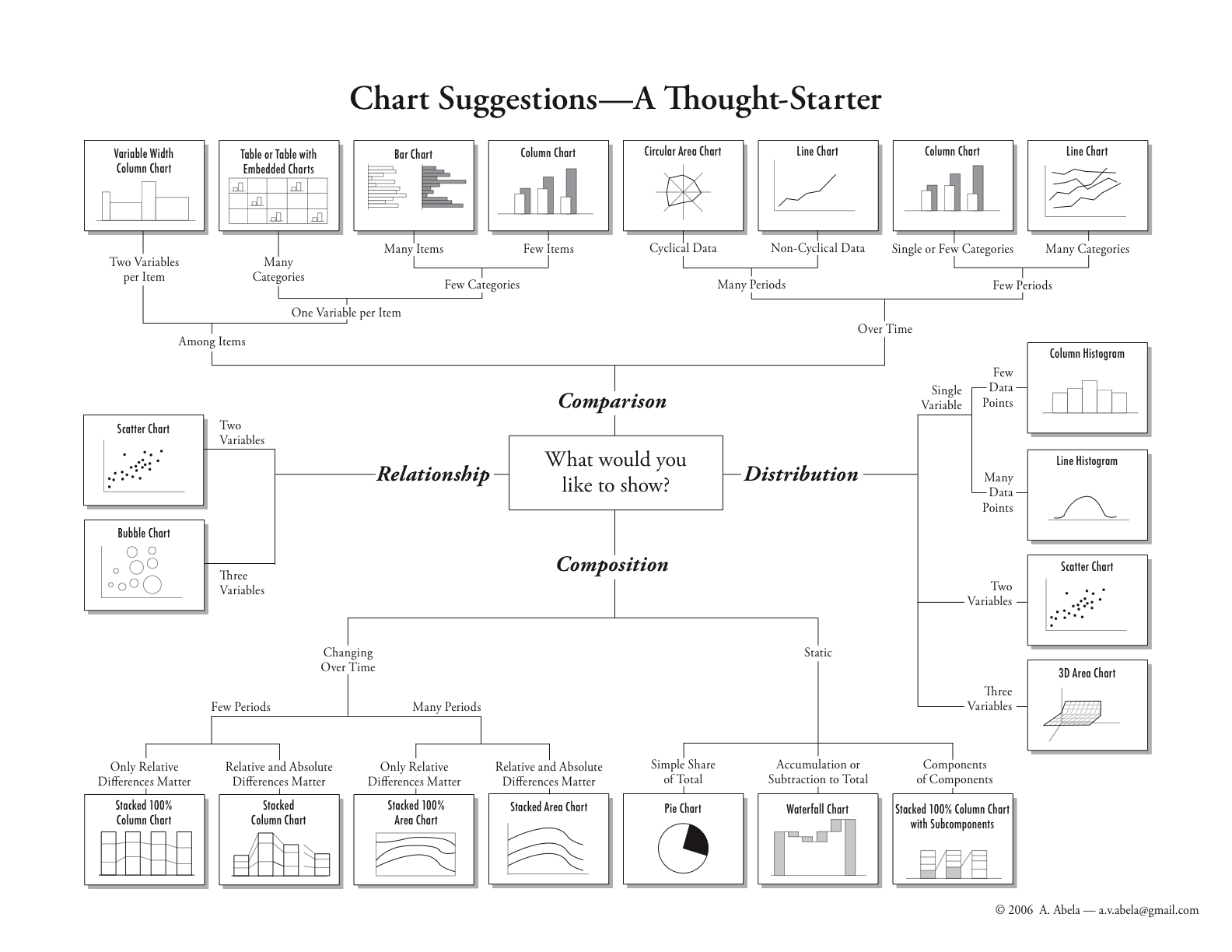
I highly recommend Andrew Abela’s simple decision tree called “Chart Suggestions—A Thought-Starter” (see image below).  It’s based on Gene Zelazny's classic work Saying It With Charts. The decision tree starts with the basic question: “What would you like to show?” And provides four options:

Comparison. You have two or more groups of things or people and you want to see which group is largest or smallest (or somewhere in between) on some measure. You also may want to see how these groups compare on the measure over time.

Distribution. You have a bunch of data points (e.g. the ages of participants in a program or test scores of students in a class) and you want to know how spread out or bunched up they are. Are most of the ages, test scores (whatever) near the average? Or is there a wide range? Are there some extreme outliers?

Composition. You want to understand who or what makes up a larger group such as how many of the participants in a program are in different age brackets or how many have been in the program for different lengths of time.

Relationship. You want to know if one thing is related to another, either at one point in time or over time. Do participants in a mental health program report less distress over time? Do those with lower incomes have higher heart rates?

Once you answer this basic question, the decision tree helps you to choose a specific chart based on the type of data you have. Abela’s chart chooser includes the types of charts you are most likely to select. But there are more rare species out there. To learn more about the wide array of ways to visualize data, check out the Data Visualization Catalogue.

See other data tips in this series for more information on how to effectively visualize and make good use of your organization's data.

chart-suggestion-infographic.jpg

Color Coordinate Your Data

Copy of 60-SECOND DATA TIP #8 (1).png

Color is a great tool for drawing attention to certain data points in a graph, chart, map, or diagram. But, WARNING, color also can confuse the viewer. Adopting a few rules of thumb will turn a rainbow of confusion into an elegant and clear picture:

1) Limit one meaning per color. If you are color coding a map and assigning blue to a certain income range, then do not use blue to mean anything else in that map or adjacent related visuals. Blue always means that specific income range.

2) Limited color palate. Limit your graph, chart, map, or diagram to a few complementary or monochromatic colors. Remember the color wheel? (See image above.) Choose complementary colors that are on opposite sides of the wheel: think orange and blue and yellow and purple. Or choose several tones of one color (a monochromatic color scheme). Looking for an effective ready-made color palate? Check out sites like color-hex.

3) Avoid reds with greens. Seven to ten percent of men are red-green colorblind. They can’t tell the difference between the two. So avoid using them both on a visualization.

4) Dial-up one data point and mute the rest. If you want to draw attention to one point, line, bar, or pie slice, give it a bright color and color the rest a muted shade or gray.

See other data tips in this series for more information on how to effectively visualize and make good use of your organization's data.


What Averages Obscure

Copy of 60-SECOND DATA TIP #8.png

Nonprofits (and everyone else) are addicted to averages. We like to talk about how participants do on average. We might describe how many visitors we have in an average week. But how much are we missing when we focus solely on averages? Short answer: it depends, but it could be a lot. If I only showed you the average sized guy in the picture, would you appreciate the full range of sizes?

To figure out what and how much we are missing, we need to calculate—or better yet show—how spread out our data points are. Understanding the spread gives us an idea of how well the average or the median represents the data. When the spread of values in the data set is large, the average obscures the real picture more than when the spread is small.

Spread measures include range, quartiles, absolute deviation, variance and standard deviation. For more on these measures, check this out. 

A great way to quickly grasp the spread of your data is to make a box plot. A box plot (aka. box and whisker diagram) shows the distribution of data including the minimum, first quartile, median, third quartile, and maximum. The box plots below show the affordability of neighborhoods in five cities. Each red circle represents a zip code area. The gray boxes show where 50 percent of the zip code areas fall on the affordability scale. And the median is where the dark gray meets the light gray. You can see that, in general (i.e according to the median), New York is more affordable than Los Angeles. However, New York has some zip code areas that are much less affordable than the median seems to suggest.

So when looking at your data, don’t just look at averages, also consider the spread.

boxplot2.jpg

See other data tips in this series for more information on how to effectively visualize and make good use of your organization's data.

Image created by Moxilla for Noun Project.

A Good Cause Is No Coincidence

1.png

We all know that correlation does not equal causation. Just because something occurs with something else, doesn’t mean that one caused the other. If you do a dance and then it rains, that’s not enough evidence that the dance caused it to rain. Even if it rains almost every time you dance, it could be that something else is causing both the rain and your dancing. Perhaps a drop in barometric pressure causes your joints to hurt and you dance to loosen them up while the same drop in pressure causes rain. It’s a silly example. But you get the point. (Check out this hilarious website which shows other spurious correlations, such as the one between cheese consumption and death-by-bedsheets.) 

Nonprofits (and everyone else) often make erroneous claims based on correlation. We might conclude, based on our data, that participation in our employment training leads to higher wages over time. Well, maybe. But perhaps employment in our city is on the rise and affecting everyone, not just participants in our program. Or maybe our program tends to attract participants who are quite motivated to find jobs and would do just as well without the program.

Correlation is necessary but not sufficient to prove causation. Indeed causation is a very high bar to reach. You must have three conditions: 1) correlation: two factors co-occur, 2) precedence: the supposed cause comes before the supposed effect in time, and 3) no plausible alternatives. This third condition is the trickiest. It involves ruling out other causes of the observed effect. So you can see why even carefully designed studies can rarely produce incontrovertible evidence of causation. (For more on establishing cause and effect, read this.) 

Short of hiring researchers to design and conduct rigorous (and usually expensive) studies of your work, you can at least consider plausible alternatives. When you observe something good or bad happening in your organization, consider possible causes both within and outside of your organization’s control. If possible, try altering just one factor, collect data over time, chart it, and see if a trend changes. Explore rather than assume.

See other data tips in this series for more information on how to effectively visualize and make good use of your organization's data.

Photo by Ariel Lustre on Unsplash

Simplify

Copy of 60-SECOND DATA TIP #8 (1).png

This data tip comes from the grandfather of modern data visualization: Edward Tufte. He originally recommended the elimination any non-data ink from data visualizations. Although today we might think more in terms of pixels than ink. The idea is to remove any distractors from the story that a data visualization--such as a bar chart or line graph--shows. Such distractors can include bells and whistle such as bars on a bar chart drawn as people or buildings (Tufte called this “chartjunk”). But there are more subtle distractors like graph lines and background color. The two images here show the same data, but the one on the right is stripped down to the essentials: no graph lines, no axis titles, only the visual information necessary to see the slope and to quantify it. So next time you visualize data, try simplifying so that your story shines through.

Note: 60-Second Data Tips will resume in January 2018. Happy New Year!

See other data tips in this series for more information on how to effectively visualize and make good use of your organization's data.

Point To The Story

Copy of 60-SECOND DATA TIP #8.png

Data can tell a story. But rarely is that story apparent when you look at a spreadsheet. (See Tip #1.) You can bring the story into focus by visualizing the data. You can show change over time using a line graph. You can compare and contrast groups using a bar chart. You can juxtapose a part of a group and the whole group using a pie chart. And there are plenty of other examples. But once you have visualized, the story can still be hidden, particularly to those unfamiliar with the data. That’s when it’s time to call out data points with color and annotations. In the visualization below, each line is a city in Hennepin County in Minnesota. The slope of the lines shows changes in housing prices overtime. The Minneapolis Star Tribune, which created the visualization, draws our attention to the city of St. Louis Park and allows us to easily compare this city's housing prices to that of other cities before and after the housing bubble peak. The annotation also gives us specific data on St. Louis Park that would be difficult to glean from the graph alone. The interactive version of this graph allows you to highlight different cities and look at median housing cost, relative cost, and relative change in cost.

See other data tips in this series for more information on how to effectively visualize and make good use of your organization's data.

Screen Shot 2017-12-13 at 10.37.27 AM.png

Consider Outliers

60-SECOND DATA TIP #8 (1).png

When you visualize your data (in a bar chart or line graph, for example), your eyes tend to focus on clumps of data. That makes sense. The clumps are where the action is. Groups of data — which appear as the longest bars or data that forms an approximate line on a graph — show us general patterns in the data. For example, they tell us that as one thing increases (like age), another thing also increases (like risk of disease). Or they might tell us that use of counseling services peaks in the months of January, February, and March. These are important stories, so certainly keep your eyes on the action. But also do not ignore small bars or the isolated points or smaller clumps of data points, aka “outliers”. They have important stories to tell too. First, their message might be: “Warning! Human error! The data is wrong and needs to be corrected." Second, if you have confirmed that the data is correct, then these outliers might alert you to distinct subpopulations that, for example, do particularly well or notably poorly in a program. This is an interesting finding, one not to be discounted. They should prompt you to ask: Who are these individuals? What about them sets them apart from the others? Did they have different program instructors? Did they have certain characteristics which would (dis)advantage them in the program? The answers to such questions often prove to be insights that help you to adjust your course and improve curriculum, your recruitment strategy, or other ways in which you do your work.

See other data tips in this series for more information on how to effectively visualize and make good use of your organization's data.

Pies are for eating

There are better ways to show your data.

60-SECOND DATA TIP #8.png

Pies are delicious but often inscrutable when applied to data. Humans are pretty good at deciphering some visual cues and pretty bad at others. For example, we do well when comparing lengths along a common scale. So looking at this image, we can confidently proclaim the E bar as the tallest. But we would be hard pressed to pick out which pie slice is largest. That’s because we don’t do so well with angles. So when comparing the quantities of several things, bar charts are almost always better than pie charts. The only exception is when you want to compare a part to a whole. In this case, a pie chart does a good job of showing that girls, for example, represent only a sliver of all the participants in a program or that 30 to 40 year olds are the majority of visitors to an event. But once you get beyond 2 (or maybe 3) slices, skip the pie and dust off the trusty bar chart.

Get the whole picture

tip7.jpg

In an ancient Indian parable, a group of blind men encounter an elephant for the first time. Each man feels a different part of the animal and reaches his own conclusions. One feels a tusk and proclaims it a spear. Another feels a leg and decides it’s a tree trunk. The message? Collect more evidence and take a wider view. This is a good message for nonprofits. Notice a 3-month downward trend in participation in one of your programs? Zoom out and see if the trend holds over longer periods of time. If not, is there a cyclical pattern? For example, when looking at the trend over the past 5 years, does participation increase during certain months and decrease in others? Also, zoom in and see if the trend holds for subgroups. Is there a downward trend for boys in your program but an upward trend for girls? Do those in certain age groups have differing trends? Zoom out and zoom in to clearly understand the whole story.

See other data tips in this series for more information on how to effectively visualize and make good use of your organization's data.

Photo by jinsu Park on Unsplash

Clean Data Tell Clear Stories

tip6.jpg

Many nonprofits have entry-level staff or multiple staff entering data into management information systems or spreadsheets. The result can be “dirty” data — data with a troubling level of inaccuracy because it has not been entered correctly and/or consistently. If, for example, Michael Smith is entered twice, once with a middle initial and once without, then tracking his progress through your program will be difficult.

To make sure data is accurate and thus of any value at all, it should be regularly "cleaned." A few simple procedures for cleaning data include:

  • Spell Check: Use a spell checker to find values that are not used consistently, such as a program name.

  • Remove Duplicate Rows or Entries: Sort data or use conditional formatting in Excel to find duplicates. Filter data for unique values to find near duplicates.

  • Find and Replace: Use find and replace function to correct data entered incorrectly in multiple rows or entries.

  • Use Upper Case and Trim: Change all text to upper case and remove extras spaces before and after values to ensure consistency. The UPPER(text) and TRIM(text) functions in Excel can do this.

  • Make Date Format Consistent: Make sure that dates are entered in a consistent format (such as MM/DD/YYYY). Excel has several functions that can help you convert date formats.

See other data tips in this series for more information on how to effectively visualize and make good use of your organization's data. 

Choose Your Data Visualization Weapon

Tip5.jpg

There are plenty of software programs out there to help you visualize your data. Excel, which you may already have, is perhaps the simplest to use. Other programs such as Tableau and Qlik Sense allow you to create interactive visuals and “drill down” into your data. If, for example, you see an overall downward trend in program participation, you might want to see if the trend holds for subgroups of participants such as women, men, or those in certain age groups. Free versions of Tableau and Qlik Sense are available as long as you store your data and visuals on the companies’ servers (and you can make your data and charts invisible to anyone without the URL).

See other data tips in this series for more information on how to effectively visualize and make good use of your organization's data. 

(This data tip originally appeared on Philanthropy News Digest’s PHILANTOPIC blog.)

Don't Just Set Goals, Track Them

tip4.jpg

Many organizations go to a lot of trouble setting goals, eating up loads of staff and board meeting time, and then neglect to do one or both of the following:

  • Figure out how they will know if they are making progress toward their goals.

  • Track their progress toward their goals.

If your organization or program doesn’t already have clearly articulated goals, a logic model is a good first step toward setting them. Logic models show how resources, programs and services, and desired results relate to each other according to your organization’s strategic plan. (For more on logic models, check out the Pell Institute’s Evaluation Toolbook.)

You can set goals for any stage of the process: what resources you hope to garner, what services you intend to provide, or what outcomes you expect to see. The trick is to make these goals specific and measurable. Don’t say you will work strengthen a program, say that participation in the program will increase to 250 and that evaluation surveys will show average ratings at or above 4 (on a five point scale).

Once you set specific and measurable goals, don’t wait until you have all of the necessary data to visualize it. It’s important to bring the data to life for everyone involved, and that means showing it sooner rather than hiding it in spreadsheets and databases.

Even a simple line graph showing progress over time toward a goal will make your data perceptible, prompting you and your colleagues to ask yourselves important questions, such as: Is our data accurate? What additional data do we need to better understand the trends we see? What is going on in our program or our community or our field that might be affecting these trends? Questions like these can strengthen your resolve to gather new or better data as well as to make changes to enhance the efficacy of your program.

See other data tips in this series for more information on how to effectively visualize and make good use of your organization's data. 

Image Source: Pixabay.com

(This data tip originally appeared on Philanthropy News Digest’s PHILANTOPIC blog.)

Go With The Flo (Florence Nightingale)

tip3.jpg

Like many nonprofit staff today, Florence Nightingale probably wasn’t a numbers person at the outset. She became a nurse to serve others. Yet, she soon realized she could provide care more effectively with the help of data. Working with a statistician named William Farr, Nightingale analyzed mortality rates during the Crimean War. She and Farr discovered that most of the soldiers who died in the conflict perished not in combat but as a result of “preventable diseases” caused by bad hygiene.

Nightingale’s solution? She invented the polar area chart, a variant of the pie chart, meant “to affect thro’ the Eyes what we fail to convey to the public through their word-proof ears.” Each pie represented a twelve-month period of the war, with each slice showing the number of deaths per month, growing outward if the number increased, and color-coded to show the causes of death (blue: preventable, red: wounds, black: other). Clearly seeing the importance of hygiene, the Queen and Parliament quickly set up a sanitary commission and, as a result, mortality rates fell.

See other data tips in this series for more information on how to effectively visualize and make good use of your organization's data. 

Also, see the Smithsonian's excellent article The Surprising History of the Infographic for more on the history of data visualization.

Image Source: Smithsonian

(This data tip originally appeared on Philanthropy News Digest’s PHILANTOPIC blog.)

Admit That You Avoid Data

tip2.jpg

Nonprofits avoid data for any number of understandable reasons, including:

Data animus. Many nonprofit staff members possess expertise in environmental issues, the arts, health, or education but not data analysis. Some suffer from data aversion. They admit — or sometimes proudly proclaim — that they are not “numbers people.”

Time. Nonprofit staffers do not have time for data analysis. They are struggling to stay afloat, to submit the next proposal, to sustain their programs, to address the huge and varied needs of their clientele, to cultivate donors. As a result, digging through data is almost always a back-burner item.

Fear. Some worry about what their data might reveal. They fear they won’t be able to control the narrative, that the data will be taken out of context, or that funders will withdraw their support based on the data.

“Dirty” data. Many nonprofits have entry-level staff or multiple staff entering data into management information systems or spreadsheets. The result can be “dirty” data — data with a troubling level of inaccuracy because it has not been entered correctly and/or consistently.

Wrong data. While many nonprofits have data on their financials and clients, they often lack data that demonstrates theimpact of their programs. A tutoring program may not track students’ school grades or test scores. An employment program may lack data on program graduates’ wages over time.

Disconnected data. Rather than maintaining a central management information system, small nonprofits often store their data in separate Excel spreadsheets.

See other data tips in this series for how to overcome barriers to data use.

Image Source: smejoinup.com

(This data tip originally appeared on Philanthropy News Digest’s PHILANTOPIC blog.)


Make Your Data Visible

tip1.jpeg

Nonprofits are lousy with data. But, like secretive hoarders, we are reluctant to admit how little data we actually use. We may pay lip service to “evidence-based practices” or “data-driven strategies”. But, if pressed, many of us admit that we care about the people and the programs and glaze over at the site of a spreadsheet.

Indeed, we are not wired well for processing data in spreadsheets.

Our visual system has evolved, over millions of years, to process images essentially in parallel. We don’t read the Mona Lisa from top to bottom and from left to right. We take it all in together and understand, almost instantly, that this is a picture of a woman in front of a landscape, sporting a dark dress and an inscrutable smile. Words and numbers, which only appeared within the last few thousand years, require our visual system to scan individual characters one at a time and piece them together to create meaning.

Data is encoded in words and numbers making it difficult for us to extract the stories they can tell. However, if we use visual elements (like bars, pie slices, and sloping lines) to encode the data, the story can come into focus more quickly. 

See other data tips in this series for more information on how to effectively visualize and make good use of your organization's data.

Image Sources: thinglink.com and perfect-cleaning.info

(This data tip originally appeared on Philanthropy News Digest’s PHILANTOPIC blog.)