How To Squeeze MUCH More Information From Your Surveys (Repost)

60-SECOND DATA TIP #8 (5).png

Surveys are such a common data source for nonprofits. And I get so many questions about how to make better use of survey data, that I’m reposting this tip which originally appeared in June 2018.


Surveys provide answers to many nonprofit questions.  How do participants like this program? What are barriers to enrollment? What types of services do community members lack and need?

It’s easy enough to create a survey on Survey Monkey or the like. It's harder to get an adequate number of responses.  And even when you do, the respondents might not fairly represent the larger group you want to know about. But let’s say you get past this hurdle. There’s still a major hurdle ahead of you: extracting meaning from your data.

Surveys include different types of questions. Perhaps the most common one is the Likert scale question. You have seen them a million times. Respondents are asked to indicate how much they agree or disagree with a particular statement using a five to seven point scale.

Let’s say you want to know participants’ feelings about a program. Your Likert scale statements might be; “I feel that I can ask the instructor for help when I’m confused” or “I feel comfortable interacting with the other participants in the program.” Survey Monkey will give you each respondent’s rating of each statement and will also give you the average rating. What meaning can you extract from these numbers?

Many organizations will use just the averages to determine where they are doing well and where they need to worker harder or differently. But there is so much more information in those numbers than averages can tell you, including:

The extremes: Averages can’t tell you what were the lowest or highest ratings on any given statement.

What most respondents said: Averages also can’t tell you if the average is three because most people responded with a “3” or because half responded with a 5 and half responded with a 1.

What subgroups think and feel: Even though the overall average might be high, the average might be low for some subgroups within your group of respondents. Perhaps respondents from a certain neighborhood, for example, had very different opinions than the group overall.

You can extract and show this information using data visualization tools like Tableau that allow you to interact with your data. The viz below shows the range of responses to each survey statement and the proportion of responses for each rating. Moreover, the interactive version allows you to “drill down” into the data and see how the results change overtime. We could also construct the visualize to show us results for different subgroups.

If you are going to go to the trouble of conducting a survey, make sure to squeeze all of the information you can from the data you collect.

survey_large.png

Let’s talk about YOUR data!

Got the feeling that you and your colleagues would use your data more effectively if you could see it better? Data Viz for Nonprofits (DVN) can help you get the ball rolling with an interactive data dashboard and beautiful charts, maps, and graphs for your next presentation, report, proposal, or webpage. Through a short-term consultation, we can help you to clarify the questions you want to answer and goals you want to track. DVN then visualizes your data to address those questions and track those goals.


See other data tips in this series for more information on how to effectively visualize and make good use of your organization's data.

Wait, What? Numbers That Bewilder

60-SECOND DATA TIP_3 (1).png

Numbers can bewilder our hunter-gatherer brains. For more than 95 percent of human history, folks were not processing written numbers or words. But they were processing visual information in the form of color, shape, and size. It’s not surprising that our brains, evolved over many thousands of years, are better at understanding data in visual form than in word and number form. So when numbers confuse, try “translating” them to the visual.

Here’s a great example of a number that makes me scratch my head: “54% more students with monitors improved attendance than students without monitors.” The statement relates to a fictional program that (like some non-fictional programs) pairs students with monitors to boost their attendance. At first blush, to me, that sounds pretty impressive. It sounds like this: if 10% of the students without monitors improved their attendance, then 64% (10% + 54%) with monitors improved their attendance. Or, put another way, six times as many kids with monitors improved their attendance as kids without monitors.

But my brain just made a wrong turn. That 54% is showing what statisticians call “relative difference.” And the problem with this type of stat is that indicators with low values have a tendency to produce large relative differences even when the “absolute difference” is small.

Okay, still bewildered? No worries, I give you now a picture for your primitive brain. Let’s say, in our fictional program, there are 10 students per class. In one class, all of the kids got paired with monitors. In the other class, none of the kids did. The picture below shows how many kids in each class improved their attendance.

out of 10 students who got Little Bit support, improved their attendance. (3).png

So the difference (aka “absolute difference”) is 1.4 (4.0-2.6) which means that 1.4 more kids in the class with monitors improved their attendance. How did that measly 1.4 become 54%? Well, relative difference is calculated as the absolute difference divided by the “standard” which, in this case, is the class without monitors. So 4.0 minus 2.6 divided by 2.6 or .54, which when expressed as a percentage is 54%.

If relative difference requires varsity level processing for many of us, then percentages are junior varsity. So if I were visualizing the difference between the two groups, I would stay away from both and use an icon chart, like the one above. I might make it even more concrete by showing 25 person icons in each group since the typical elementary school classroom has 25 students. I would then use color to show that 6.5 students out of 25 without monitors had improved attendance and 10 students out of 25 with monitors had improved attendance. So, if you bring the program to a typical classroom, you might expect it to improve the attendance of an additional 3 to 4 kids.

Bottom line? Numbers can be like road signs pointing us in the wrong direction. To move folks in the right direction, make your message concrete and visible.

See other data tips in this series for more information on how to effectively visualize and make good use of your organization's data.


Avoid This Danger When Choosing Metrics

60-SECOND DATA TIP_3.png

I’m all about making data clear and easy-to-digest. But there is a danger in it. The clarity may cause you accept what the data seems to tell you. You may not linger. You may not reflect.

Writer Margaret J. Wheatley warns us that “without reflection, we go blindly on our way, creating more unintended consequences, and failing to achieve anything useful.”

Economist Charles Goodhart recognized this danger in the metrics we create to measure our progress. At first, a certain metric may seem like a good indicator of progress. If we want kids in an after-school track program to increase their endurance, we might measure how far they run at the beginning of the program and then again at the end.  Makes sense, right? We might then try to motivate students by offering them free running shorts if they increase their miles by a certain amount. But, that’s when students might start gaming the system. They can increase their miles not only by training hard and running farther over time but also by running very short distances at the start. This is the kind of unintended consequence that Goodhart warned us about. His law states: “When a measure becomes a target, it ceases to be a good measure.” 

The solution? First, reflection. Consider the potential unintended consequences of each of your metrics, particularly those tied to incentives. Second, use multiple metrics to provide a more balanced understanding of progress.  In our running example, in addition to the change in miles participants run, you might also measure resting heart rates at the beginning and end of the program, knowing that a lower resting heart rate generally indicates a higher level of cardiovascular fitness.

See other data tips in this series for more information on how to effectively visualize and make good use of your organization's data. 

The Allure and Danger of Data Stories

60-SECOND DATA TIP (1).png

“Data” and “storytelling” are an item. You see them together all the time lately.

When I first came across the term “data storytelling,” it instantly appealed to me. “Data” suggests credibility, information that has some objective basis. But data, to many of us, is boring. Its meaning is often uncertain or unclear. Or, even worse, it’s both. “Storytelling,” by contrast, suggests clarity, a plot with both excitement and resolution. So, by coupling these two words, we seem to get the best of both worlds. Data lend credibility to stories. Stories lend excitement and clarity to data.

Indeed, that’s the point of data storytelling. As Brent Dykes, a data storytelling evangelist of sorts, noted in a 2016 Forbes article, “Much of the current hiring emphasis has centered on the data preparation and analysis skills—not the ‘last mile’ skills that help convert insights into actions.” That’s where data storytelling comes in, using a combination of narrative, images, and data to make things “clear.”

But let’s step back just a minute. Why are we so drawn to stories? According to Yuval Harari, author of Sapiens: A Brief History of Humankind, the answer is:  survival. Harari maintains that humans require social cooperation to survive and reproduce. And, he suggests that to maintain large social groups (think cities and nations), humans developed stories or “shared myths” such as religions and corporations and legal systems. Shared myths have no basis in objective reality. Reality includes animals, rivers, trees, stuff you can see, hear, and touch. Rather, stories are an imagined reality that governs how we behave. The U.S. Declaration of Independence states: “We hold these truths to be self-evident: that all men are created equal . . . “ Such “truths” may have seemed obvious to the framers, but Harari notes that there is no objective evidence for them in the outside world.  Instead, they are evident based on stories we have told and retold until they have the ring of truth.

So stories (in the past and present) are not about telling the whole truth and nothing but the truth. Instead, they are often about instruction: whom to trust, how to behave, etc. And we should keep this in mind when telling and listening to “data stories.” To serve their purpose, stories leave out a lot of data — particularly data that doesn’t fit the arc of the story. For example, you might not hear about a subgroup whose storyline is quite different from the majority. Or, indeed the story might focus exclusively on a subgroup, ignoring truths about the larger group.

Bottom line: listener beware. A story, whether embellished with data or not, is still just a story. And truth can lie both within and outside of that story.

See other data tips in this series for more information on how to effectively visualize and make good use of your organization's data.

Why Your Organization Should Care About Data Deviants

60-SECOND DATA TIP #8.png

“Standard deviation” sounds like an oxymoron. Any high school student knows that you can’t be both standard and a deviant at the same time. And any high school stats class will clarify, in the first week or so, what standard deviations are really about. And most high school students will hold that knowledge for a semester and then delete it to make space for more valuable knowledge.

But I come to you today to re-enter the standard deviation onto your personal hard drive. Because it is valuable even to those of us who are not statisticians or researchers. It’s a great tool for anyone trying to understand what is going in organizations trying to up their impact.

60-Second Data Tip #13 addressed what averages obscure. The answer was: how spread out your data points are around the average. The standard deviation tells you just how spread out they are. You might think of the average as the “standard” (the person at your high school who was average in every way). And you might think of the rest of the data points as “deviants” with some deviating from average just a bit (perhaps a kid with a nose ring who was otherwise sporty) and others deviating a lot (full-on Goth).

Here’s a more nonprofity example. If the average wage of participants in a job-training program is $19 per hour, this might obscure the fact that a few participants are earning over $30 per hour and the majority are earning below $10 per hour.

A standard deviation close to 0 indicates that the data points tend to be very close to the mean. As standard deviation values climb,  data point values are farther away from the mean, on average. So a job-training program aiming for an average wage of $17 per hour among participants might want to see a pretty low standard deviation in wages to feel confident that the large majority has reached the goal.

I won’t scare you with the formula for calculating the standard deviation. You can keep that off your hard drive. Any spreadsheet program will calculate it for you. For example, for data in rows 1-350 in column A on an Excel spreadsheet, just use enter “=STDEV(A1:A350)” to get it.

See other data tips in this series for more information on how to effectively visualize and make good use of your organization's data.

Photos by Ben Weber and Alex Iby on Unsplash

How To Squeeze MUCH More Information From Your Surveys

60-SECOND DATA TIP #8 (5).png

Surveys provide answers to many nonprofit questions.  How do participants like this program? What are barriers to enrollment? What types of services do community members lack and need?

It’s easy enough to create a survey on Survey Monkey or the like. It's harder to get an adequate number of responses.  And even when you do, the respondents might not fairly represent the larger group you want to know about. But let’s say you get past this hurdle. There’s still a major hurdle ahead of you: extracting meaning from your data.

Surveys include different types of questions. Perhaps the most common one is the Likert scale question. You have seen them a million times. Respondents are asked to indicate how much they agree or disagree with a particular statement using a five to seven point scale.

Let’s say you want to know participants’ feelings about a program. Your Likert scale statements might be; “I feel that I can ask the instructor for help when I’m confused” or “I feel comfortable interacting with the other participants in the program.” Survey Monkey will give you each respondent’s rating of each statement and will also give you the average rating. What meaning can you extract from these numbers?

Many organizations will use just the averages to determine where they are doing well and where they need to worker harder or differently. But there is so much more information in those numbers than averages can tell you, including:

The extremes: Averages can’t tell you what were the lowest or highest ratings on any given statement.

What most respondents said: Averages also can’t tell you if the average is three because most people responded with a “3” or because half responded with a 5 and half responded with a 1.

What subgroups think and feel: Even though the overall average might be high, the average might be low for some subgroups within your group of respondents. Perhaps respondents from a certain neighborhood, for example, had very different opinions than the group overall.

You can extract and show this information using data visualization tools like Tableau that allow you to interact with your data. The viz below shows the range of responses to each survey statement and the proportion of responses for each rating. Moreover, the interactive version allows you to “drill down” into the data an see if whole group results hold for subgroups.

If you are going to go to the trouble of conducting a survey, make sure to squeeze all of the information you can from the data you collect.

survey_large.png

See other data tips in this series for more information on how to effectively visualize and make good use of your organization's data.

Drill Into Your Data

60-SECOND DATA TIP #8 (2).png

I’m not sure how a term from construction and dentistry became so ubiquitous in the world of data analysis. Perhaps because when you are “drilling down” into data, you are going deeper. Drilling down means viewing data at increasing levels of detail. (By the way, the word for viewing data at decreasing levels of detail is called “rolling-up”, a culinary term?)

Applications such as Tableau and Qlik Sense allow you to create interactive data visualizations, which means users can use filters to drill down into the data. If, for example, you see an overall downward trend in program participation, you might want to see if the trend holds for subgroups of participants such as women, men, or those in certain age groups. 

Why is drilling down important? Because it helps you to identify both strengths to build on and problems to address. An overall upward trend hides problems in subgroups. Perhaps participants in a certain age group are not doing as well as others in a substance abuse program. Conversely, overall negative results hide positive findings. For example, although on average the wages of participants in an employment program have gone down, they may have increased for a subgroup who entered the program after a certain date.

If, after using various filters, it appears that results vary significantly across a certain type of category, you might want to create several small visuals and place them side by side to more easily make comparisons among subgroups (for more on this, see Tip #25).

Bottom line: Don’t only look at the forest. Check out groups of trees to get the whole story.

See other data tips in this series for more information on how to effectively visualize and make good use of your organization's data.


How To Consume Data

1.png

Charts, graphs, maps, and other types of data visualizations (aka “data viz”) often pull me in, especially if they are visually striking. But until I became versed in the art and science of data visualization, even dazzling charts often would frustrate me. I could not extract their meaning quickly and thus moved on.

There are five steps in quickly consuming a data viz. I know that doesn’t sound quick, but most steps take only seconds to do. In each step, you answer a simple question. The questions are:

1.     What’s this about? What question is it answering?

This first question comes from a 1940 classic book called How To Read A Book by Mortimer J. Adler. Adler maintains that you don’t save time on books by learning to speed-read. Instead, you save time by making an informed decision about what to and what not to read. And the best way to make this decision is to do an “inspectional read” which means skimming through titles, headings, tables of context, etc. Similarly, when you encounter a chart, map, or graph in text, skim over it by reading the title and subtitle, and any captions or annotations. Then determine what its about and, more specifically, what question it is trying to answer.

2.     What’s my guess about the answer to that question?

This might seem like an unnecessary step, but studies have shown that comprehension increases when a reader forms questions about a text before consuming it. A question primes your brain for an answer. The more our curiosity is piqued, the easier all learning becomes.

3.     What’s the quality of the data?

This might be the most important step and the least likely to be taken. At least determine the source of the data and whether the source appears to be reliable and credible. True, individuals will disagree on which sources are reliable and credible. Some of us, however, might be wary of data from institutions with clear political leanings or agendas. If no data source is noted, the viz is not worth your time.

For extra credit, look for information on what is and what is NOT included in the data. Consider, for example, the time period of the data and the demographics of people represented by the data. You are trying to determine if the data are equal to the task of the visualization. Can it really answer its question(s)? Or are there gaps in the data that weaken its ability to answer the questions fully or at all?

4.     What more can I learn from the structure of the viz

If you have gotten this far, you are engaged by the viz. Now consider what it all means. A visualization is, by nature, an abstraction of reality. It shows data collected in the real world using position, color, shape, and size to represent the data. Thus it’s important to understand what these visual cues mean in the particular viz you are consuming.

5.     What is the answer to the question and what questions am I left with?

Finally, consider what answers you see in the viz and how they compared to your expectations. And to prime yourself to consider future information on the same subject, ask yourself what else you’d like to know about it. 

See other data tips in this series for more information on how to effectively visualize and make good use of your organization's data.

Give Voice To Data Points

60-SECOND DATA TIP #8.png

We are, each of us, data points in an unlimited number of data stories. These stories can be told using charts, maps, and graphs. Depending on the topic, you might be a data point lost in a crowd of other points (in other words, you are in the norm) or you might be hanging out on the fringe (aka an outlier). Either way, you hold valuable information that the chart, map, or graph cannot tell on its own.

Let’s say that you’re a dot on a scatterplot. A scatter plot uses horizontal and vertical axes to plot data points. They show the relationship (or correlation) of one variable to another. A scatterplot might show the amount of time spent in a program—say an employment training program—on one axis and an intended program outcome—say current wages—on the other. Each point is a participant in the program.

Of course, you would hope to see that wages increase as duration in the program increases, at least to a certain point. But what if that’s not the case? That’s when it’s good to get the data points' points of view. Share the scatterplot with a few participants with different durations in the program and at different wage levels and ask: "Why do you think the data looks like this?"

They are going to share their personal experiences, their understanding of causes and effects in their own lives. And these stories will help you to understand general trends across all of the participants in the program. Perhaps one will tell you that he dropped out of the program several times when he gained new employment, which reduced his time in the program but also increased his wages. This insight, along with insights from other individuals (either collected informally or through a survey) can lead your organization to program reforms which, in turn, change trends in your data.

See other data tips in this series for more information on how to effectively visualize and make good use of your organization's data.
Images created by Ilaria Bernareggi and n.o.o.m. for Noun Project.

A Valentine's Day Post On (Data) Relationships

60-SECOND DATA TIP #8 (2).png

Data on any one thing isn’t that interesting. You might know the ages of all the participants in a program or the average grant amounts for a group of foundations. But that doesn’t really tell you anything until you look at that data in relationship to something else. That “something else” usually falls into these categories: time, other data, space, rank, or networks.

Time.  Is participation now greater or less than in the past? To see this, you need a line chart with some measure of time, such as each month of a year, along the horizontal (aka X) axis and number of participants along the vertical (aka Y) axis. Each point shows how many people participated in a given month. Connecting the dots gives you a slope, which instantly shows you whether participation is increasing, decreasing, or varying over time.

Other data. You might want to know how participation relates to other data you have on participants. For example, are the ages of participants related to their satisfaction with your program (as reported on a survey)? In this case, you could use a scatter plot with satisfaction scores along the vertical axis and age along the horizontal axes. Each dot shows the age and satisfaction of a single participant. If the dots suggest a rough increasing slope, then older participants are often more satisfied with your program than younger ones. You might then color dots representing females red and those representing males as blue to see if and how gender relates to the age and satisfaction of participants. 

Space. To show where participants live in relation to each other and to your organization, participant dots can be placed on a map. If you size the dots to show another factor, such as income, then you have a bubble map.

Rank. These types of charts show your data in relationship to a scale that indicates importance, prevalence, or some other metric. Perhaps the most common type of chart in this category is the tree diagram, which is often used to show reporting relationships among staff in an organizational chart. You might use it to show the educational institutions of participants in your program, starting with school districts at the top, individual schools in the middle, and classrooms at the bottom.

Networks.  In network visuals, the relationships among individuals, groups, things, concepts, etc., are shown using connecting lines. For example, you might visualize participants as dots and the connecting lines show what other participants they referred to your program. In this way, you can quickly distinguish frequent referrers from infrequent ones. 

See other data tips in this series for more information on how to effectively visualize and make good use of your organization's data.
 

A Good Cause Is No Coincidence

1.png

We all know that correlation does not equal causation. Just because something occurs with something else, doesn’t mean that one caused the other. If you do a dance and then it rains, that’s not enough evidence that the dance caused it to rain. Even if it rains almost every time you dance, it could be that something else is causing both the rain and your dancing. Perhaps a drop in barometric pressure causes your joints to hurt and you dance to loosen them up while the same drop in pressure causes rain. It’s a silly example. But you get the point. (Check out this hilarious website which shows other spurious correlations, such as the one between cheese consumption and death-by-bedsheets.) 

Nonprofits (and everyone else) often make erroneous claims based on correlation. We might conclude, based on our data, that participation in our employment training leads to higher wages over time. Well, maybe. But perhaps employment in our city is on the rise and affecting everyone, not just participants in our program. Or maybe our program tends to attract participants who are quite motivated to find jobs and would do just as well without the program.

Correlation is necessary but not sufficient to prove causation. Indeed causation is a very high bar to reach. You must have three conditions: 1) correlation: two factors co-occur, 2) precedence: the supposed cause comes before the supposed effect in time, and 3) no plausible alternatives. This third condition is the trickiest. It involves ruling out other causes of the observed effect. So you can see why even carefully designed studies can rarely produce incontrovertible evidence of causation. (For more on establishing cause and effect, read this.) 

Short of hiring researchers to design and conduct rigorous (and usually expensive) studies of your work, you can at least consider plausible alternatives. When you observe something good or bad happening in your organization, consider possible causes both within and outside of your organization’s control. If possible, try altering just one factor, collect data over time, chart it, and see if a trend changes. Explore rather than assume.

See other data tips in this series for more information on how to effectively visualize and make good use of your organization's data.

Photo by Ariel Lustre on Unsplash

Consider Outliers

60-SECOND DATA TIP #8 (1).png

When you visualize your data (in a bar chart or line graph, for example), your eyes tend to focus on clumps of data. That makes sense. The clumps are where the action is. Groups of data — which appear as the longest bars or data that forms an approximate line on a graph — show us general patterns in the data. For example, they tell us that as one thing increases (like age), another thing also increases (like risk of disease). Or they might tell us that use of counseling services peaks in the months of January, February, and March. These are important stories, so certainly keep your eyes on the action. But also do not ignore small bars or the isolated points or smaller clumps of data points, aka “outliers”. They have important stories to tell too. First, their message might be: “Warning! Human error! The data is wrong and needs to be corrected." Second, if you have confirmed that the data is correct, then these outliers might alert you to distinct subpopulations that, for example, do particularly well or notably poorly in a program. This is an interesting finding, one not to be discounted. They should prompt you to ask: Who are these individuals? What about them sets them apart from the others? Did they have different program instructors? Did they have certain characteristics which would (dis)advantage them in the program? The answers to such questions often prove to be insights that help you to adjust your course and improve curriculum, your recruitment strategy, or other ways in which you do your work.

See other data tips in this series for more information on how to effectively visualize and make good use of your organization's data.

Get the whole picture

tip7.jpg

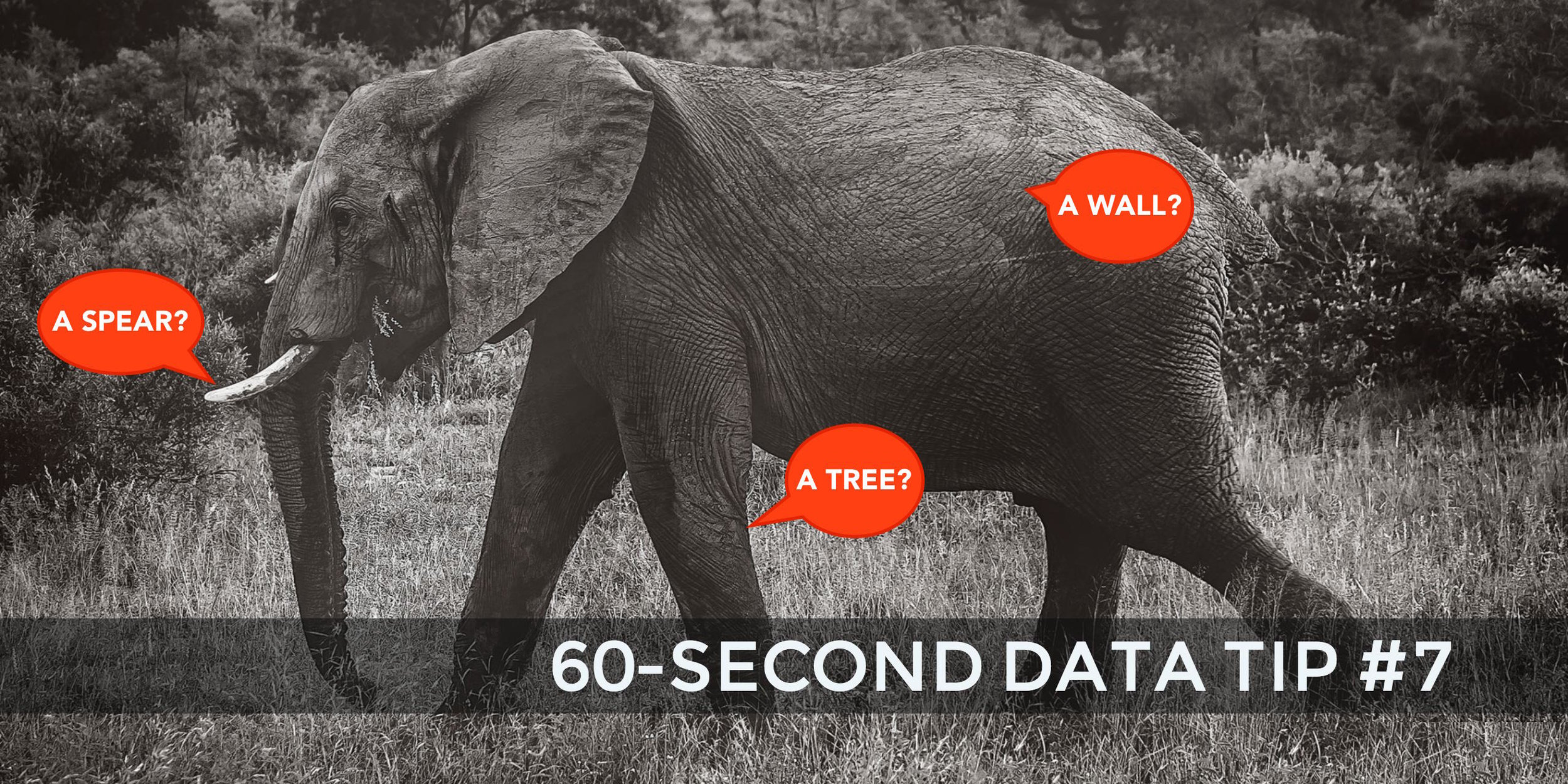
In an ancient Indian parable, a group of blind men encounter an elephant for the first time. Each man feels a different part of the animal and reaches his own conclusions. One feels a tusk and proclaims it a spear. Another feels a leg and decides it’s a tree trunk. The message? Collect more evidence and take a wider view. This is a good message for nonprofits. Notice a 3-month downward trend in participation in one of your programs? Zoom out and see if the trend holds over longer periods of time. If not, is there a cyclical pattern? For example, when looking at the trend over the past 5 years, does participation increase during certain months and decrease in others? Also, zoom in and see if the trend holds for subgroups. Is there a downward trend for boys in your program but an upward trend for girls? Do those in certain age groups have differing trends? Zoom out and zoom in to clearly understand the whole story.

See other data tips in this series for more information on how to effectively visualize and make good use of your organization's data.

Photo by jinsu Park on Unsplash