How Data Viz Can Save Your Thanksgiving

Copy+of+60-SECOND+DATA+TIP_3.jpg

Your next data challenge may involve turkey. And I’m here to help. This week we take a break from nonprofit data and consider Thanksgiving data. If you are in charge this year, and you have a medium to small oven and fridge, you have to be strategic. When should you cook, chill, and reheat each dish to make the most of your time and oven/fridge space?

I give you my color-coded gantt chart. I used it last year, and it worked like a charm. I took all my recipe data and came up with this chart to make sure I had my timing right. Made it in good old Excel. Nothing fancy, but it did the trick. Feel free to adapt it to your recipes or perhaps your next fundraising event!

Happy Turkey/Tofurky Day.

Thanksgiving Game Plan 2018-1.jpg

Data Viz for Nonprofits helps organizations to effectively and beautifully present their data on websites, reports, slide decks, interactive data dashboards and more. Click HERE to learn more about our services and HERE to set up a meeting to discuss how we can meet your particular needs.

Plug Your Logic Model Into Real-Time Data

Copy of 60-SECOND DATA TIP_3 (5).png

Want to see this rather boring logic model come to life?

A logic model (aka causal chain, model of change, roadmap, or theory of change) is a type of flow chart showing how an intervention or program is supposed to work. It tells a story about how one thing leads to another. It’s a great way to plan for solving a problem. But logic models are hypothetical, best case scenarios. And, well, reality can bite.

Another problem with logic models is that they get more play during the planning and proposal-writing phase of a project than during implementation. During the daily work of a project, logic models are taking it easy, gathering dust in files and on servers.

But what if we could plug a logic model into the real world? What if we could see how our plan is playing out in reality and make adjustments along the way?

You can do just that with data viz software like Tableau. The current that animates such “living logic models” is real-time data. A living logic model compares theory to reality by showing progress to date. It also allows you to track the progress of subgroups and individuals. So it helps you to plan, to ask the right questions, and to make mid-course corrections.

A living logic model is more understandable and tangible than a traditional one. The user can scroll over any component in the model to learn more about it. Such descriptions can include photos and web links for interested users.

A living logic model shows progress to date. Color saturation indicates the status of each component. And the user can click on any component to see what subgroups might be driving progress, stagnation, or regression.

Play around with this living logic model for a tutoring program to get an idea of its potential for your organization. It’s best viewed in full screen mode. If you’d rather not learn Tableau to make one yourself, I’d be happy to create one for you. Just shoot me an email at amelia@nonprofitviz.com.


Data Viz for Nonprofits help organizations to effectively and beautifully present their data on websites, reports, slide decks, interactive data dashboards and more. Click HERE to learn more about our services and HERE to set up a meeting to discuss how we can meet your particular needs.

Bar Chart Hack #7: The Lollipop Chart

60-SECOND DATA TIP_3.png

The lollipop chart provides a short and sweet ending to the 60-Second Data Tip series, “How to Hack a Bar Chart.”

A lollipop chart is nothing more than thin bars with circles on top. So why go to the trouble? Well, if you have a lot of bars of similar length, you should not go to the trouble. The circles will just make comparing the lengths of the bars more difficult.

But the lollipop chart can be helpful when you have a bunch of bars of varying lengths, and you want to set them apart in a visually interesting way. Also, you can use those circle as labels, as in the example above.

Check out these easy instructions for making lollipop charts in Tableau and Excel.

And, before we leave bar chart hacks altogether, check out this wonderful animated bar chart showing the GDP of various countries over time. Watch China fall and rise! (And thanks to my friend, Harry Gottlieb, for sharing this chart with me.)

See other data tips in this series for more information on how to effectively visualize and make good use of your organization's data. 

Icons created by Ben Davis, Dinosoft Labs, and andrewcaliber from Noun Project.

Bar Chart Hack #6: The Funnel Chart

60-SECOND DATA TIP_3.png

Today we arrive at Episode 6 of the 60-Second Data Tip series, “How to Hack a Bar Chart.” As we have discussed, bar charts are user-friendly and familiar, but familiarity can breed contempt. So this week we consider yet another variation of the bar chart called the funnel chart.

The funnel chart is used to visualize a process and how the amount of something decreases as it progresses from one phase to another.

The example below shows the decreasing number of participants at each stage of a food service training program. We can see that few of those who attend orientation make it all the way to a job. And we can see where there is the most/least drop off. This funnel is also interactive. You can see the funnels for particularly subgroups, such as men and women, by changing the filter at the top to gender. Other options are race/ethnicity and family status.

It looks cool and makes intuitive sense, but a funnel chart is just a bar chart on its side with a mirror image. Check out these easy instructions for making funnel charts in Tableau and Excel.

Funnel Image 1.png
Funnel Image 2.png

See other data tips in this series for more information on how to effectively visualize and make good use of your organization's data. 

Bar Chart Hack #5: Fine Tuning

60-SECOND DATA TIP_3.png

Welcome back to the 60-Second Data Tip series, “How to Hack a Bar Chart.” This week we look at some graphical fine-tuning that can transform a traditional bar chart into something that’s more engaging and more informative.

First I’ll show. Then I’ll tell.

Take a look at example A below. Then take a look at example B.

large_small_data (version 1).jpg

Example A

voices.png

Example B


Both are bar charts showing the same data. But B wins, hands down. Why?

Chart A truncates the Y-axis making the difference between large and small counties look bigger than it actually is. Chart B, by contrast, fills in the whole bar and darkens the portion not attending school or employed, thus giving us a sense of the size of both groups (those who are in and out of of school and work) in large and small counties.

Chart B points us to the conclusion it wants us to draw with the title and annotations.

Chart B doesn’t have unnecessary and distracting visual elements such as gridlines and axes labels.

Chart B provides images to further emphasize the contrast between large and small counties.

See other data tips in this series for more information on how to effectively visualize and make good use of your organization's data. 

Bar Chart Hack #4: Radial Charts

3.png

Welcome to Episode 3 of “How to Hack a Bar Chart.” This time we consider two bar chart species that recast the regular bar chart in circular form. They may be eye-catching but be careful how you use them.

1.png

Radial Column Chart: (aka Circular Column Graph or Star Graph). As you can see in the example above, the bars on this chart are plotted on a grid of concentric circles, each representing a value on a scale. Usually, the inner circles represent lower values and values increase as you move outward. Sometimes each bar is further divided using color to show subgroups within each category. Because we are better at assessing length along a common scale, this type of chart isn’t ideal if you want viewers to accurately compare the lengths of each bar. However, these charts are great at showing cyclical patterns. Florence Nightingale used this type of chart (which she called a polar area chart) to show a cyclical pattern in the number and causes of death in the Crimean war.

This work is in the public domain in its country of origin and other countries and areas where the copyright term is the author's life plus 70 years or less.


2.png

Radial Bar Chart (aka Circular Bar Chart) is simply a bar chart in which the bars curve around a circle, like runners on a circular track. As you may recall, races on circular or oval running tracks include staggered starting lines so that runners on the outer (longer) tracks run the same distance as those on the inner (shorter) tracks. But the bars on a radial chart have the same starting line making it difficult to compare lengths. So skip the radial bar chart. Not worth the effort.

See other data tips in this series for more information on how to effectively visualize and make good use of your organization's data. 

Bar Chart Hack #3: The Combo Chart

60-SECOND DATA TIP_3.png

Welcome to another episode in the 60-Second Data Tip series, “How to Hack a Bar Chart.” As we have discussed, bar charts are user-friendly familiar but like all things familiar, they can be boring and easy-to-ignore. This week we consider—in about 30 seconds— how to combine a bar chart with another type of chart to wake us and engage us.

Consider the two charts below. Both show the same data: fundraising goals vs. actual funds raised. The one on top uses bars for both categories. The bottom one uses bars for the goals and lines for actual amounts.

Which works better? I vote for the bottom one. It makes comparing values between two different categories easier because it uses not only different colors to distinguish them but different “encodings” (bars and lines).  The bottom chart gives us a clear view of when we are exceeding or falling short of our goals in any given month.

See other data tips in this series for more information on how to effectively visualize and make good use of your organization's data. 

combo chart image.png

Bar Chart Hack #2: The Icon Bar Chart

60-SECOND DATA TIP_3.png

Welcome to Episode 2 of “How to Hack a Bar Chart.” This mini-series shows you how to take something that works well and that folks understand and move it in a more creative and engaging direction. This time, you meet a close cousin of the bar chart, but this cousin is more interesting than its relative. It has icons.

This is what you should NOT do with icons: make them into bars. Here’s why: bar charts are powerful (if boring) because we can easily compare their lengths. When icons or images are used in place of bars, such comparisons are more difficult to make. See the first example below showing how many clients live in different types of homes. It’s quite a challenge to determine how many more clients live in suburban homes vs. high rises. That’s because the height of the icons are difficult to assess.

2.png

The second example makes it a little easier. But I’d argue that in both examples 1 and 2, the icons make the viewer’s job (comparing lengths) unnecessarily difficult.

3.png

The third example, introduces bars back into the bar chart and thus requires minimal viewer effort.

60-SECOND+DATA+TIP_3+%281%29.jpg

And the fourth further lightens the load by removing the Y-axis and directly labeling the bars and placing the bars closer together.

5.jpg

See other data tips in this series for more information on how to effectively visualize and make good use of your organization's data. 

Image credits: House by ANTON icon from the Noun Project, company by Angriawan Ditya Zulkarnain from the Noun Project, Farm by Ferran Brown from the Noun Project

Bar Chart Hack #1: The Divergent Stacked Bar Chart

60-SECOND DATA TIP.png

Last week I promised to arm you with useful bar chart hacks. The idea is to take something that works well and that folks understand but move it in a more creative and interesting direction.

So this week I give to you: The Divergent Stacked Bar Chart.

Okay, so you know what a bar chart is. And you probably know what a stacked bar chart is, even if you don’t call it that. It uses color to show the subgroups that comprise each bar (or larger group) in the chart like this:

bar.png

Regular Stacked Bar Chart

Now the cool, or divergent, part. It’s easier to show you than to describe it. So take a look:

returnstohomelessness.jpg

Divergent Stacked Bar Chart

As you can see, the the divergent chart aligns each bar around a common midpoint. So it’s much easier to compare, for example, positive and negative values across categories.

Stephanie Evergreen provides directions on making a divergent stacked bar chart in Excel. And here are instructions on creating such a chart in Tableau. Other data viz softwares can make this chart too.

For a much deeper dive into the data viz world’s debate over when and if to use divergent stacked bar charts, check out this article by Daniel Zvinca.

See other data tips in this series for more information on how to effectively visualize and make good use of your organization's data. 


How To Hack A Bar Chart

60-SECOND DATA TIP (1).png

Choosing a chart type is like making breakfast for your kids. Bar charts are Cheerios. You know they will eat it and it’s healthy. Now come the buts:

But #1:  Cheerios is boring and you wish they had a wider palate.

But #2: If you give them a quinoa breakfast bowl, it will go uneaten and you might as well have given them Cheerios.

When it comes to data visualization, Maarten Lambrechts says don't settle for Cheerios. He calls the problem “xenographobia” or the fear of weird charts. And he implores us to boost our viewers’ “graphicacy” by feeding them the equivalents of quinoa breakfast bowls in the chart world.

Here’s what I think. We should neither spook our children at breakfast time nor our funders, board members, and staff throughout the day. But we should try to slowly widen their palates. One way to do that is to take something they know and love and hack it a bit. Throw some nuts on the Cheerios. Use color in novel ways to enliven a bar chart.

Over the next several weeks, I will offer up different ways to hack a bar chart. Stay tuned!

See other data tips in this series for more information on how to effectively visualize and make good use of your organization's data.

When To Reconsider The Pie Chart

Copy of 60-SECOND DATA TIP.png

In honor of the upcoming pie-focused holiday, I am revisiting the pie chart. You’ve heard me (and perhaps countless others) disparage the pie chart. Humans, as you may recall, are not so good at distinguishing between different angles. And pie slices involve angles. We are better at assessing length along a common scale. So it’s much easier to figure out which bar in the bar chart below is longest than it is to determine which pie slice is largest.

bar_pie_charts.jpg

Data viz gurus will tell you to only use the pie chart to show part-to-whole relationships. Like this one showing what percentage of all pie lovers love minced meat pie (data source: my imagination).

part_whole.jpg

But I’m going to push back against the data viz orthodoxy a bit. Because I think there are two types of angles we are really good at assessing: the 90-degree angle and the 180-degree angle. Moreover, when we use those angles to divide a circle, we instantly perceive one-quarter and one-half, respectively. Nothing says “a quarter” like a quarter slice of pie. But show me quarter of a tray of brownies? Well, one-fourth is probably not your first thought.

brownie.jpg

Indeed, we are so good at one-half and one-quarter assessments, that we can immediately detect when a slice slightly misses the mark. 

Untitled design (1).jpg

But it’s more difficult when comparing bars. Can you tell which bar below is divided 75/25 and which is 73/27?

bar_percent.jpg

So consider a pie chart (or it’s close cousin the donut chart) when:

  • Showing how the size of one or two groups relates to the whole group

  • Showing group sizes that equal one-half or one-quarter of the whole

  • Showing when a group size is slightly more or less than one-half or one-quarter of the whole

And during Thanksgiving, just consider pie, regardless of the shape and size of the slice.

(I know I promised you more on making data beautiful last week. Stay tuned for that tip in the upcoming weeks.)

See other data tips in this series for more information on how to effectively visualize and make good use of your organization's data.


Photo by Chloe Benko-Prieur on Unsplash

Photo by Alison Marras on Unsplash

Tap Into The Mighty Flowchart

Copy of 60-SECOND DATA TIP (1).png

Behold the power of the flowchart. They are engaging, easy to digest, and charmingly analog. Don’t forget to use them to:

See other data tips in this series for more information on how to effectively visualize and make good use of your organization's data.

Choose The Right Viz

Copy of 60-SECOND DATA TIP.png

Data Viz UX, Episode 3

Three weeks ago, I promised to show you how to apply some UX (User Experience) tips to keep your viewers awake, engaged, and wielding data from the data visualizations (aka data viz) you create. So far, I’ve covered the first two steps: knowing your users and choosing the right data. Today, we tackle choosing the right visualization for your data.

I highly recommend Andrew Abela’s simple decision tree called Chart Suggestions—A Thought-Starter.  It’s based on Gene Zelazny's classic work Saying It With Charts. The decision tree starts with the basic question: “What would you like to show?” And provides four options:

Comparison. You have two or more groups of things or people and you want to see which group is largest/smallest or highest/lowest (or somewhere in between) on some measure. You also may want to see how these groups compare on the measure overtime.

Distribution. You have a bunch of data points (e.g. the ages of participants in a program or test scores of students in a class) and you want to know how spread out or bunched up they are. Are most of the ages, test scores (whatever) near the average? Or is there a wide range? Are there some extreme outliers?

Composition. You want to understand who or what makes up a larger group such as how many of the participants in a program are in different age brackets or how many have been in the program for different lengths of time.

Relationship. You want to know if one thing is related to another, either at one point in time or overtime. Does more participation in a mental health program correlate with less distress over time? Do those with lower incomes have higher heart rates?

Once you answer this basic question, the decision tree helps you to choose a specific chart based on the type of data you have. Abela’s chart chooser includes the types of charts you are most likely to select. But there are more rare species out there. To learn more about the wide array of ways to visualize data, check out the Data Visualisation Catalog.

However, I will leave you with a word of caution. And that word is: “Xenographphobia” or fear of weird charts. It’s a thing. And you should be aware of it. Although we might like the look of sexy charts, we don’t usually have the time or patience to figure them out. So in the interest of creating a positive and productive UX, stick with the charts folks already know how to read or are self-explanatory.

Stay tuned for the other steps in the UX process: refining the viz and testing it.

See other data tips in this series for more information on how to effectively visualize and make good use of your organization's data.


Column chart with line chart by HLD, Line Graph by Creative Stall, Pie Chart by frederick allen, Radar Chart by Agus Purwant, and sankey diagram by Rflor (from the Noun Project)

A Simple and Powerful Way To Extract Meaning From Your Data

60-SECOND DATA TIP #8.png

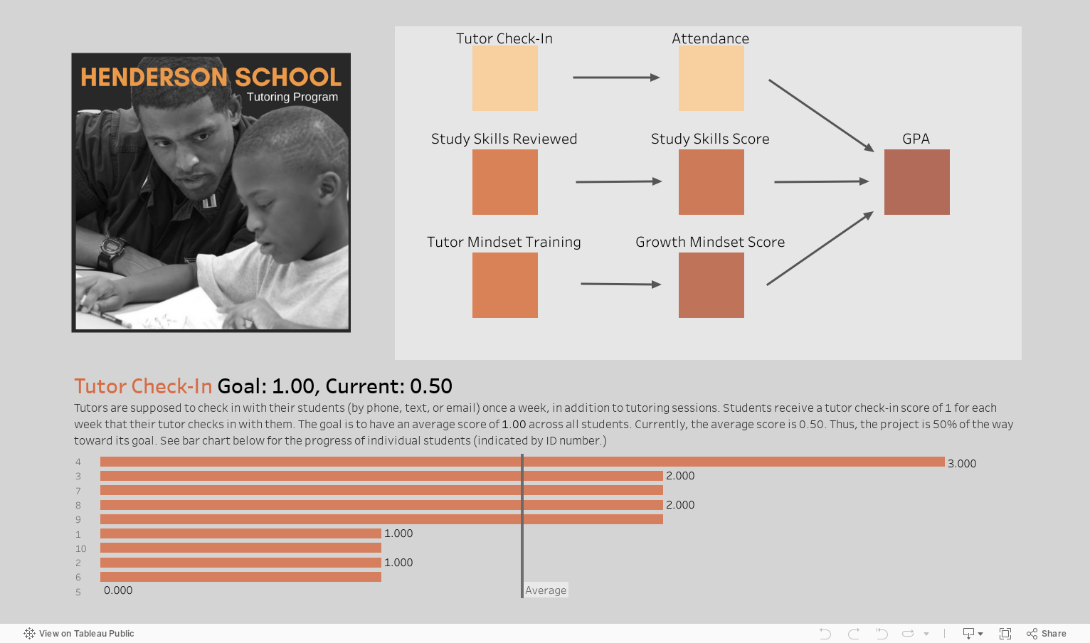
Here’s an easy, quick, and powerful way to visualize your data. It leads to significant insights in seconds. 

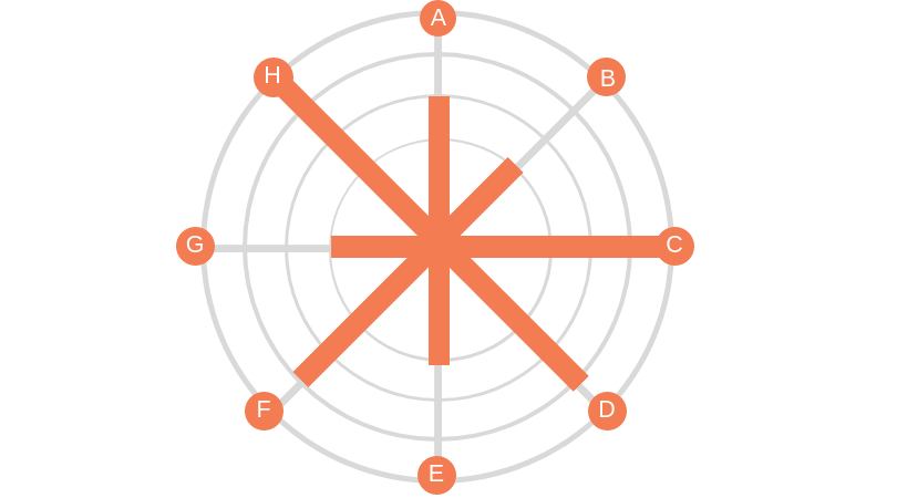
You have probably seen quadrants graphs. People, programs, or projects are graphed along two measures, one on the Y-axis and one on the X-axis. The graph is divided into four quadrants based on the average or midpoint (or some other meaningful dividing point) of the two measures. That makes it sound more complicated than it really is. Check out the quadrants graph above.  Each circle is a participant in a tutoring program. The measures are: grade point average (Y-axes) and attendance in weekly tutoring (X-axis). So participants in the:

Top right quadrant are above average on both their tutoring attendance and their GPA.

Top left quadrant are above average on GPA but below average on tutoring attendance.

Bottom right quadrant are below average on GPA but above average on tutoring attendance.

Bottom left quadrant are below average on both GPA and tutoring attendance.

Well, if the tutoring program is designed to boost GPA, then you’d hope to see most of the participants in the top right quadrant. Or you’d at least want to see participants who are low on attendance also low on GPA. But if there are participants in the other quadrants, we need to figure out why these particular students defy our predictions. For example, what else in going on with participants with high attendance/low GPA that might be undermining their progress?

Other measure pairs of interest to many nonprofits might include:

Value/Action: How do staff members who value a certain program or curriculum actually perform in putting that program or curriculum into action? If not well, why not? (Survey data would be needed here.)

Cultivation/Donation Level: Are the donors you are cultivating the same ones making the largest donations to your organization? If not, why not?

Cost/Funds Raised: Did the highest cost fundraising events result in the most funds raised? If not, why not?

See other data tips in this series for more information on how to effectively visualize and make good use of your organization's data.

Data Viz Lineup

3.png

Eyes beat memory according to Tamara Munzner. Her idea (which she shares with others, including myself) is simple. It’s easier to compare two things you can see at the same time than to compare something you can see to something you can only remember.

When several small visualizations are placed side by side (called “small multiples”), you can see the power of eyes over memory. Take a few seconds to check out this great small multiples viz by Doug McCune. You can quickly scan the images to make easy comparisons.

In each chart, the X-axis shows time of day, and the Y-axis shows number of crimes. Daytime crimes are displayed with yellow bars in the top half of the chart. Night-time crimes with blue bars on the bottom.

It’s easy to see that driving under the influence and drunkenness occur more often during the night and trespassing and suicide occur more often during the day. It would be much harder to draw this conclusion flipping through pages or clicking through screens.

See other data tips in this series for more information on how to effectively visualize and make good use of your organization's data.

Choose the Right Viz for the Job

Copy of 60-SECOND DATA TIP #8.png

When you think of visualizing data, your mind probably goes to bar graphs or maybe pie charts. However, there are many more species of visualizations. Ever heard of a waterfall or a circular area chart? Your first decision when visualizing data is what type of chart or graph to choose and that depends on what you want to show and what type of data you have.

I highly recommend Andrew Abela’s simple decision tree called “Chart Suggestions—A Thought-Starter” (see image below).  It’s based on Gene Zelazny's classic work Saying It With Charts. The decision tree starts with the basic question: “What would you like to show?” And provides four options:

Comparison. You have two or more groups of things or people and you want to see which group is largest or smallest (or somewhere in between) on some measure. You also may want to see how these groups compare on the measure over time.

Distribution. You have a bunch of data points (e.g. the ages of participants in a program or test scores of students in a class) and you want to know how spread out or bunched up they are. Are most of the ages, test scores (whatever) near the average? Or is there a wide range? Are there some extreme outliers?

Composition. You want to understand who or what makes up a larger group such as how many of the participants in a program are in different age brackets or how many have been in the program for different lengths of time.

Relationship. You want to know if one thing is related to another, either at one point in time or over time. Do participants in a mental health program report less distress over time? Do those with lower incomes have higher heart rates?

Once you answer this basic question, the decision tree helps you to choose a specific chart based on the type of data you have. Abela’s chart chooser includes the types of charts you are most likely to select. But there are more rare species out there. To learn more about the wide array of ways to visualize data, check out the Data Visualization Catalogue.

See other data tips in this series for more information on how to effectively visualize and make good use of your organization's data.

chart-suggestion-infographic.jpg

What Averages Obscure

Copy of 60-SECOND DATA TIP #8.png

Nonprofits (and everyone else) are addicted to averages. We like to talk about how participants do on average. We might describe how many visitors we have in an average week. But how much are we missing when we focus solely on averages? Short answer: it depends, but it could be a lot. If I only showed you the average sized guy in the picture, would you appreciate the full range of sizes?

To figure out what and how much we are missing, we need to calculate—or better yet show—how spread out our data points are. Understanding the spread gives us an idea of how well the average or the median represents the data. When the spread of values in the data set is large, the average obscures the real picture more than when the spread is small.

Spread measures include range, quartiles, absolute deviation, variance and standard deviation. For more on these measures, check this out. 

A great way to quickly grasp the spread of your data is to make a box plot. A box plot (aka. box and whisker diagram) shows the distribution of data including the minimum, first quartile, median, third quartile, and maximum. The box plots below show the affordability of neighborhoods in five cities. Each red circle represents a zip code area. The gray boxes show where 50 percent of the zip code areas fall on the affordability scale. And the median is where the dark gray meets the light gray. You can see that, in general (i.e according to the median), New York is more affordable than Los Angeles. However, New York has some zip code areas that are much less affordable than the median seems to suggest.

So when looking at your data, don’t just look at averages, also consider the spread.

boxplot2.jpg

See other data tips in this series for more information on how to effectively visualize and make good use of your organization's data.

Image created by Moxilla for Noun Project.

Pies are for eating

There are better ways to show your data.

60-SECOND DATA TIP #8.png

Pies are delicious but often inscrutable when applied to data. Humans are pretty good at deciphering some visual cues and pretty bad at others. For example, we do well when comparing lengths along a common scale. So looking at this image, we can confidently proclaim the E bar as the tallest. But we would be hard pressed to pick out which pie slice is largest. That’s because we don’t do so well with angles. So when comparing the quantities of several things, bar charts are almost always better than pie charts. The only exception is when you want to compare a part to a whole. In this case, a pie chart does a good job of showing that girls, for example, represent only a sliver of all the participants in a program or that 30 to 40 year olds are the majority of visitors to an event. But once you get beyond 2 (or maybe 3) slices, skip the pie and dust off the trusty bar chart.