Zoom In

Copy of 60-SECOND DATA TIP (1).png

Imagine a photo of a flower. It’s a yellow daisy. Turn the page, and there’s the daisy again, on a black lapel. Turn the page once more, and you see a teenage boy wearing a dark suit with a daisy on his lapel standing in front of split-level ranch house. Now imagine that the carnation along a roadside surrounded by trash or in a bucket on a flower truck.

Someone once said (and then a lot of others repeated): “Context is everything.”

So when presenting a series of charts, maps, or graphs, give your viewer some context. Provide the wide view first (the ranch house, the roadside, the flower truck) and then zoom in on the details (the daisy).

Here's an example. It's a series of charts showing the prevalence of chronic disease among adults (based on data from the Center for Disease Control).

Begin With The Wide View: The first is a map shows how prevalent all chronic diseases are across the U.S.

map.jpeg

Then Zoom In: The second is a parallel coordinates chart in which each line represents one of the 50 states. It provides a more specific view of the prevalence of particular types of diseases in particular states.

pc.jpeg

Now Zoom In Further: Finally, the interactive dashboard, the third view, allows the viewer to drill even further into the data and explore how various risk and protective factors (diet, smoking) relate to the prevalence of different diseases.

explore.jpeg

See other data tips in this series for more information on how to effectively visualize and make good use of your organization's data.

Photo by Cam Morin on Unsplash


How To Make Your Data Digestible

Copy of 60-SECOND DATA TIP.png

I’ve said it before. We are much better at digesting visual information—position, size, color, hue—than we are at digesting words and numbers. Words and numbers, which only appeared within the last few thousand years, require our visual system to scan individual characters one at a time and piece them together to create meaning. By contrast, we can process visual cues simultaneously and very quickly. We don’t read pictures from left to right and from top to bottom. We process the elements of a picture in parallel. Very efficient.

Once you decide to represent your data visually, you need to decide how. What visual cues are right for the job?  Luckily, there’s some research to point you in the right direction. Cleveland and McGill (and others) have studied what types of encodings or “channels” people are able to decode most accurately and ranked them, as shown above.

As you can see, we are great at assessing position along a common scale and pretty good at length, even without a common scale. This is one reason why bar charts are so powerful. We are less good at assessing something like color intensity. While we can see that one color is darker than the other, it’s hard to determine if it’s twice as dark.

So if you need your viewers to make more accurate assessments, use visual encodings toward the right end of the spectrum, but other encodings, toward  the left end, are fine for more general assessments.

See other data tips in this series for more information on how to effectively visualize and make good use of your organization's data.

When You Should NOT Visualize Your Data

Copy of 60-SECOND DATA TIP (1).png

Data viz is getting a lot of hype these days. And, if you have read any of my data tips, you know I’m on the bandwagon. But even a devotee like myself can see that visualizing data is not always best. There are at least two circumstances when you are better off with a drab spreadsheet:

1) You have an already-engaged but diverse audience.

These are folks who are highly motivated to access certain data and won’t be annoyed by having to find that data on a table. Tables use paper or screen real estate efficiently. You can fit a lot of rows and columns in a small space allowing users with different interests to find data in a single table.

2) You have many units of measure.

For example, you want to show the height, weight, location, and satisfaction level of participants in a healthy eating program. This data involves four different units of measure: inches, pounds, latitude/longitude, and survey ratings. Such complexity is difficult to represent on a single visualization but you can do so in a single table quite easily.

See other data tips in this series for more information on how to effectively visualize and make good use of your organization's data.

How To Dress Your Data In The Right Colors

Copy of 60-SECOND DATA TIP.png

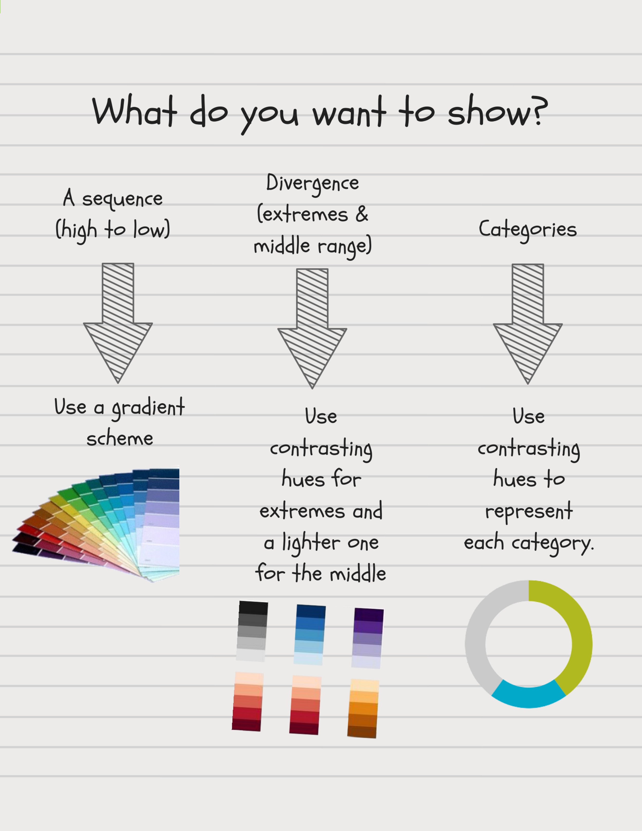
Bad color decisions can break an otherwise effective data visualization. In Data Tip #14, I gave you some color dos and don'ts. Today, I offer a simple flow chart to help you choose the right type of color scheme for your viz, based on what you want to show.

Choosing Colors.png

See other data tips in this series for more information on how to effectively visualize and make good use of your organization's data.

Two Ways to Offer The "Just Right" Data Portion

60-SECOND DATA TIP #8 (3).png

Pretend that you are Goldilocks and your porridge is data. How much data is just right? Just enough to be engage your funders, staff, or board members, but not so much as to be overwhelming?

To answer this question, we might consider Miller’s Law. George A. Miller was a psychology professor at Princeton University and wrote one of the most frequently cited papers in psychology: "The Magical Number Seven, Plus or Minus Two: Some Limits on Our Capacity for Processing Information."

Miller conducted experiments on human memory and concluded that the number of objects that an average human can remember in the short-term is 7 ± 2.  Objects can include symbols like numbers or abstract concepts. We also can hold several groups of related objects.

Armed with this knowledge, we can make visualizations of data (charts, maps, graphs) easier to digest by:

1) Grouping data into categories. Whenever you have a graph or chart with more than 5 to 10 data categories, the individual units start to lose their individuality and are perceived by our eyes as a single whole. In the “before” and “after” examples below, the after chart is easier to process because it combines data on donors into just two groups: those in Chicago and those in other cities.

2) Highlight one or two single categories and gray out the rest. The chart below (called a parallel coordinates chart) includes a line for each of the 50 states showing the prevalence of various diseases in each state. But only one state (Hawaii) is highlighted and the rest are grayed out. Thus there are really only two data categories to compare: 1) Hawaii and 2) the rest of the states.

BEFORE: TOO MANY GROUPS

many groups.jpg

AFTER: JUST TWO GROUPS

two groups.jpg

HIGHLIGHT ONE GROUP

hawaii.jpg

See other data tips in this series for more information on how to effectively visualize and make good use of your organization's data.

How to Make Your Data Irresistible (To Your Donors, Board Members, and Everyone Else)

60-SECOND DATA TIP #8 (1).png

We humans might be data averse by nature – especially when presented with data in a spreadsheet (see Data Tip #1). But there is one type of data we can’t get enough of: data about ourselves. So when visualizing data, consider how you can put your viewer/user/reader into the chart, graph, or map.

The Guardian cleverly places their reader squarely in the middle of this simple chart. First, they ask what the reader expects is the correct answer to a question concerning a news topic such as: “Out of every 100 prisoners in the United States, about how many do you think were born in a foreign country?” The reader gives her answer and then can compare her answer to that other others in her country and to the correct answer. 

Try it yourself. Would these stats have engaged you nearly as much had The Guardian simply presented them in text form? Are you more likely to remember these stats tomorrow? Did you reflect on how on/off the mark you were? Did you consider why your answer differed from that of others?

See other data tips in this series for more information on how to effectively visualize and make good use of your organization's data.

Photo by Ashim D’Silva on Unsplash

The Why of the Y (Axis)

60-SECOND DATA TIP #8.png

When was the last time you pondered the Y-axis? Wait, you might be thinking, what’s the Y-axis again? In a typical chart (think bar chart, line graph), it’s the vertical axis. For example, in a bar chart, the Y-axis indicates the length of the bars and thus how much of something is in a category or at a certain point in time. The categories or time periods are indicated along the horizontal or X-axis. You might recall from your middle school days that the X and Y axes are part of the Cartesian coordinate system that René Descartes (pictured here) invented in the 17th century.

What's to ponder about a Y-axes? Well, at least two questions:

1. What should be the lowest and highest number on the axis?

2. What should be the interval between numbers on the axis?

The lowest point is called the “origin.” It’s where the Y and X axes intersect. Much has been written about the importance of starting the Y-axis at zero because, when you don’t, you can make a small difference look like a big one (see the two bar charts below for a case in point.) However, when all the numbers you are charting are not anywhere near zero, then starting at zero can make differences hard to detect (see the two line graphs below for examples.) And, if your high points are too high, your data will be crammed into the upper part of your chart, leaving a lot of useless empty space below.

Think of the low point and the high point as reference points for your data. Do you want to show progress compared to historic low or high points? Do you want to show progress in relation to goals? The answer to such questions will help you decide where to start and end your Y-axis.

As for what falls in between these two points, you should consider the range of your data points and how much accuracy and ease your viewer will want. If the data ranges from 2 to 12 with slight differences between points, then you might want intervals of .01. However, if the data ranges from 6 to 10,000, then intervals of 10, 100, or even 1,000 might be sufficient to give viewers a general, easy-to-interpret sense of the data.

If you’d like to ponder the Y-axis a bit further, check out this great video from Vox.

See other data tips in this series for more information on how to effectively visualize and make good use of your organization's data.

Zero Origins.png


Frans Hals - Portret van René Descartes, André Hatala [e.a.] (1997) De eeuw van Rembrandt, Bruxelles: Crédit communal de Belgique, ISBN 2-908388-32-4.

Flatten Your Data

60-SECOND DATA TIP #8 (1).png

Bells and whistles can be a problem when visualizing data. Edward Tufte, the grandfather of modern data viz, entreated us to remove any non-data ink. The idea is to focus on what matters — the story the data is telling us — without any unnecessary distractions.

Making visualizations look three-dimensional is almost always a distraction and a distortion. To make something look 3D, you have to use a technique called “foreshortening” which means that parts that are supposed to be perceived as closer in space are larger (see red slice of the pie in the image below), and parts that are supposed to be perceived as farther away are smaller (see green and blue slices). The angles represented on the 2D chart on the left, as you can see, are distorted on the 3D chart on the right, making it more difficult to judge the relative size of the slices.

Another way of creating the illusion of three dimensions is to obscure some objects with others to make it appear that one object is in front of another. But, of course, this is a problem for accurate assessment in a data viz. For example, in the 3D bar chart below, the green bars for "C" are barely visible whereas the flat image shows the green bars clearly.

Is it ever a good idea to make data visualizations look 3D? Yes, but rarely. The rule is simple. Only use 3D visualizations for 3D spatial data such as a diagram showing airflow over a spacecraft. Otherwise keep it flat.

See other data tips in this series for more information on how to effectively visualize and make good use of your organization's data.

pie_3d.png
bar_3d.png

Show Order

Copy of 60-SECOND DATA TIP #8.png

We visualize data to take advantage of our visual superpowers. And when doing so, we should keep in mind how our mind works. We humans are great at detecting patterns, even when none exists (think conspiracy theories). From an evolutionary perspective, pattern recognition has helped us to understand what we see and make predictions that help us survive and reproduce.

Order is a particular type of pattern. It is the arrangement of people or things in relation to each other according to a particular sequence. So when there is an order to our data, we should show it. Our pattern-seeking minds will thank us for delivering up a real pattern and making it so easy for us to see.

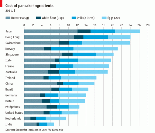
For example, arrange bars on a bar charts in descending order so that viewers can easily pick out the top/bottom or the most/least. In this visualization from The Economist, we can easily see that Japan is the most expensive place to make pancakes (assuming you are buying all of your ingredients there.) It also gives you a sense of what is driving the difference in cost of pancake ingredients: butter in Japan, eggs in Switzerland.

pancakes.gif

See other data tips in this series for more information on how to effectively visualize and make good use of your organization's data.

Camel by Tatiana Belkina from the Noun Project

Color Coordinate Your Data

Copy of 60-SECOND DATA TIP #8 (1).png

Color is a great tool for drawing attention to certain data points in a graph, chart, map, or diagram. But, WARNING, color also can confuse the viewer. Adopting a few rules of thumb will turn a rainbow of confusion into an elegant and clear picture:

1) Limit one meaning per color. If you are color coding a map and assigning blue to a certain income range, then do not use blue to mean anything else in that map or adjacent related visuals. Blue always means that specific income range.

2) Limited color palate. Limit your graph, chart, map, or diagram to a few complementary or monochromatic colors. Remember the color wheel? (See image above.) Choose complementary colors that are on opposite sides of the wheel: think orange and blue and yellow and purple. Or choose several tones of one color (a monochromatic color scheme). Looking for an effective ready-made color palate? Check out sites like color-hex.

3) Avoid reds with greens. Seven to ten percent of men are red-green colorblind. They can’t tell the difference between the two. So avoid using them both on a visualization.

4) Dial-up one data point and mute the rest. If you want to draw attention to one point, line, bar, or pie slice, give it a bright color and color the rest a muted shade or gray.

See other data tips in this series for more information on how to effectively visualize and make good use of your organization's data.


Simplify

Copy of 60-SECOND DATA TIP #8 (1).png

This data tip comes from the grandfather of modern data visualization: Edward Tufte. He originally recommended the elimination any non-data ink from data visualizations. Although today we might think more in terms of pixels than ink. The idea is to remove any distractors from the story that a data visualization--such as a bar chart or line graph--shows. Such distractors can include bells and whistle such as bars on a bar chart drawn as people or buildings (Tufte called this “chartjunk”). But there are more subtle distractors like graph lines and background color. The two images here show the same data, but the one on the right is stripped down to the essentials: no graph lines, no axis titles, only the visual information necessary to see the slope and to quantify it. So next time you visualize data, try simplifying so that your story shines through.

Note: 60-Second Data Tips will resume in January 2018. Happy New Year!

See other data tips in this series for more information on how to effectively visualize and make good use of your organization's data.

Point To The Story

Copy of 60-SECOND DATA TIP #8.png

Data can tell a story. But rarely is that story apparent when you look at a spreadsheet. (See Tip #1.) You can bring the story into focus by visualizing the data. You can show change over time using a line graph. You can compare and contrast groups using a bar chart. You can juxtapose a part of a group and the whole group using a pie chart. And there are plenty of other examples. But once you have visualized, the story can still be hidden, particularly to those unfamiliar with the data. That’s when it’s time to call out data points with color and annotations. In the visualization below, each line is a city in Hennepin County in Minnesota. The slope of the lines shows changes in housing prices overtime. The Minneapolis Star Tribune, which created the visualization, draws our attention to the city of St. Louis Park and allows us to easily compare this city's housing prices to that of other cities before and after the housing bubble peak. The annotation also gives us specific data on St. Louis Park that would be difficult to glean from the graph alone. The interactive version of this graph allows you to highlight different cities and look at median housing cost, relative cost, and relative change in cost.

See other data tips in this series for more information on how to effectively visualize and make good use of your organization's data.

Screen Shot 2017-12-13 at 10.37.27 AM.png

Don't Just Set Goals, Track Them

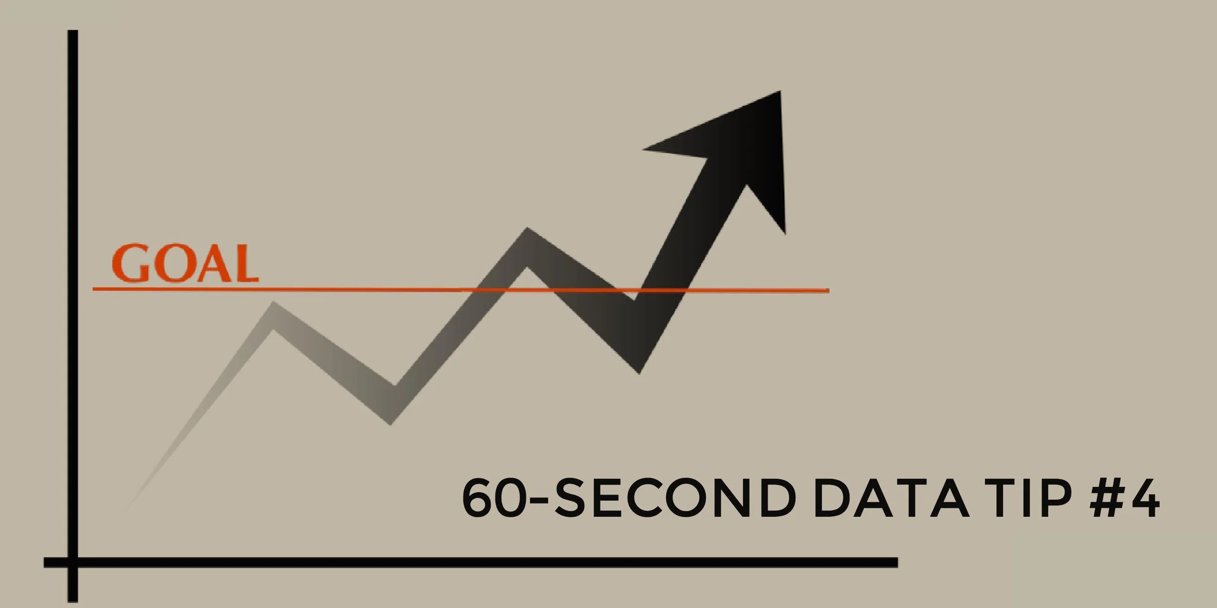
tip4.jpg

Many organizations go to a lot of trouble setting goals, eating up loads of staff and board meeting time, and then neglect to do one or both of the following:

  • Figure out how they will know if they are making progress toward their goals.

  • Track their progress toward their goals.

If your organization or program doesn’t already have clearly articulated goals, a logic model is a good first step toward setting them. Logic models show how resources, programs and services, and desired results relate to each other according to your organization’s strategic plan. (For more on logic models, check out the Pell Institute’s Evaluation Toolbook.)

You can set goals for any stage of the process: what resources you hope to garner, what services you intend to provide, or what outcomes you expect to see. The trick is to make these goals specific and measurable. Don’t say you will work strengthen a program, say that participation in the program will increase to 250 and that evaluation surveys will show average ratings at or above 4 (on a five point scale).

Once you set specific and measurable goals, don’t wait until you have all of the necessary data to visualize it. It’s important to bring the data to life for everyone involved, and that means showing it sooner rather than hiding it in spreadsheets and databases.

Even a simple line graph showing progress over time toward a goal will make your data perceptible, prompting you and your colleagues to ask yourselves important questions, such as: Is our data accurate? What additional data do we need to better understand the trends we see? What is going on in our program or our community or our field that might be affecting these trends? Questions like these can strengthen your resolve to gather new or better data as well as to make changes to enhance the efficacy of your program.

See other data tips in this series for more information on how to effectively visualize and make good use of your organization's data. 

Image Source: Pixabay.com

(This data tip originally appeared on Philanthropy News Digest’s PHILANTOPIC blog.)