When To Reconsider The Pie Chart

Copy of 60-SECOND DATA TIP.png

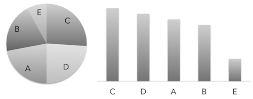
In honor of the upcoming pie-focused holiday, I am revisiting the pie chart. You’ve heard me (and perhaps countless others) disparage the pie chart. Humans, as you may recall, are not so good at distinguishing between different angles. And pie slices involve angles. We are better at assessing length along a common scale. So it’s much easier to figure out which bar in the bar chart below is longest than it is to determine which pie slice is largest.

bar_pie_charts.jpg

Data viz gurus will tell you to only use the pie chart to show part-to-whole relationships. Like this one showing what percentage of all pie lovers love minced meat pie (data source: my imagination).

part_whole.jpg

But I’m going to push back against the data viz orthodoxy a bit. Because I think there are two types of angles we are really good at assessing: the 90-degree angle and the 180-degree angle. Moreover, when we use those angles to divide a circle, we instantly perceive one-quarter and one-half, respectively. Nothing says “a quarter” like a quarter slice of pie. But show me quarter of a tray of brownies? Well, one-fourth is probably not your first thought.

brownie.jpg

Indeed, we are so good at one-half and one-quarter assessments, that we can immediately detect when a slice slightly misses the mark. 

Untitled design (1).jpg

But it’s more difficult when comparing bars. Can you tell which bar below is divided 75/25 and which is 73/27?

bar_percent.jpg

So consider a pie chart (or it’s close cousin the donut chart) when:

  • Showing how the size of one or two groups relates to the whole group

  • Showing group sizes that equal one-half or one-quarter of the whole

  • Showing when a group size is slightly more or less than one-half or one-quarter of the whole

And during Thanksgiving, just consider pie, regardless of the shape and size of the slice.

(I know I promised you more on making data beautiful last week. Stay tuned for that tip in the upcoming weeks.)

See other data tips in this series for more information on how to effectively visualize and make good use of your organization's data.


Photo by Chloe Benko-Prieur on Unsplash

Photo by Alison Marras on Unsplash

Tap Into The Mighty Flowchart

Copy of 60-SECOND DATA TIP (1).png

Behold the power of the flowchart. They are engaging, easy to digest, and charmingly analog. Don’t forget to use them to:

See other data tips in this series for more information on how to effectively visualize and make good use of your organization's data.

Choose The Right Viz

Copy of 60-SECOND DATA TIP.png

Data Viz UX, Episode 3

Three weeks ago, I promised to show you how to apply some UX (User Experience) tips to keep your viewers awake, engaged, and wielding data from the data visualizations (aka data viz) you create. So far, I’ve covered the first two steps: knowing your users and choosing the right data. Today, we tackle choosing the right visualization for your data.

I highly recommend Andrew Abela’s simple decision tree called Chart Suggestions—A Thought-Starter.  It’s based on Gene Zelazny's classic work Saying It With Charts. The decision tree starts with the basic question: “What would you like to show?” And provides four options:

Comparison. You have two or more groups of things or people and you want to see which group is largest/smallest or highest/lowest (or somewhere in between) on some measure. You also may want to see how these groups compare on the measure overtime.

Distribution. You have a bunch of data points (e.g. the ages of participants in a program or test scores of students in a class) and you want to know how spread out or bunched up they are. Are most of the ages, test scores (whatever) near the average? Or is there a wide range? Are there some extreme outliers?

Composition. You want to understand who or what makes up a larger group such as how many of the participants in a program are in different age brackets or how many have been in the program for different lengths of time.

Relationship. You want to know if one thing is related to another, either at one point in time or overtime. Does more participation in a mental health program correlate with less distress over time? Do those with lower incomes have higher heart rates?

Once you answer this basic question, the decision tree helps you to choose a specific chart based on the type of data you have. Abela’s chart chooser includes the types of charts you are most likely to select. But there are more rare species out there. To learn more about the wide array of ways to visualize data, check out the Data Visualisation Catalog.

However, I will leave you with a word of caution. And that word is: “Xenographphobia” or fear of weird charts. It’s a thing. And you should be aware of it. Although we might like the look of sexy charts, we don’t usually have the time or patience to figure them out. So in the interest of creating a positive and productive UX, stick with the charts folks already know how to read or are self-explanatory.

Stay tuned for the other steps in the UX process: refining the viz and testing it.

See other data tips in this series for more information on how to effectively visualize and make good use of your organization's data.


Column chart with line chart by HLD, Line Graph by Creative Stall, Pie Chart by frederick allen, Radar Chart by Agus Purwant, and sankey diagram by Rflor (from the Noun Project)

A Simple and Powerful Way To Extract Meaning From Your Data

60-SECOND DATA TIP #8.png

Here’s an easy, quick, and powerful way to visualize your data. It leads to significant insights in seconds. 

You have probably seen quadrants graphs. People, programs, or projects are graphed along two measures, one on the Y-axis and one on the X-axis. The graph is divided into four quadrants based on the average or midpoint (or some other meaningful dividing point) of the two measures. That makes it sound more complicated than it really is. Check out the quadrants graph above.  Each circle is a participant in a tutoring program. The measures are: grade point average (Y-axes) and attendance in weekly tutoring (X-axis). So participants in the:

Top right quadrant are above average on both their tutoring attendance and their GPA.

Top left quadrant are above average on GPA but below average on tutoring attendance.

Bottom right quadrant are below average on GPA but above average on tutoring attendance.

Bottom left quadrant are below average on both GPA and tutoring attendance.

Well, if the tutoring program is designed to boost GPA, then you’d hope to see most of the participants in the top right quadrant. Or you’d at least want to see participants who are low on attendance also low on GPA. But if there are participants in the other quadrants, we need to figure out why these particular students defy our predictions. For example, what else in going on with participants with high attendance/low GPA that might be undermining their progress?

Other measure pairs of interest to many nonprofits might include:

Value/Action: How do staff members who value a certain program or curriculum actually perform in putting that program or curriculum into action? If not well, why not? (Survey data would be needed here.)

Cultivation/Donation Level: Are the donors you are cultivating the same ones making the largest donations to your organization? If not, why not?

Cost/Funds Raised: Did the highest cost fundraising events result in the most funds raised? If not, why not?

See other data tips in this series for more information on how to effectively visualize and make good use of your organization's data.

Data Viz Lineup

3.png

Eyes beat memory according to Tamara Munzner. Her idea (which she shares with others, including myself) is simple. It’s easier to compare two things you can see at the same time than to compare something you can see to something you can only remember.

When several small visualizations are placed side by side (called “small multiples”), you can see the power of eyes over memory. Take a few seconds to check out this great small multiples viz by Doug McCune. You can quickly scan the images to make easy comparisons.

In each chart, the X-axis shows time of day, and the Y-axis shows number of crimes. Daytime crimes are displayed with yellow bars in the top half of the chart. Night-time crimes with blue bars on the bottom.

It’s easy to see that driving under the influence and drunkenness occur more often during the night and trespassing and suicide occur more often during the day. It would be much harder to draw this conclusion flipping through pages or clicking through screens.

See other data tips in this series for more information on how to effectively visualize and make good use of your organization's data.

Choose the Right Viz for the Job

Copy of 60-SECOND DATA TIP #8.png

When you think of visualizing data, your mind probably goes to bar graphs or maybe pie charts. However, there are many more species of visualizations. Ever heard of a waterfall or a circular area chart? Your first decision when visualizing data is what type of chart or graph to choose and that depends on what you want to show and what type of data you have.

I highly recommend Andrew Abela’s simple decision tree called “Chart Suggestions—A Thought-Starter” (see image below).  It’s based on Gene Zelazny's classic work Saying It With Charts. The decision tree starts with the basic question: “What would you like to show?” And provides four options:

Comparison. You have two or more groups of things or people and you want to see which group is largest or smallest (or somewhere in between) on some measure. You also may want to see how these groups compare on the measure over time.

Distribution. You have a bunch of data points (e.g. the ages of participants in a program or test scores of students in a class) and you want to know how spread out or bunched up they are. Are most of the ages, test scores (whatever) near the average? Or is there a wide range? Are there some extreme outliers?

Composition. You want to understand who or what makes up a larger group such as how many of the participants in a program are in different age brackets or how many have been in the program for different lengths of time.

Relationship. You want to know if one thing is related to another, either at one point in time or over time. Do participants in a mental health program report less distress over time? Do those with lower incomes have higher heart rates?

Once you answer this basic question, the decision tree helps you to choose a specific chart based on the type of data you have. Abela’s chart chooser includes the types of charts you are most likely to select. But there are more rare species out there. To learn more about the wide array of ways to visualize data, check out the Data Visualization Catalogue.

See other data tips in this series for more information on how to effectively visualize and make good use of your organization's data.

chart-suggestion-infographic.jpg

What Averages Obscure

Copy of 60-SECOND DATA TIP #8.png

Nonprofits (and everyone else) are addicted to averages. We like to talk about how participants do on average. We might describe how many visitors we have in an average week. But how much are we missing when we focus solely on averages? Short answer: it depends, but it could be a lot. If I only showed you the average sized guy in the picture, would you appreciate the full range of sizes?

To figure out what and how much we are missing, we need to calculate—or better yet show—how spread out our data points are. Understanding the spread gives us an idea of how well the average or the median represents the data. When the spread of values in the data set is large, the average obscures the real picture more than when the spread is small.

Spread measures include range, quartiles, absolute deviation, variance and standard deviation. For more on these measures, check this out. 

A great way to quickly grasp the spread of your data is to make a box plot. A box plot (aka. box and whisker diagram) shows the distribution of data including the minimum, first quartile, median, third quartile, and maximum. The box plots below show the affordability of neighborhoods in five cities. Each red circle represents a zip code area. The gray boxes show where 50 percent of the zip code areas fall on the affordability scale. And the median is where the dark gray meets the light gray. You can see that, in general (i.e according to the median), New York is more affordable than Los Angeles. However, New York has some zip code areas that are much less affordable than the median seems to suggest.

So when looking at your data, don’t just look at averages, also consider the spread.

boxplot2.jpg

See other data tips in this series for more information on how to effectively visualize and make good use of your organization's data.

Image created by Moxilla for Noun Project.

Pies are for eating

There are better ways to show your data.

60-SECOND DATA TIP #8.png

Pies are delicious but often inscrutable when applied to data. Humans are pretty good at deciphering some visual cues and pretty bad at others. For example, we do well when comparing lengths along a common scale. So looking at this image, we can confidently proclaim the E bar as the tallest. But we would be hard pressed to pick out which pie slice is largest. That’s because we don’t do so well with angles. So when comparing the quantities of several things, bar charts are almost always better than pie charts. The only exception is when you want to compare a part to a whole. In this case, a pie chart does a good job of showing that girls, for example, represent only a sliver of all the participants in a program or that 30 to 40 year olds are the majority of visitors to an event. But once you get beyond 2 (or maybe 3) slices, skip the pie and dust off the trusty bar chart.