Click on examples below to learn more.
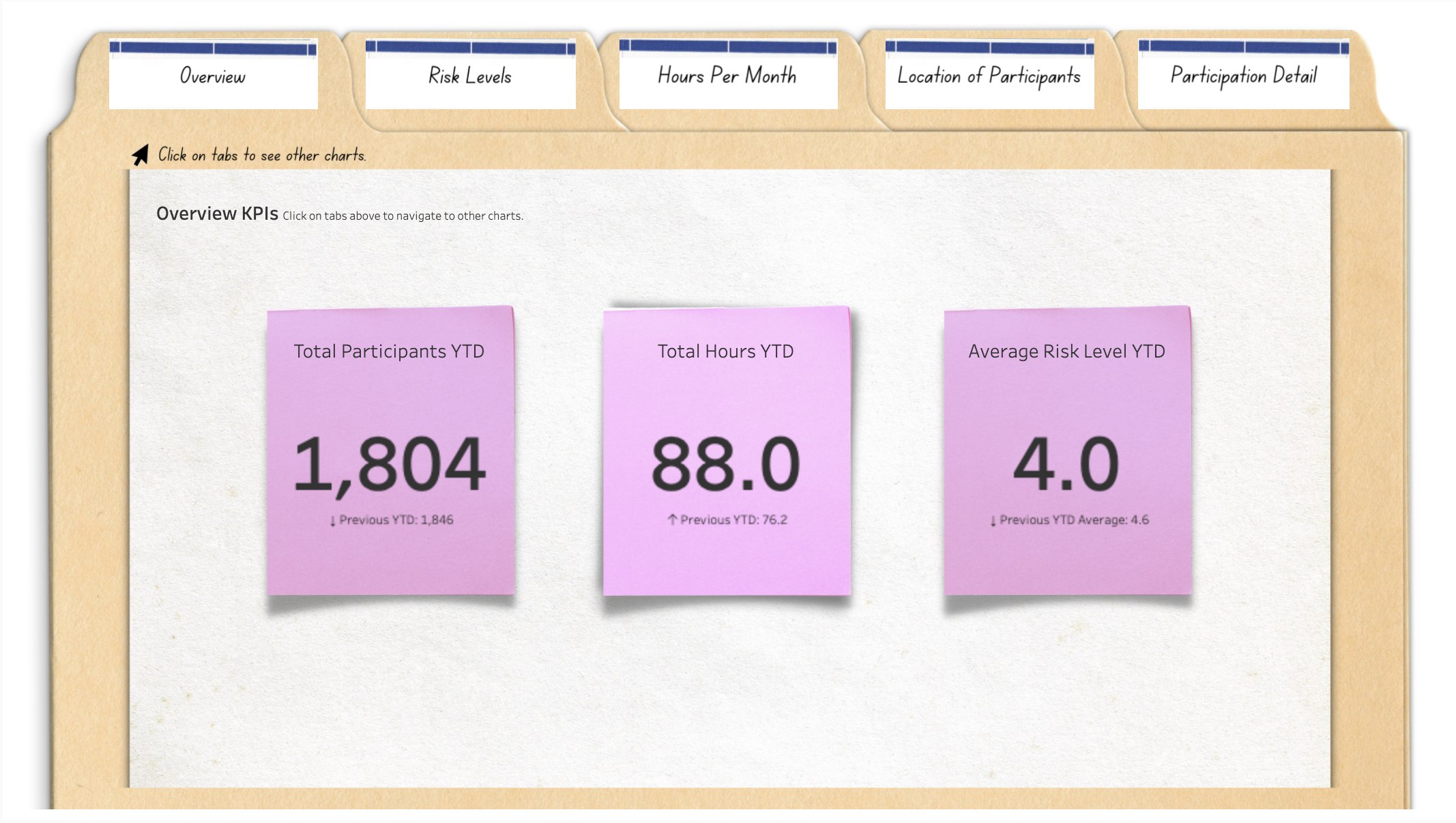
DVN works to make data more comfortable, particularly for non-data people. Sometimes that means creating simple charts that everyone can understand. Sometimes that means limiting the number of charts presented. For many of us, paper, file folders, paper clips, and post-it notes are familiar and perhaps even comforting. Give this old school meets new school data dashboard a spin and see what you think.
Click HERE to interact with this visualization.
Click HERE to see other examples of DVN’s work.
A logic models shows how one thing leads to another. It’s a great way to plan a program or intervention. The problem with many logic models is that they are hypothetical, best case scenarios. And, well, reality can bite. But when you plug a logic model into real-time data, you get something much more useful: a living logic model. A living logic model compares theory to reality by showing progress to date. It also allows you to track the progress of subgroups and individuals. So it helps you to plan, to ask the right questions, and to make mid-course corrections.
Click HERE to interact with this visualization.
Click HERE to see other examples of DVN’s work.
Surveys provide answers to many nonprofit questions. To what degree do participants value this program? What are barriers to enrollment? What types of services do community members lack and need?
It’s easy enough to create a survey on Survey Monkey or the like. It's harder to get an adequate number of responses. But let’s say you get past this hurdle. There’s still a major hurdle ahead of you: extracting meaning from your data.
DVN will custom design an interactive data dashboard that allows anyone to easily interpret your survey data. It will show you overall trends, subgroup results, and implications for your work ahead.
Click HERE to interact with this visualization.
Click HERE to see other examples of DVN’s work.
An interactive map is a great way to show donors, board members, prospective funders and other stakeholders whom you serve, including their age, location, income, and other characteristics. Use maps also to show where you provide services or where there is need.
Click HERE to interact with this visualization.
Click HERE to see other examples of DVN’s work.
Your participants, clients, donors, and other stakeholders flow through your organization, moving from one stage to another. Understand those processes or flows and where the bottlenecks are by visualizing the data.
Click HERE to interact with this visualization.
Click HERE to see other examples of DVN’s work.